Overview
This article presents effective strategies for mastering call-to-action (CTA) buttons, aimed at significantly boosting conversion rates.
Understanding user intent is paramount; it forms the foundation of successful CTA implementation.
Furthermore, employing effective visual design elements plays a critical role in capturing user attention.
Optimizing the placement and copy of these buttons is essential, as data indicates that tailored approaches can dramatically enhance user engagement and improve conversion outcomes.
By integrating these strategies, businesses can expect to see a marked increase in their conversion rates.
Introduction
Understanding the motivations behind user actions is paramount in today’s competitive digital landscape. Mastering the art of crafting effective call-to-action (CTA) buttons enables businesses to significantly enhance user engagement and drive conversions. Yet, with the diversity of user intents and the multitude of design elements at play, how can brands ensure their CTAs resonate and compel action? This article explores proven strategies that not only optimize CTA effectiveness but also unlock the potential for increased profitability and growth.
Understand User Intent and Behavior
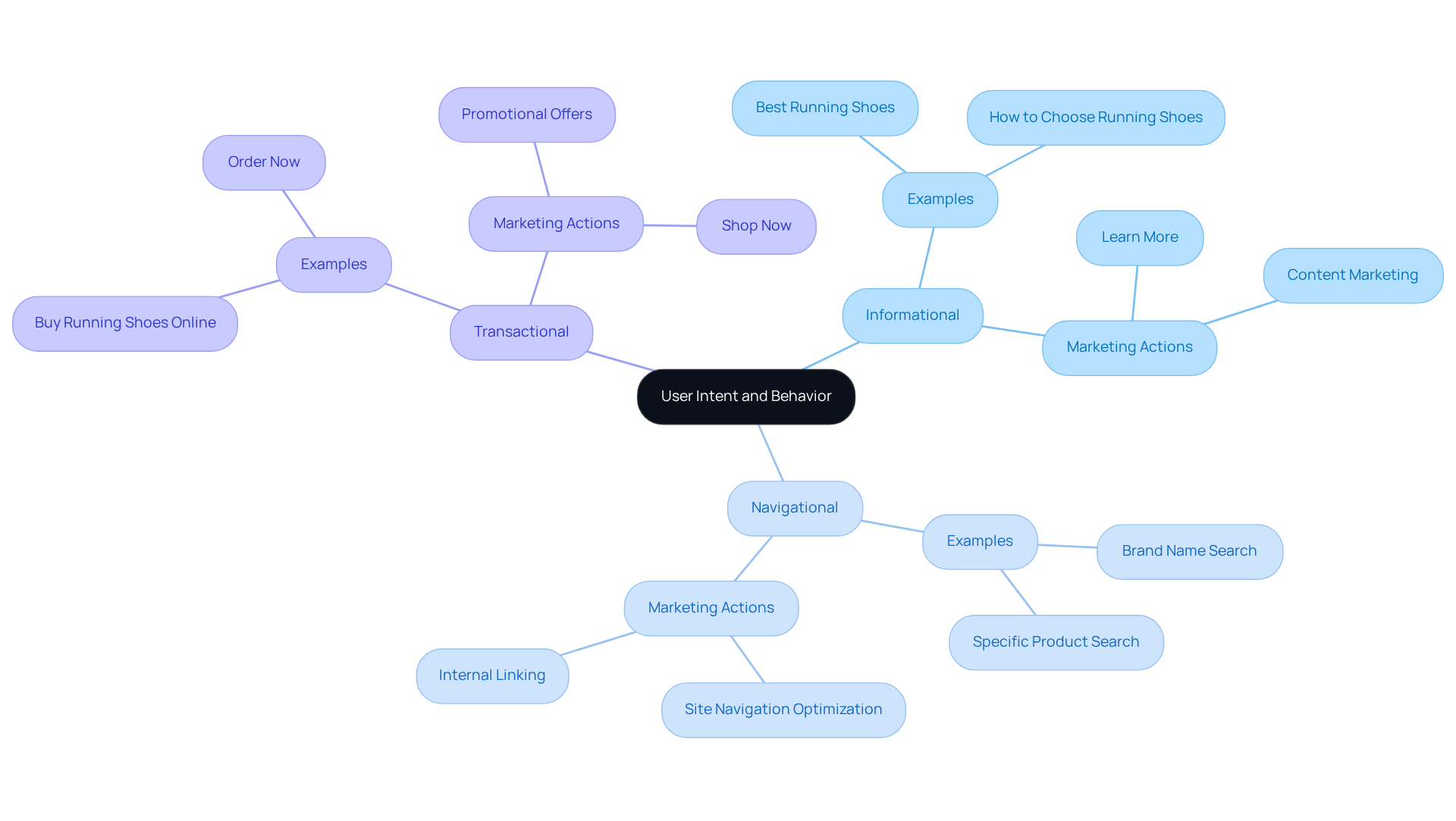
To effectively enhance conversions, it is crucial to comprehend the underlying motivations behind user actions. User intent can be categorized into three primary types:
- Informational
- Navigational
- Transactional
For instance, an individual searching for 'best running shoes' is likely in the informational phase, while someone looking for 'buy running shoes online' is in the transactional phase. Customizing cta buttons according to these intents can significantly improve audience engagement. Using 'Learn More' for informational queries and 'Shop Now' for transactional ones creates a more personalized experience that drives conversions.
Insights from psychologists highlight that anticipation in consumers can fuel action, ultimately leading to increased purchases. Instruments such as heatmaps and session recordings provide valuable information on how individuals engage with calls to action, allowing brands to consistently refine their strategies based on actual behavior patterns.
Comprehending audience intent not only guides the design of effective cta buttons but also plays a crucial role in enhancing overall conversion rates for e-commerce. Parah Group emphasizes these strategies, having successfully transformed DTC brand profitability through innovative approaches, as demonstrated in our case studies, ultimately driving sustainable growth and profitability.

Utilize Effective Visual Design Elements
Effective visual design is paramount for ensuring that CTA buttons capture attention on a webpage. Key elements—such as color, size, shape, and placement—play significant roles in enhancing user interaction. For instance, A/B testing conducted by HubSpot revealed that CTAs in vibrant colors like red can boost click-through rates by 21% compared to green options, as they stand out more against standard backgrounds. Additionally, larger buttons, ideally sized at least 44x44 pixels for mobile devices, can enhance click-through percentages by a remarkable 90%. This enlargement leads to substantial performance improvements. Familiar shapes, such as rounded buttons, often feel more inviting and enhance user recognition, increasing the likelihood of engagement. Positioning CTAs above the fold, where they are immediately visible without scrolling, can elevate visibility rates by 73%. Moreover, ensuring that CTAs are not surrounded by clutter and incorporating negative space around them significantly enhances their effectiveness. A/B testing various designs, including color variations and button shapes, is essential for gathering data on what resonates best with the target audience, with studies indicating that such testing can result in a 49% increase in conversions. Furthermore, understanding that individuals typically follow an 'F' pattern when reviewing content can inform effective placement strategies for calls to action.

Optimize Placement and Craft Compelling Copy
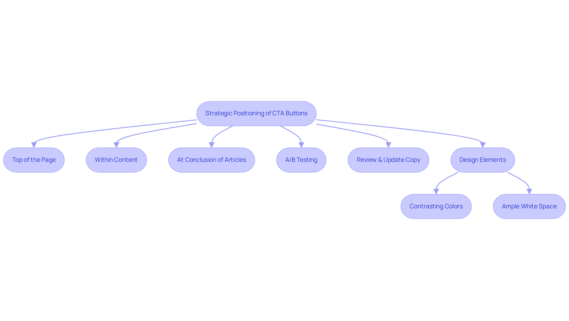
Strategic positioning of cta buttons is essential for capturing user attention at critical moments. Effective placements for cta buttons typically include:
- The top of the page
- Within the content
- At the conclusion of articles
Each location should be rigorously tested through A/B testing to identify which yields the highest conversion rates. The text used in cta buttons must be clear, concise, and focused on prompting action. Phrases such as 'Get Started,' 'Join Free for a Month,' or 'Claim Your Discount' not only convey urgency but also highlight the value of the offer.
Incorporating psychological triggers such as exclusivity or scarcity can further motivate individuals to take action; for instance, phrases like 'Limited Time Offer' instill a sense of urgency that encourages immediate engagement. Regularly reviewing and updating the copy for CTA buttons based on performance metrics is essential for maintaining relevance and effectiveness.
Data indicates that calls to action should ideally consist of two to five words to significantly improve click-through rates. Additionally, utilizing contrasting colors and ample white space around cta buttons can improve visibility and user interaction, ensuring that CTAs stand out in a crowded digital landscape.

Conclusion
Understanding user intent and behavior is fundamental for optimizing CTA buttons and boosting conversion rates. By tailoring these buttons to align with the specific motivations of users—whether they are seeking information, navigation, or making a transaction—brands can create a more engaging and effective experience. This personalized approach not only enhances user interaction but also significantly drives conversions, underscoring the importance of strategic design and placement.
Key insights reveal that effective visual design elements, such as color, size, shape, and placement, are crucial in capturing user attention. A/B testing has shown that vibrant colors and larger buttons can dramatically increase click-through rates. Additionally, positioning CTAs in visible areas and utilizing compelling, action-oriented copy can further motivate users to engage. The integration of psychological triggers, such as urgency and exclusivity, enhances this effect, making it vital to continually assess and refine CTA strategies based on performance data.
Ultimately, the success of CTA buttons hinges on a comprehensive understanding of user behavior and intent. By implementing the best practices discussed—ranging from effective visual design to strategic copywriting—brands can significantly enhance their conversion rates. Embracing these strategies not only elevates user engagement but also fosters sustainable growth, making it imperative for marketers to prioritize the optimization of their CTA elements in an increasingly competitive digital landscape.
Frequently Asked Questions
What is user intent and why is it important for conversions?
User intent refers to the underlying motivations behind user actions, which can be categorized into informational, navigational, and transactional types. Understanding user intent is crucial for enhancing conversions as it allows businesses to tailor their strategies and calls to action (CTAs) to meet the specific needs of users.
What are the three primary types of user intent?
The three primary types of user intent are: 1. Informational: Users seeking knowledge or information. 2. Navigational: Users looking for a specific website or page. 3. Transactional: Users intending to make a purchase or complete a transaction.
How can CTA buttons be customized based on user intent?
CTA buttons can be customized to align with user intent by using phrases that resonate with the user's motivations. For example, using 'Learn More' for informational queries and 'Shop Now' for transactional queries can create a more personalized experience that enhances audience engagement and drives conversions.
What role does consumer anticipation play in driving action?
Insights from psychologists suggest that consumer anticipation can fuel action, leading to increased purchases. When consumers feel anticipation for a product or service, they are more likely to take action, such as clicking on a CTA or completing a purchase.
What tools can help understand user behavior?
Tools like heatmaps and session recordings provide valuable insights into how users engage with calls to action. These tools allow brands to analyze actual behavior patterns and refine their strategies for better performance.
How does understanding audience intent impact e-commerce conversion rates?
Comprehending audience intent is essential for designing effective CTAs and enhancing overall conversion rates in e-commerce. By aligning strategies with user motivations, brands can improve engagement and drive sustainable growth and profitability.
What is the significance of Parah Group's approach to user intent?
Parah Group emphasizes the importance of understanding user intent and has successfully transformed direct-to-consumer (DTC) brand profitability through innovative strategies. Their case studies demonstrate how these approaches can lead to sustainable growth and increased profitability.
FAQs


