Overview
Call to action (CTA) buttons are pivotal in driving higher conversions, compelling users to take specific actions such as making a purchase or signing up for a service. Effective CTAs depend on strategic design elements, including:
- Visibility
- Size
- Placement
Continuous testing and optimization are essential; these practices can significantly enhance user engagement and conversion rates, sometimes by as much as 332%. By focusing on these elements, businesses can create CTAs that not only attract attention but also encourage decisive action.
Introduction
Understanding the pivotal role of call to action (CTA) buttons in digital marketing is essential for any brand aiming to enhance user engagement and drive conversions. These seemingly simple prompts, such as 'Buy Now' or 'Sign Up', wield significant influence over a visitor's journey, transforming casual browsers into loyal customers.
However, with varying design principles and strategies, the critical question arises: how can brands effectively optimize their CTAs to not only capture attention but also compel action?
This article delves into the intricacies of crafting impactful CTA buttons, exploring best practices and innovative approaches that can lead to remarkable improvements in conversion rates.
Define Call to Action Buttons and Their Role in Conversion Optimization
are essential prompts on websites that compel individuals to take specific actions, such as 'Buy Now', '', or 'Learn More'. These buttons, especially the call to action button, serve as pivotal touchpoints in the , guiding visitors toward completing actions that align with business objectives. The effectiveness of the call to action button transcends mere text; it encompasses design, placement, and contextual relevance.
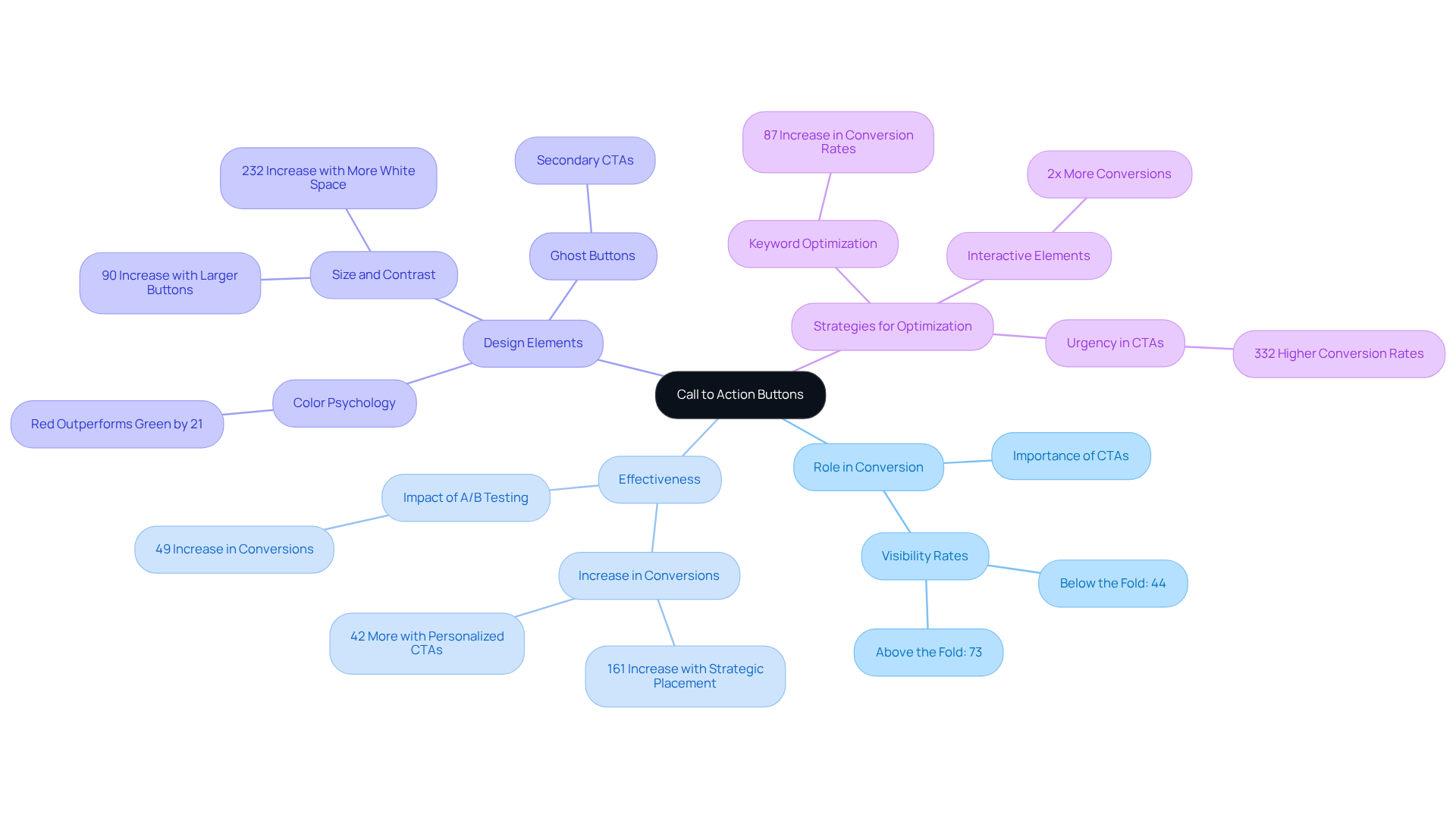
For example, studies indicate that strategically positioned [call to action buttons](https://sixthcitymarketing.com/call-to-action-stats) can significantly , with clear and persuasive prompts capable of increasing conversions by as much as 161%. Furthermore, a call to action button placed above the fold boasts a of 73%, thereby amplifying the likelihood of capturing attention.
The design elements, including color contrast and size, play a crucial role; red call to action buttons can outperform green ones by 21%, while enlarging a call to action button can lead to a 90% increase in click-through rates. Additionally, incorporating ghost buttons as secondary call to action buttons provides users with alternative options without overwhelming them. Effective utilization of white space surrounding the call to action button can elevate conversion rates by 232%, underscoring the significance of layout in design. Personalized call to action buttons convert 42% more viewers than their untargeted counterparts, showcasing the effectiveness of tailored messaging.
Understanding these mechanics is imperative for brands seeking to and effectively influence user behavior on their websites by utilizing a call to action button.

Implement Key Design Principles for Effective CTA Buttons
To create , several key must be implemented:
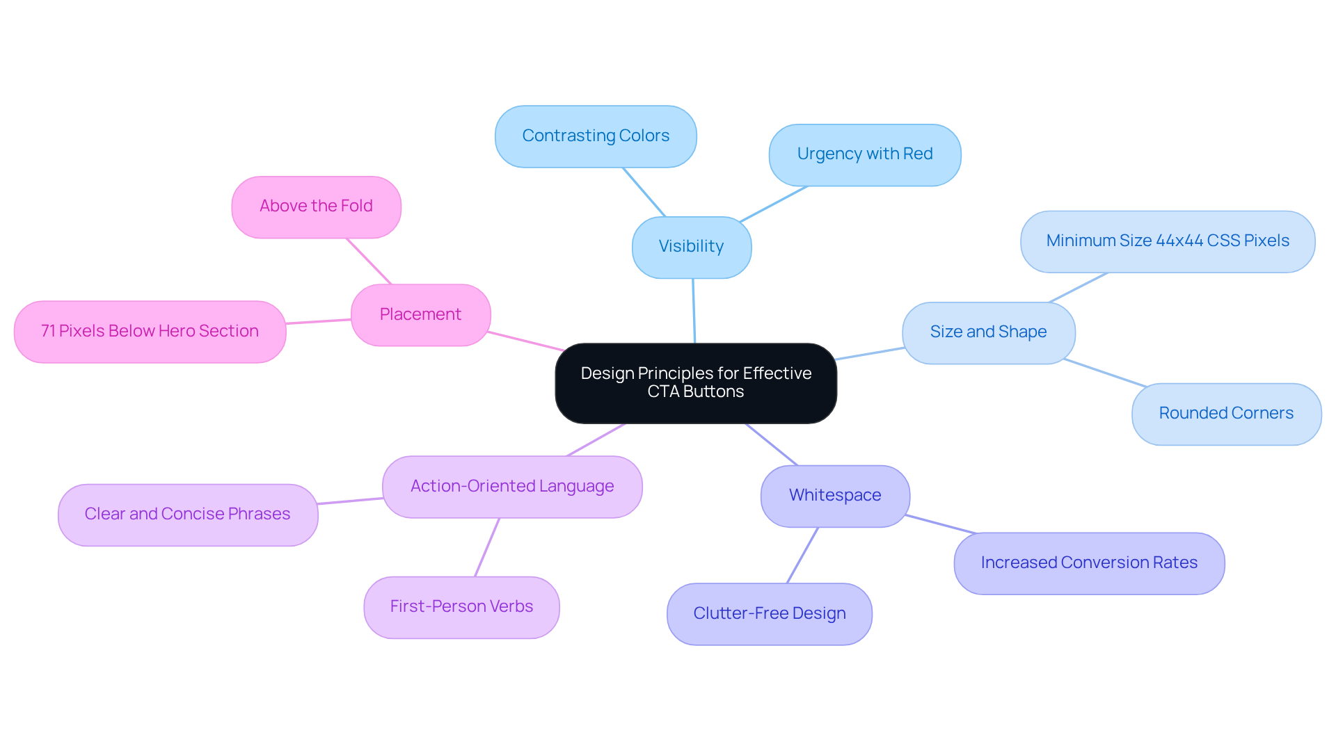
- Visibility: The CTA must stand out from the . Employ contrasting colors that draw attention without clashing with the overall design. Research indicates that red controls evoke urgency, making them particularly effective for sales-related actions.
- Size and Shape: The control should be sufficiently large to ensure easy clicking, especially on mobile devices. Studies show that elements with rounded corners often perform better, as they appear more inviting. A minimum size of 44 x 44 CSS pixels is recommended for optimal usability.
- Whitespace: Surrounding the CTA with ample whitespace is crucial to prevent a cluttered appearance. This design choice helps users concentrate on the button, significantly . A clean environment around the call to action button can lead to increased .
- : Employ that prompts immediate action. Phrases such as 'Get Started', 'Join Free for a Month', or 'Claim Your Discount' instill a sense of urgency and encourage clicks. Using first-person verbs like can elevate participant engagement. Concise, value-driven phrases are more effective than vague terms, boosting overall engagement.
- Placement: Position the CTA strategically within the content. Common placements include above the fold, at the conclusion of engaging content, or as a sticky feature that follows the user as they scroll. Effective placement significantly impacts visibility and interactions, with optimal positioning often being 71 pixels below the hero section on landing pages.
By adhering to these design principles, brands can create that effectively attract attention and drive conversions.

Test and Optimize CTA Buttons for Continuous Improvement
To maintain the effectiveness of CTA elements, are crucial. Implementing is essential for .
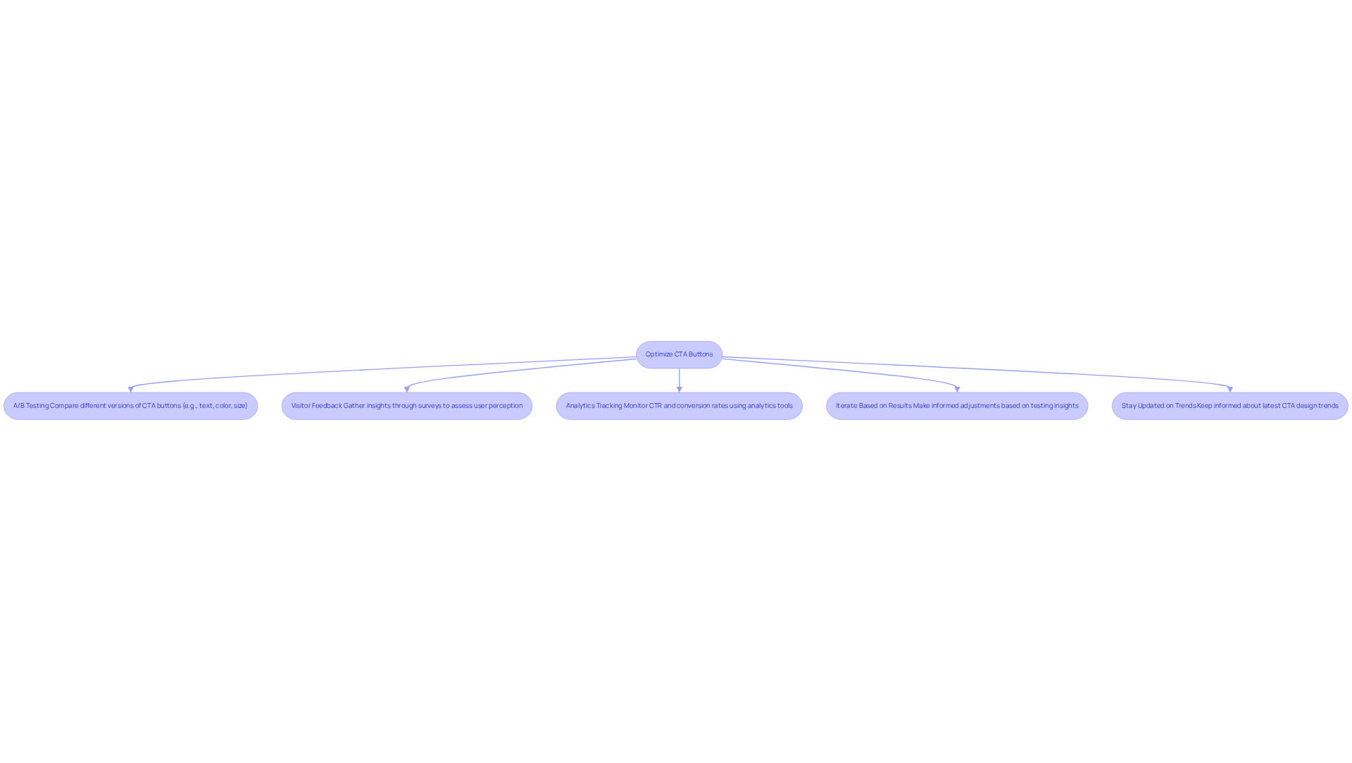
: Regularly conduct A/B tests to compare different versions of your CTA buttons. Experiment with variations in text, color, size, and placement to determine which combinations yield the highest . For instance, changing the CTA copy from 'Book A Demo' to 'Get Started' resulted in a 111.55% increase in conversion rates.
Visitor Feedback: to assess how guests perceive your . This qualitative information enhances quantitative findings, offering a more comprehensive view of engagement. convert 202% better than generic versions, emphasizing the significance of adapting messages according to user feedback.
Analytics Tracking: Utilize (CTR) and conversion rates associated with each CTA. This information assists in recognizing trends and guides choices regarding which calls to action to keep, alter, or remove. For instance, calls to action positioned above the fold perform 304% better than those below, highlighting the need for strategic placement.
Iterate Based on Results: Use insights from testing to make informed adjustments. If a particular color scheme consistently surpasses others, consider implementing it across all calls to action. Larger buttons can increase click-through rates by about 90%, demonstrating the impact of design choices.
Stay Updated on Trends: The digital landscape is ever-evolving. and behavior of individuals to ensure your prompts remain relevant and effective. For instance, adding urgency cues can increase conversions by 332%, making it essential to adapt to changing consumer expectations.
By implementing a robust testing and optimization strategy, brands can continuously enhance their CTAs, leading to improved user engagement and higher conversion rates.

Conclusion
Call to action buttons are crucial for maximizing conversion rates on websites, acting as essential prompts that direct users toward desired actions. Their effectiveness is rooted not only in compelling text but also in strategic design, placement, and personalization. By comprehensively understanding and implementing these elements, brands can significantly enhance user engagement and drive conversions.
This article has explored key insights into the mechanics of effective call to action buttons. From the importance of visibility and size to the impact of whitespace and action-oriented language, each design principle plays a vital role in creating buttons that capture attention and prompt action. Furthermore, the necessity of continuous testing and optimization, including A/B testing and analytics tracking, ensures that CTAs remain effective and relevant in an ever-evolving digital landscape.
Ultimately, the significance of mastering call to action buttons cannot be overstated. As businesses strive to optimize their conversion strategies, prioritizing these elements will not only enhance user experience but also lead to higher conversion rates. By embracing these best practices and remaining attuned to evolving trends, brands will be empowered to effectively influence user behavior and achieve their marketing goals.
Frequently Asked Questions
What are call to action buttons?
Call to action buttons are prompts on websites that encourage users to take specific actions, such as 'Buy Now', 'Sign Up', or 'Learn More'.
Why are call to action buttons important for conversion optimization?
They serve as crucial touchpoints in the user journey, guiding visitors toward completing actions that align with business objectives and significantly enhancing conversion rates.
How can the placement of call to action buttons affect conversion rates?
Strategically positioned call to action buttons can significantly increase conversion rates, with those placed above the fold achieving a visibility rate of 73%.
What design elements influence the effectiveness of call to action buttons?
Design elements such as color contrast and size are important; for example, red buttons can outperform green ones by 21%, and larger buttons can lead to a 90% increase in click-through rates.
What are ghost buttons and how do they function?
Ghost buttons are secondary call to action buttons that provide users with alternative options without overwhelming them, allowing for a more flexible user experience.
How does white space around call to action buttons impact conversion rates?
Effective use of white space surrounding call to action buttons can elevate conversion rates by 232%, highlighting the importance of layout in design.
What is the benefit of personalized call to action buttons?
Personalized call to action buttons convert 42% more viewers than untargeted ones, demonstrating the effectiveness of tailored messaging in influencing user behavior.
FAQs


