Overview
The article underscores the critical importance of effective 404 page design for direct-to-consumer (DTC) brands, asserting that it significantly enhances user experience and engagement. It elaborates on essential components such as:
- Clear messaging
- Navigation options
- Brand consistency
Through compelling examples, the article illustrates how a well-crafted 404 page can transform a frustrating encounter into a valuable opportunity for customer retention and brand reinforcement.
Introduction
A 404 page is often dismissed as a mere inconvenience; however, it possesses untapped potential for brands to engage users and elevate their overall experience. By transforming this ubiquitous error screen into a strategic communication tool, businesses can significantly reduce bounce rates while reinforcing their brand identity. The challenge, nonetheless, lies in crafting a design that captivates visitors rather than driving them away.
How can brands convert a frustrating moment into an opportunity for connection and exploration? This question invites a deeper examination of how to leverage a 404 page effectively.
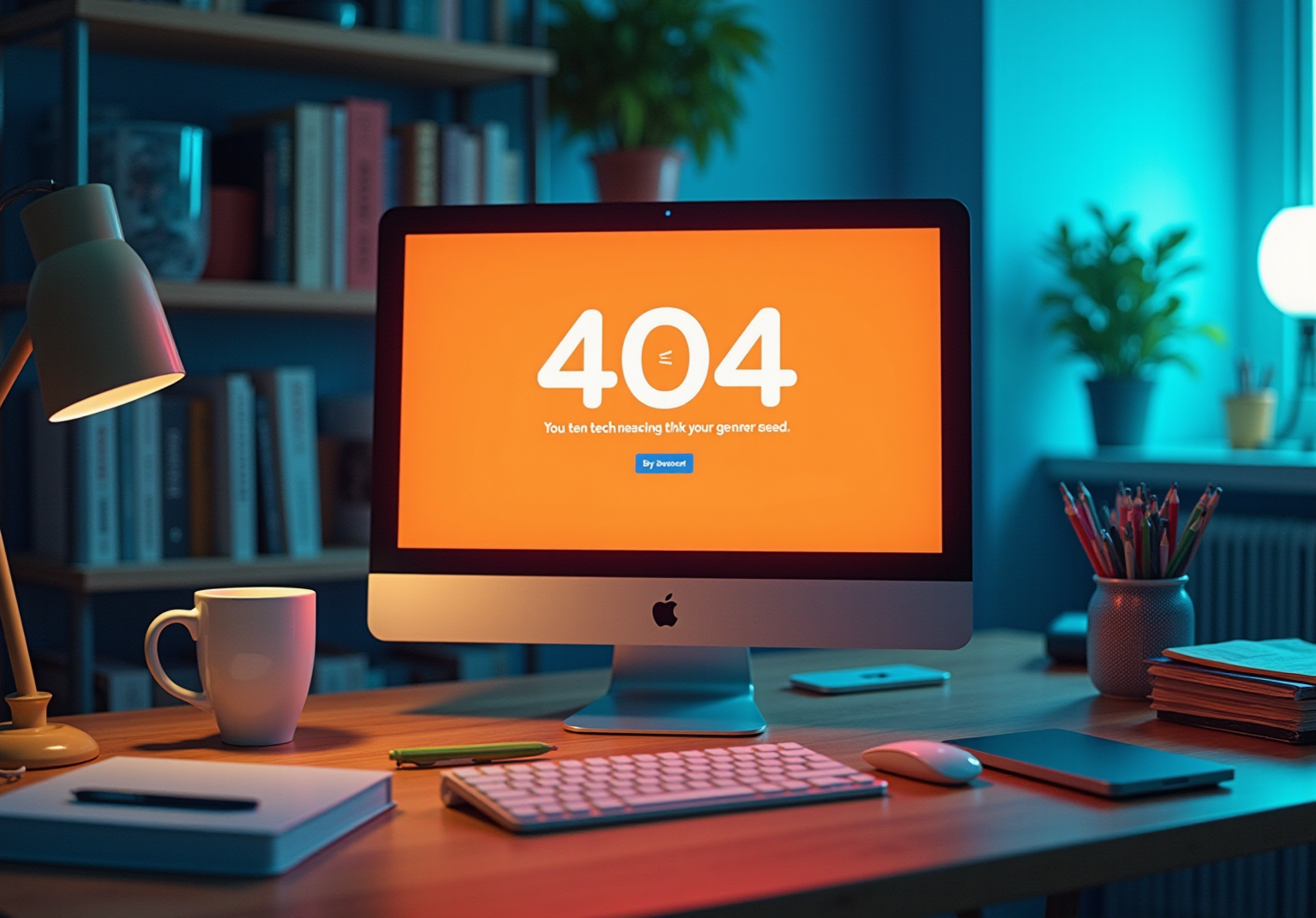
Define the Purpose of a 404 Page
A 404 page design, commonly referred to as a 'Not Found' screen, serves as more than just an error notification; it is an essential communication tool that significantly influences user experience. Its primary function is to inform visitors that the requested content is unavailable. However, a thoughtfully crafted 404 page design can transform a potentially frustrating encounter into an opportunity for engagement, which is directly tied to reducing bounce rates.
Statistics reveal that nearly 74% of visitors leave a site without further interaction when faced with a standard 404 page design error, highlighting the significance of effective design. By integrating valuable features such as:
- Links to popular sections
- A search bar
- Suggestions for alternative content
businesses can effectively guide visitors back to functional areas of the site. Exemplary cases, such as Airbnb's visually appealing 404 page design that encourages users to explore other properties, demonstrate how innovative design can sustain interest and foster further exploration of a company's offerings.
Additionally, incorporating brand elements like logos and colors on error screens enhances consistency, while the potential for these screens to act as feedback tools allows users to report broken links, making them feel valued. Ultimately, a acts as a strategic asset, cultivating a positive experience and reinforcing brand identity, even amid errors.

Identify Essential Components for Effective 404 Pages
An effective 404 page design must incorporate several essential components to enhance user experience and maintain engagement.
- Clear Error Message: A straightforward message indicating that the page is not found sets expectations and reduces frustration. IMDB cleverly employs to express the mistake while maintaining a light tone, which not only educates individuals but also amuses them.
- Navigation Options: Offering links to the homepage, popular products, or categories enables individuals to easily find their way back to pertinent content. This approach is crucial for retaining visitors who might otherwise leave the site. Research indicates that a well-structured 404 error can lower bounce rates by as much as 30%.
- Search Bar: Incorporating a search function allows individuals to seek specific items or information directly from the 404 page, facilitating a smoother navigation experience. A search box can significantly enhance visitor retention by directing them back to relevant content.
- Branding Components: Consistent application of colors, logos, and fonts strengthens identity and preserves a cohesive experience. This consistency helps individuals feel connected to the company even when facing an error. As Danica Ulbata states, "A 404 error should never seem like a dead end; remain consistent, even in mistakes."
- Engaging Visuals: Integrating attractive graphics or illustrations can render the content more inviting and less frustrating for individuals. For instance, LEGO's 404 screen employs humor and lively visuals to captivate visitors, showcasing its playful identity.
- Humor or Personality: A light-hearted tone can help diffuse frustration, making the experience more enjoyable while still directing individuals back to the site. Companies such as Mailchimp skillfully employ whimsical illustrations to craft a memorable error screen that aligns with their identity. Humor can improve visitor engagement, as demonstrated in several effective 404 screens.
By integrating these elements into their 404 page design, brands can turn a potentially negative experience into an opportunity for engagement, ultimately enhancing user satisfaction and retention. Moreover, steering clear of typical errors like employing generic messages or messy designs can further enhance the effectiveness of 404 screens.

Implement Best Practices for User-Centric 404 Page Design
To create a user-centric 404 page design, consider the following best practices:
- Keep It Simple: A clutter-free design is essential. Users should immediately recognize they have encountered a and clearly understand their next steps without confusion. Research shows that a simple method greatly improves satisfaction, as excessively complicated layouts can cause frustration. Brewster Kahle asserts, "the average lifespan of a webpage is around 100 days," which can lead to potential errors if not managed properly.
- Maintain Consistency: Align the 404 page with your overall website design and branding. This consistency fosters a sense of familiarity, allowing individuals to feel more comfortable and less inclined to leave the site. As Google states, "Concentrate on the customer, and everything else will follow."
- Provide Clear Next Steps: Clearly outline actionable options for individuals, such as returning to the homepage, searching for products, or exploring popular categories. This guidance is essential in assisting individuals in finding their way away from the error and back to valuable content. For example, Monday.com utilizes a minimalistic layout for its 404 error, efficiently guiding visitors to the homepage and promoting product trials.
- Monitor and Analyze: Utilize analytics tools to track interactions with the 404 screen. This information can uncover typical navigation problems and guide essential modifications, ensuring the site develops to satisfy the needs of visitors efficiently. Configuring personalized alerts in Google Analytics can inform you when visitors reach a 404 error, enabling prompt enhancements.
- Test and Iterate: Regularly perform testing on the 404 page to gather feedback and implement enhancements. A/B testing various designs can reveal which elements connect most effectively with your audience, ultimately improving retention and satisfaction. Additionally, be cautious with humor; while it can enhance engagement, it may not resonate with all users, leading to potential misunderstandings.

Leverage Brand Identity and Creativity in 404 Page Design
A 404 page design presents an opportunity to effectively showcase your company's personality. Here are strategic ways to leverage brand identity and creativity:
- Utilize : Infuse your content with your company's distinct tone and language. Whether it embodies playfulness, professionalism, or quirkiness, this voice must resonate with your audience, establishing a connection that reflects your brand's essence.
- Creative Visuals: Incorporate unique graphics or animations that embody your company's style. Such creativity transforms the 404 page design into an engaging experience, mitigating frustration and enhancing user interaction.
- Humorous Elements: If aligned with your brand identity, consider integrating humor to lighten the mood. This approach can foster a positive connection with your business, even amidst an error, by improving your 404 page design and reinforcing your brand's relatability.
- Interactive Features: Engage visitors through interactive elements, such as quizzes or games, that not only entertain but also redirect them to other sections of your site. This strategy keeps users involved and encourages exploration.
- Highlight Brand Values: Use the 404 page design to subtly reinforce your brand values or mission. Reminding users of the principles that drew them to your brand in the first place can strengthen their loyalty, even in the face of an error.

Conclusion
A well-crafted 404 page is not merely a placeholder for errors; it is a vital touchpoint in the user experience journey. Transforming a frustrating encounter into an engaging opportunity allows brands to significantly reduce bounce rates and maintain user interest. This essential communication tool effectively guides visitors back to relevant content while reinforcing brand identity, showcasing the importance of thoughtful design in every aspect of a website.
Key elements such as clear error messages, navigation options, and engaging visuals play a pivotal role in enhancing the effectiveness of 404 pages. Incorporating humor or personality further enriches the user experience, making the encounter less daunting and more memorable. By adhering to best practices like simplicity, consistency, and actionable next steps, brands can ensure that their 404 pages not only inform but also delight users, ultimately fostering a stronger connection with their audience.
In an increasingly competitive digital landscape, the significance of a well-designed 404 page cannot be overstated. It presents an opportunity to showcase brand values while redirecting users to valuable content, thereby enhancing overall satisfaction. Brands must view their 404 pages as strategic assets—tools to engage, inform, and retain customers even in moments of error. Embracing creativity and brand identity in this space can transform a simple error message into a powerful extension of the brand experience.
Frequently Asked Questions
What is the primary purpose of a 404 page?
The primary purpose of a 404 page, commonly referred to as a 'Not Found' screen, is to inform visitors that the requested content is unavailable.
How can a well-designed 404 page improve user experience?
A well-designed 404 page can transform a frustrating encounter into an opportunity for engagement, helping to reduce bounce rates and keep visitors on the site.
What statistics highlight the importance of an effective 404 page design?
Statistics reveal that nearly 74% of visitors leave a site without further interaction when faced with a standard 404 page design error, underscoring the significance of effective design.
What features can be integrated into a 404 page to guide visitors?
Valuable features that can be integrated into a 404 page include links to popular sections, a search bar, and suggestions for alternative content.
Can you provide an example of a successful 404 page design?
An example of a successful 404 page design is Airbnb's visually appealing page that encourages users to explore other properties, demonstrating how innovative design can sustain interest.
How do brand elements contribute to a 404 page?
Incorporating brand elements like logos and colors on error screens enhances consistency and reinforces brand identity, even amid errors.
What additional function can a 404 page serve beyond notifying users of an error?
A 404 page can also act as a feedback tool, allowing users to report broken links and making them feel valued.
Why is a well-designed 404 page considered a strategic asset?
A well-designed 404 page is considered a strategic asset because it cultivates a positive experience for users and reinforces brand identity, helping to maintain engagement even during errors.