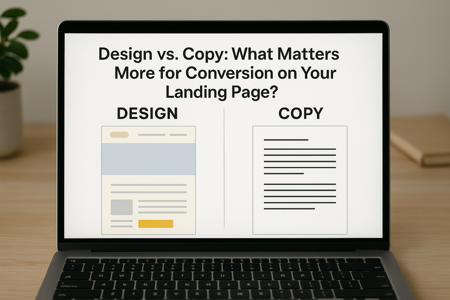
The Conversion Tug-of-War
When a visitor lands on a web page for the first time, there are only a few seconds to make an impact. Those moments often determine whether the person will take action, leave immediately, or hover in hesitation. In the world of e-commerce and digital marketing, landing pages play a central role in turning casual browsers into paying customers. Yet, behind every high-performing landing page lies an ongoing debate that marketers, designers, and copywriters have wrestled with for years: what matters more for conversion, design or copy?
At first glance, it may seem like design is the clear winner. After all, humans are visual creatures. Eye-catching layouts, smooth animations, and well-chosen color palettes can generate trust and admiration instantly. An attractive interface can signal professionalism, credibility, and attention to detail. It can also guide users intuitively toward desired actions, such as signing up, purchasing, or clicking through. Some of the best-known e-commerce brands invest heavily in visual presentation because they know it affects user behavior.
But great design alone is not enough. If the messaging is unclear, confusing, or irrelevant, even the most beautifully crafted layout will fall short. This is where copy enters the equation. The words on your landing page are what inform, persuade, reassure, and motivate. Copy tells visitors what problem your product solves, why it is worth their time, and how they can benefit. It handles objections, addresses concerns, and calls people to action. Without clear, concise, and persuasive language, conversions tend to stall regardless of visual appeal.
The tension between these two elements is not just theoretical. It shows up in real-world projects every day. A team redesigns a landing page with cleaner visuals but sees no improvement in sales. Another brand rewrites its offer and headline but keeps the same layout and suddenly sees a spike in leads. These scenarios are not uncommon, and they point to a deeper truth: design and copy are not competing forces, but rather interdependent parts of the same system. However, when resources are limited or decisions need to be prioritized, marketers often ask which should be addressed first.
Understanding the answer to that question requires more than personal opinion. It demands evidence from actual user behavior, insights from testing, and a firm grasp of how people make decisions online. This article will take a closer look at the roles design and copy play in landing page performance, drawing from both psychological research and practical case studies. We will examine when each element takes the lead, how they interact, and why the most successful pages rely on their alignment, not just their strength in isolation.
If your team has ever debated whether to start with a wireframe or a messaging brief, this breakdown will bring clarity. By the end of the article, you will not only have a better understanding of what drives conversions, but you will also be equipped to make smarter decisions the next time you build or optimize a landing page.
The Role of First Impressions
The moment a user arrives on your landing page, a critical cognitive process begins. In a matter of milliseconds, the brain starts to assess whether the page feels trustworthy, relevant, and worthy of attention. This immediate evaluation shapes the visitor's next decision, whether that be to stay and explore or to bounce and never return. Numerous studies have shown that first impressions online are formed rapidly, often in less than 100 milliseconds, and these impressions are heavily influenced by visual cues.
One of the most frequently cited studies in this area comes from Google’s research on visual complexity and prototypicality. The findings revealed that users judge a website's appeal in as little as 50 milliseconds. Pages that appeared too complex or deviated from familiar design patterns were consistently rated as less attractive. This suggests that visual design, including layout, structure, and color harmony, is a major factor in those crucial first moments.
Design, in this context, serves two primary functions. First, it delivers immediate aesthetic appeal. Clean, modern layouts, pleasing color combinations, and thoughtful use of whitespace can create a sense of calm and professionalism. Second, it supports usability. A well-designed landing page intuitively guides the eye from headline to subhead, from product image to call-to-action. Visual hierarchy, font size, button placement, and alignment all work together to create flow and reduce cognitive friction.
However, the power of design is not just about looking good. It also affects trust. Studies from the Stanford Web Credibility Project have shown that nearly half of users assess a site's credibility based on its visual design alone. Sites that appear outdated, cluttered, or overly busy tend to lose credibility instantly. In e-commerce, this perception can be the difference between a purchase and an abandoned session.
Despite the weight that design carries in first impressions, it is important to recognize its limits. Design can grab attention, but it cannot explain, persuade, or justify a purchase. That is the job of copy. Yet if the design is off-putting or confusing, users may never even read the copy. This creates a delicate balancing act. You need visual appeal to earn the right to be read, but you also need substance behind the visuals to drive action.
The initial impression a user forms is not just about beauty, but also about clarity and confidence. If a landing page communicates its purpose clearly and looks polished and organized, users are more likely to trust the brand and explore further. On the other hand, if the page feels disjointed, crowded, or visually inconsistent, users may feel lost or even suspicious of the offer.
In the context of conversions, the lesson is clear. While copy may do the heavy lifting later in the experience, design often determines whether that opportunity even exists. You can think of visual design as the handshake that gets your visitor to stay long enough to hear what you have to say. Without that invitation, even the most persuasive copy will remain unread.
When Design Drives the Click
In digital marketing, conversions do not happen in a vacuum. Every interaction a user has with your landing page is shaped by their environment, device, expectations, and the cues your page provides. While messaging may persuade users to commit, it is often design that gets them to act in the first place. There are moments when design is not just supporting the message but actively driving behavior.
Think about how people interact with mobile websites, especially in fast-paced environments like public transportation or during a quick break at work. On smaller screens, space is limited and attention spans are even shorter. In these scenarios, the structure of your page, the speed at which it loads, and how clearly buttons and forms appear can all influence conversion. Users are unlikely to engage with a landing page that is slow, cluttered, or visually frustrating.
One of the most immediate ways design influences action is through visual hierarchy. This refers to the arrangement of elements in a way that naturally guides the user’s eye from most important to least important content. When done well, this technique can direct visitors toward your call-to-action almost instinctively. For example, using size, contrast, and spacing to highlight the primary offer or lead form can increase click-through rates without changing a single word.
Color choice is another design decision that can significantly impact conversions. Bright, contrasting colors are often used to highlight buttons and calls-to-action, while muted background tones help create a sense of clarity. But color is not just about standing out. It also communicates emotion and brand personality. Blue is often associated with trust and calm, while red can create urgency and draw the eye. The key is using color intentionally, not just to decorate but to communicate and guide.
Whitespace, often underestimated, also plays a role in conversions. Proper use of spacing between elements can make a page feel less overwhelming and more digestible. When a landing page feels clean and uncluttered, users are more likely to focus on what matters. Cluttered interfaces, on the other hand, create cognitive overload and push users away before they even get to the core offer.
Even micro-interactions such as hover effects, button animations, and scroll cues can reinforce user confidence. These small design details signal responsiveness and professionalism. They assure users that the page is functioning correctly, that their clicks are registering, and that the company behind the interface cares about the user experience.
Real-world data backs this up. A study from ConversionXL found that something as simple as changing the placement and styling of a call-to-action button increased conversions by more than 30 percent on one landing page. In another case, reducing the number of form fields and using a simpler, visually streamlined layout led to a double-digit lift in completed submissions.
Design does not always need to be dramatic to be effective. Sometimes it is the small adjustments, such as increasing contrast on a CTA or ensuring visual consistency across devices, that produce the biggest results. When aligned with the user's expectations and goals, good design helps reduce friction, promote action, and pave the way for the copy to do its job.
In situations where users are scanning quickly or where brand trust is not yet established, design often leads the way. It catches the eye, sets the tone, and creates the conditions in which copy can perform at its best.
When Copy Closes the Deal
While design may catch the visitor’s attention, copy is often what convinces them to act. No matter how elegant the layout or how visually pleasing the colors, it is the words that carry meaning. Copy communicates value, addresses concerns, and ultimately moves users to convert. It is where emotional appeal meets logical reasoning. In many cases, conversions hinge not on how the page looks, but on what it says and how clearly that message is delivered.
Effective copywriting on a landing page is rarely accidental. It stems from a deep understanding of the audience’s pain points, desires, and decision-making process. A headline that speaks directly to a user's need can stop them from scrolling past. A well-crafted subheadline can frame the offer in a way that makes it irresistible. Bullet points that highlight specific benefits, not just features, can help people imagine the product or service improving their lives.
This persuasive function is especially important for offers that require more than a casual commitment. High-ticket purchases, subscription services, or products in a competitive market demand more than visual appeal. They require trust, clarity, and a compelling reason to act. Copy fills this gap. It explains the product, sets expectations, and creates urgency or excitement. Without it, users are left to interpret the page themselves, often leading to hesitation or confusion.
Frameworks like AIDA (Attention, Interest, Desire, Action) and PAS (Problem, Agitate, Solution) help structure landing page copy in a way that aligns with how people make decisions. AIDA begins with grabbing attention, then builds interest and desire, and finally encourages action. PAS identifies a problem, amplifies its impact, and then presents the offer as a solution. Both of these approaches have proven effective across industries because they speak to basic human psychology.
Another strength of copy is its ability to remove friction. Landing pages often lose conversions because of unanswered objections. A customer may wonder about shipping times, return policies, product compatibility, or price justification. Strategic microcopy, such as tooltips, FAQs, or brief statements near form fields, can address these concerns before they derail the user journey. Testimonials, guarantees, and trust badges are all forms of supporting copy that reinforce credibility and help people feel comfortable completing the action.
Copy also plays a critical role in tone. A page written in a cold, technical voice might alienate a casual shopper, while overly casual language could cause doubt in a B2B setting. The tone must match the audience and the product. It must also remain consistent across the page. A mismatch between the headline, body text, and CTA can create subtle confusion, reducing the overall persuasive effect.
Importantly, good copy is not just about persuasion. It is about clarity. If users are not sure what your offer is or how to claim it, they will hesitate. Vague messaging is a common cause of poor conversion rates. On the other hand, clear, benefit-driven copy gives users the confidence to move forward.
In short, while design may attract attention and shape perception, copy is what turns interest into action. It carries the message that matters most and gives users the information they need to justify clicking, signing up, or buying. Without persuasive, relevant, and strategic copy, even the most visually stunning landing page will fail to perform at its full potential.

Design as the Delivery Vehicle
Design plays many roles on a landing page, but one of its most important is acting as the delivery vehicle for the message. Even the most persuasive copy can be rendered ineffective if the design surrounding it fails to support its visibility, readability, or emphasis. When a user arrives on a page, their ability to consume and process the information depends not only on what is said, but also on how it is presented.
One of the most common issues marketers face is good copy getting buried in a poor layout. A value proposition may be well-written, but if it is placed too far down the page, if the font is difficult to read, or if competing visual elements pull attention elsewhere, the message will never land. Effective design ensures that the hierarchy of information is clear and that the user naturally follows the path intended by the copywriter. Without this alignment, friction increases and the conversion opportunity decreases.
Typography is a good place to start when evaluating the delivery of copy. Font size, line spacing, and contrast all influence readability. A lightweight font on a light background may look modern, but it forces the user to strain, leading to frustration. Oversized headings that push important content below the fold can also cause confusion. The job of design in this case is to make the copy easy to engage with. When users can absorb content quickly and comfortably, they are more likely to stay on the page and act.
Layout decisions are equally critical. If a page is packed edge to edge with text, users will likely skim or ignore large chunks of content. However, if that same content is broken into scannable sections, supported by visual cues like icons, borders, or color blocks, it becomes much more digestible. This structure respects the user's attention span and allows the message to shine.
Design also affects emotional tone. A friendly, minimal layout might support a conversational and upbeat copy style. A darker, more structured page might be used to reinforce authority or formality. When the tone of the design matches the tone of the copy, the entire landing page feels more cohesive. This alignment can subtly influence trust and engagement by making the user feel understood.
Calls-to-action provide another example of design as delivery. A compelling CTA in words is not enough if it is placed in a hard-to-find location, or if the button blends in with the background. Effective CTA design includes ample spacing, contrasting color, clear labeling, and strategic positioning. Users should be able to spot the CTA at a glance, and the surrounding layout should reinforce its importance.
There is also the matter of consistency. If the design changes style from one section to another, it creates cognitive dissonance. This inconsistency makes the copy harder to follow because users feel like they are jumping between unrelated parts of the page. A unified design system, from fonts to colors to spacing, allows the user to stay focused on the content without mental interruptions.
In essence, design acts as the translator and amplifier of copy. It ensures that the words are not just present but also prominent and easy to absorb. A landing page with strong messaging will underperform if its design fails to support that message visually. On the other hand, a clean, intentional design can elevate even simple copy, making it feel more impactful and persuasive simply by how it is delivered.
Copy as the Conversion Engine
While design plays a vital role in attracting attention and presenting information, copy serves as the engine that powers conversion. It is not just about making the page look appealing. It is about what you say, how you say it, and whether your words connect with the reader’s goals, fears, and motivations. Good copy does not simply inform. It persuades, reassures, and inspires action.
Effective copy on a landing page starts with a deep understanding of the target audience. What are they struggling with? What goals are they trying to achieve? What have they tried before that did not work? When copy speaks directly to these concerns in plain, specific language, it becomes powerful. A vague value proposition like “Our platform makes things easier” means very little. On the other hand, a line like “Cut your email response time in half with our shared inbox tool” is clear, benefit-driven, and outcome-focused. That is the type of messaging that drives action.
Headlines are especially important because they are often the first words a user sees. A headline must capture attention and give users a reason to keep reading. Subheadlines then expand on that promise or clarify the offer. If the message resonates, users will continue scanning the rest of the page. At this point, body copy takes over, reinforcing benefits, explaining features, and addressing any questions or doubts a visitor might have.
A key strength of copy is its ability to build trust. Landing pages that rely only on design may come across as superficial or insubstantial. Strong copy, especially when it includes social proof such as testimonials, customer logos, or case studies, reinforces credibility. Testimonials that include specific results and real names feel authentic and relatable. A brief paragraph explaining why your company exists or what makes your approach different can also build emotional connection.
Copy also clarifies the offer. What exactly is the user getting? How much does it cost? What happens after they click the button? Clear answers to these questions remove uncertainty, which is one of the biggest enemies of conversion. If users feel unsure or confused, they leave. Strong copy ensures that every claim is explained, every benefit is reinforced, and every question is anticipated.
The call-to-action itself is another important opportunity for copy to perform. Generic buttons that say “Submit” or “Click Here” waste space and miss a chance to reinforce value. Strong CTAs use action-oriented language that reminds users why they should act. For example, “Get My Free Quote” or “Start Saving Now” feels more specific and compelling. These small changes in wording can have a measurable impact on conversion rates.
In cases where the product or offer is complex, long-form copy may be necessary. This is especially true for B2B services, financial tools, or unfamiliar software. In these situations, design should make the reading experience comfortable, but the copy needs to do the heavy lifting. It should walk the user through the problem, the solution, the proof, and the path to action.
Ultimately, good copy answers the user’s silent questions. Why should I care? What do I get out of this? Is this for someone like me? Can I trust this company? What happens next? When a landing page answers all of these questions with clarity and conviction, users are far more likely to convert. Design may bring them in, but copy moves them forward.
When the Wrong One Leads
There are many cases where landing pages fail to convert not because of a lack of effort, but because the wrong element takes priority. This imbalance often happens when teams overvalue either design or copy, assuming one can compensate for weaknesses in the other. While both are essential, overemphasizing one at the expense of the other can result in missed opportunities, low engagement, and poor performance.
Consider a scenario where design leads the process entirely. A brand invests heavily in sleek graphics, subtle animations, and on-trend aesthetics. The layout feels modern, and the typography looks premium. Everything seems polished from a visual standpoint. However, when visitors begin to interact with the page, the message feels unclear. The headline uses vague or abstract language, and the subtext fails to communicate a tangible benefit. Even though the page looks impressive, users leave confused or unconvinced. In this case, design has led the way but has not been supported by strategic messaging. The copy has not earned the visitor’s trust or attention.
Now consider the reverse. A team may spend hours perfecting their message, writing detailed product descriptions, highlighting every benefit, and structuring the page content using proven copywriting frameworks. The words themselves may be strong, but the page design looks dated. Font sizes are inconsistent, colors feel mismatched, and the call-to-action button blends into the background. There is no visual flow to guide the reader. In this situation, the copy might have potential, but the poor design discourages visitors from engaging with it. The message is present, but it is hard to access.
Both of these examples reflect a common issue in landing page development: treating design and copy as isolated functions rather than integrated components. The most successful landing pages are the result of collaboration between copywriters and designers, where layout decisions support message flow and content choices inform design direction.
There are also subtler cases of imbalance. For instance, a copy-heavy page might focus too much on explaining features without showing them visually. This can lead to fatigue or skepticism. Conversely, a highly visual page might use large imagery and minimal text, which can leave users with unanswered questions or concerns. Neither extreme works well. Each element must pull its weight and support the overall goal of conversion.
Analytics can help identify when the wrong element is leading. High bounce rates paired with low scroll depth may point to a visually confusing or uninviting layout. On the other hand, scroll depth without clicks may suggest the copy is not persuasive enough. Tools like heatmaps, click maps, and session recordings can provide visual evidence of where users lose interest and why.
In practice, landing pages must strike a balance between visual appeal and message clarity. When one element dominates the process without input from the other, the user experience suffers. Visitors need both emotional engagement and logical understanding. They want to feel drawn in by the look and feel, but also need the substance and detail to justify taking action.
When design and copy are misaligned, users sense it. They may not be able to articulate what feels off, but they will hesitate. And in conversion, hesitation is often the silent killer. Preventing that outcome means ensuring that neither design nor copy is trying to carry the page alone.
Optimizing the Relationship Between Design and Copy
If design and copy were two employees on your team, the goal would not be to figure out which one is more valuable, but rather how they can collaborate to produce better outcomes. The same principle applies to landing page optimization. Strong performance comes from alignment, not competition. When design and copy support one another, the experience becomes more seamless, and conversions rise. This section explores how to build that synergy in practical, testable ways.
Start by understanding the natural flow of information on a landing page. Users typically scan in predictable patterns, such as the F-pattern or Z-pattern, especially on desktop. On mobile, the flow is usually vertical, making hierarchy even more important. Your design should guide the user through a logical path. The headline needs to be immediately visible and clear. The supporting text should follow closely, with visuals reinforcing or illustrating what the copy is saying. When this flow is disrupted, users become disoriented and less likely to act.
One method to build alignment is to begin your landing page process with a wireframe that includes both placeholder content and design intent. Designers and copywriters should sit down together to map out what each section will say and how it will look. This collaborative approach ensures that messaging is not forced into a rigid layout after the fact, and that design decisions are not made without understanding the emotional and logical goals of the copy.
Frameworks like the LIFT Model can help identify where design and copy need improvement. The LIFT Model focuses on six factors that affect conversion: value proposition, clarity, relevance, distraction, urgency, and anxiety. Each of these elements touches both design and copy. For example, clarity might suffer if the text is too dense or if the font choice makes it hard to read. Anxiety could increase if trust signals are poorly placed or missing altogether. A test-driven process that uses this framework helps identify specific areas where better alignment is needed.
A/B testing also plays a critical role in optimization. Rather than testing only one element at a time, consider multivariate testing that evaluates how copy and design interact. For instance, test a version of your CTA with different button colors and different copy at the same time. You may find that the winning combination is not just about wording or visuals, but how the two work together.
Heatmaps and scroll maps from tools like Hotjar or Crazy Egg can also show where users are stopping, skipping, or lingering. If users consistently skip over a section, it could mean that the design is not drawing enough attention to it, or that the copy fails to promise value. These tools do not tell you exactly what the problem is, but they point you to where the user experience is breaking down.
Consistency is another key area. Copy and design must reflect the same tone. If your copy is friendly and conversational, but the design is cold and corporate, the disconnect can confuse users. Every visual element, from imagery to button shape, should match the personality expressed in the words. When design and copy speak the same language, trust increases, and users feel more comfortable taking action.
Ultimately, optimization is not about choosing one side over the other. It is about making sure that both design and copy are doing their jobs, and that their efforts are coordinated. The landing page is a shared canvas. When designers and copywriters work from the same strategy, test with purpose, and adjust based on real behavior, the results are far stronger than either could achieve alone.

Testing What Truly Matters
In conversion rate optimization, assumptions are dangerous. While experience and intuition have their place, the only reliable way to know whether design or copy is having the greatest impact is through testing. Testing removes guesswork. It replaces opinion with evidence and allows marketers to make changes that are based on real user behavior rather than personal preference. If you want to understand what truly matters on your landing page, structured experimentation is the path forward.
A/B testing is the most widely used method for comparing variations in design and copy. Also known as split testing, it involves showing different versions of a page to separate user groups and measuring which version performs better against a chosen goal, such as clicks, signups, or purchases. While this process sounds simple in theory, the success of A/B testing depends on clear planning and isolation of variables.
To isolate the impact of design, you might test different layouts, button colors, font sizes, or image placements while keeping the copy the same. If one variation leads to a significant lift in conversions, you can reasonably conclude that the design changes contributed to the result. Likewise, to test copy, keep the design stable and experiment with different headlines, benefit statements, calls to action, or value propositions. If copy adjustments drive improvement, you know where to focus your efforts.
One common mistake is testing too many things at once. When you change the design and the copy in the same test, it becomes nearly impossible to tell which element caused the difference in performance. Multivariate testing can help when there are multiple combinations to compare, but it requires a larger volume of traffic and more advanced tools to draw reliable conclusions. For smaller businesses or new landing pages, A/B testing one element at a time remains the most practical and accurate approach.
Metrics are also essential in interpreting the results of your tests. Conversion rate is often the primary metric, but it should not be the only one. Supporting metrics such as bounce rate, average time on page, scroll depth, and click-through rate can provide more context. For instance, if users are spending time on the page but not converting, the issue may lie in the copy’s clarity or persuasiveness. If users are bouncing quickly, poor visual hierarchy or slow load time may be the root cause.
Another valuable tool in the testing process is user feedback. While data shows what users do, it does not always explain why they do it. Surveys, polls, and direct interviews can help uncover objections, misunderstandings, or frustrations that may not be visible in analytics. Pairing qualitative insights with quantitative data gives a fuller picture of what needs to be improved.
Finally, timing and traffic matter. A test run for only a few days or with insufficient visitors can produce misleading results. Always aim for statistical significance before drawing conclusions, and avoid declaring a winner too early. Premature decisions often lead to false confidence and missed opportunities.
The most effective landing pages are not built from a single winning idea, but from many iterations based on real testing. Over time, these small, evidence-based changes compound into meaningful improvements. Whether you begin by testing design or copy, the goal is the same: reduce friction, increase clarity, and encourage action. When you test with intention and analyze with care, the data will tell you what matters most.
CRO Experts Weigh In
When evaluating what matters more for landing page conversions, experienced professionals in conversion rate optimization offer valuable insights. While their perspectives may vary slightly, most seasoned CRO experts agree that pitting design against copy as if one must dominate the other misses the point. The best-performing landing pages succeed because of the way these two elements work together, not because one outshines the other.
Peep Laja, founder of CXL and one of the most respected voices in CRO, frequently emphasizes the role of clarity in conversion. According to Laja, clarity is achieved through both smart messaging and thoughtful design. If your landing page does not clearly communicate the value proposition, users will not convert. And if your design gets in the way of that communication, it is just as harmful as weak copy. He notes that "clarity trumps persuasion," which means that even highly persuasive language fails if users cannot grasp what you are offering within seconds.
Talia Wolf, founder of GetUplift, takes a customer-first approach to landing page optimization. She stresses the importance of emotional targeting, which is typically executed through copy. In her framework, copy drives the emotional connection that motivates people to act, while design supports the delivery of that message. For Wolf, great design is not about aesthetics. It is about removing barriers and highlighting what matters most to the visitor. When asked whether design or copy should come first, she often responds that it is not a linear process. The message should guide the layout, but the layout should also influence how the message is delivered.
Oli Gardner, co-founder of Unbounce, has analyzed thousands of landing pages. His stance is that design often makes the first impression, but copy creates the lasting impact. Gardner talks about the "attention ratio" and how reducing distractions on a page helps focus the user’s attention on one specific goal. That goal is usually supported by copy that speaks to a specific need or desire. He warns against using generic copy in beautifully designed templates, noting that design cannot compensate for a lack of substance.
These experts agree on one core idea: successful conversion optimization comes from collaboration. A landing page is not a blank canvas where either the designer or the copywriter takes control. Instead, it is a shared platform where visuals and language must align with the user's intent, expectations, and emotional state.
Real-world examples support these principles. In one case study published by CXL, a page redesign that prioritized clear messaging and simple visuals outperformed a visually impressive layout that lacked clarity. In another from GetUplift, rewriting a headline to reflect the emotional outcome of using the product resulted in a 41 percent increase in signups, even though the page design remained unchanged.
This evidence reinforces that design and copy are most effective when working in tandem. Experienced CRO professionals do not treat them as separate domains. They test them together, refine them together, and always prioritize the user’s experience above internal preferences or trends.
In short, when it comes to converting users on a landing page, you do not need to choose between form and function. You need to create both. Let the message lead the direction, let the design elevate the experience, and test everything to validate what resonates most.
Conclusion: The Real Answer is Not Either/Or
The debate between design and copy has existed for years, and it will likely continue as long as landing pages remain a central part of digital marketing. However, when you examine the evidence, test results, expert opinions, and user behavior, one conclusion becomes clear. It is not about choosing between design or copy. It is about how the two work together to support the visitor’s decision-making process. The strongest landing pages are not the ones that look the best or read the best in isolation. They are the ones that create clarity, build trust, and guide users smoothly toward action.
Design, when done right, earns attention and fosters credibility. It makes the user feel comfortable, gives the page structure, and helps prioritize what matters most. It creates space for the copy to breathe, draws the eye to the call-to-action, and ensures that every element on the page contributes to a single goal. But it cannot work alone. Without clear and compelling messaging, users may not understand what is being offered or why it matters.
Copy, on the other hand, drives persuasion. It answers questions, builds emotional resonance, and delivers the value proposition in a way that feels personal and specific. It anticipates objections and removes doubt. But even the best-written copy will fall flat if it is hidden behind poor layout decisions, hard-to-read fonts, or distracting visual clutter.
When the two are aligned, they form a cohesive narrative that supports the user from the moment they land on the page to the moment they click. This alignment is not automatic. It takes deliberate planning, testing, and collaboration between teams. It also requires a mindset shift. Instead of asking which is more important, ask how each can make the other stronger. A designer should consider how layout supports message flow. A copywriter should be aware of how users visually engage with the page and how design elements might emphasize or dilute key points.
If you are building or optimizing a landing page, take a holistic view. Begin with a strong understanding of your audience. What do they need to know? What problems are they trying to solve? Use those insights to shape the copy, then design around that message to ensure clarity and ease of use. Revisit your assumptions often and rely on data to guide decisions. Heatmaps, user testing, and conversion tracking will show you where users are hesitating and where your messaging or design might be falling short.
Ultimately, the best performing landing pages are not the product of one great element, but of many small decisions that add up to a coherent experience. These pages do not force users to figure things out. They communicate clearly, guide effortlessly, and give users a reason to say yes. That result is only possible when copy and design are treated not as rivals, but as partners working toward the same goal.
Research Citations
- Google Inc. (2012). The role of visual complexity and prototypicality regarding first impression of websites.
- Laja, P. (2016). How clarity impacts conversions. CXL Institute.
- Nielsen Norman Group. (2006). First impressions count: Visual appeal and website credibility.
- Stanford Persuasive Technology Lab. (2002). Stanford Guidelines for Web Credibility.
- Wolf, T. (2019). Emotional targeting: The missing piece in your optimization strategy. GetUplift.
- Gardner, O. (2017). The Attention Ratio principle for landing pages. Unbounce.
- CXL Institute. (2020). Case studies in landing page optimization.
- Hotjar Ltd. (2021). Understanding scroll maps and behavior analytics.
- Crazy Egg. (2022). How to use heatmaps to improve landing pages.
- Unbounce. (2020). Landing Page Analyzer: Best practices and performance insights.
FAQs
Neither is universally more important. Both play distinct roles in influencing user behavior. Design draws users in, establishes trust, and makes content easy to consume. Copy delivers the message, persuades, and motivates action. The most effective landing pages align both elements to serve the user’s goals.
Only to a limited extent. Design can attract attention and make a good first impression, but it cannot explain value, address objections, or close a sale. If your messaging lacks clarity or relevance, even the best design will struggle to convert.
Strong copy may carry more weight in certain contexts, especially when the offer is compelling and the audience is already interested. However, if the design hinders readability or creates confusion, even excellent copy may go unread or ignored. The user experience must be smooth for the message to be effective.
Start with understanding your audience and defining your value proposition. From there, create a rough structure for your messaging. Design should follow the flow of that message, supporting it visually. The process should be collaborative, not sequential.
Use A/B testing to isolate variables. For design tests, keep the copy the same and change layout, colors, or visual hierarchy. For copy tests, keep the design stable while adjusting headlines, body text, or calls to action. Measure performance based on defined goals such as conversions or click-through rate.
Yes. Tools like Hotjar and Crazy Egg can show heatmaps, scroll depth, and user clicks. Google Analytics provides behavioral data such as bounce rate and time on page. Combined, these tools reveal where users engage or drop off, helping you identify weaknesses in either copy or design.
It depends on the complexity of the offer and the stage of the user in the buying journey. For simple offers or retargeted traffic, short and punchy messaging may work. For high-ticket or unfamiliar products, long-form copy that builds trust and explains benefits in detail often performs better.
Should my call-to-action be driven by design or copy?
Both. Visually, it should stand out with a contrasting button and enough whitespace around it. Verbally, it should use action-oriented language that reminds users what they gain by clicking. “Get My Free Trial” is clearer and more engaging than “Submit.”
Look for high scroll depth but low conversion. This often means users are reading but not persuaded to act. Vague headlines, generic benefits, or unclear offers are typical culprits. User testing and feedback can also highlight confusion or lack of interest in your messaging.
High bounce rates, low time on page, or abandoned forms can indicate design issues. If users never scroll or leave within seconds, they may be experiencing visual overload, poor layout, or untrustworthy aesthetics. Clean, intuitive design helps users stay long enough to engage with the copy.