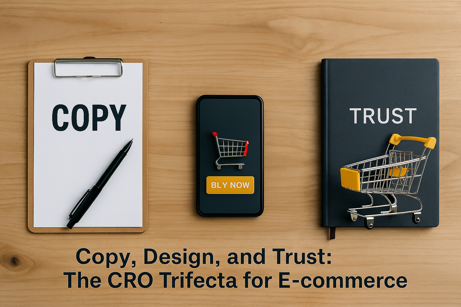
Why This Trifecta Is So Relevant
Every e-commerce business wants more conversions. Whether the goal is to boost sales, increase average order value, or reduce cart abandonment, conversion rate optimization (CRO) sits at the center of growth strategy. Yet, despite the abundance of tools, frameworks, and best practices available, many e-commerce sites still underperform. In most cases, the issue is not traffic. It is not even functionality. The real problem is misalignment between the three most influential elements on any page: copy, design, and trust.
These three components form the foundation of a high-converting online experience. They are not tactics to sprinkle in after a site is built. They are not optional enhancements for brands that already “look good.” They are fundamental levers that, when misaligned, silently suppress revenue potential. When treated as a cohesive system rather than standalone parts, copy, design, and trust combine to eliminate hesitation, clarify value, and guide visitors toward action.
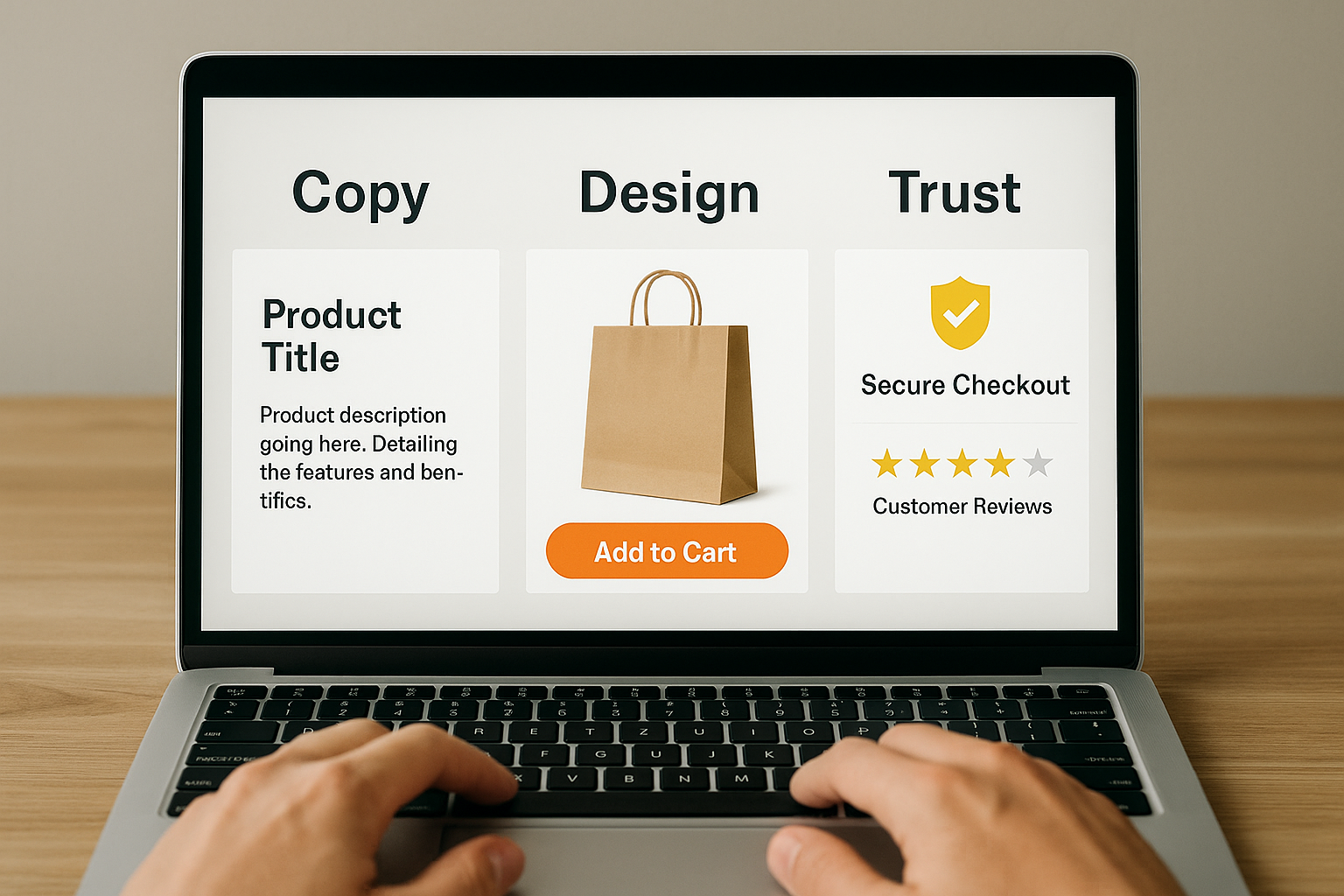
Let’s break this down. Copy refers to the language used throughout your website. This includes product titles, descriptions, headlines, call-to-action buttons, microcopy in forms, and even confirmation messages. Good copy doesn’t just describe. It motivates, reassures, and reduces friction. Without the right message, even the cleanest design can fall flat.
Design, on the other hand, is how that message is presented. Visual hierarchy, contrast, spacing, font selection, and layout all influence how the user navigates the site and interprets what they see. Effective design ensures that the copy can actually be read, understood, and prioritized. A beautiful design that hides the value proposition or distracts from the call to action becomes a liability rather than an asset.
Then comes trust. No matter how well-written or well-designed a page may be, if the visitor does not trust the brand, the product, or the buying process, conversions will stall. Trust is built through consistent branding, transparent policies, real social proof, and subtle behavioral cues. It is often the missing piece when everything “looks right” but conversion metrics refuse to budge.
Why focus on these three in combination? Because they do not operate independently. Copy needs design to be digestible. Design needs copy to communicate purpose. Both need trust signals to feel credible. When one of the three is weak, the others are forced to overcompensate, often unsuccessfully. For example, adding a security badge won’t matter if the checkout copy feels robotic or unclear. Likewise, a sleek design cannot overcome the absence of compelling product descriptions or customer testimonials.
This article will explore how each part of the trifecta contributes to user behavior, what happens when they’re out of sync, and how e-commerce brands can systematically improve each one to drive measurable results. We’ll also look at real-world examples, common mistakes, and actionable methods for testing and improving performance. By the end, you will have a clearer picture of how to make every page on your site work harder using these three critical levers, not in isolation but in harmony.
The Real Role of Copy in Conversions
Many e-commerce teams underestimate the power of copy. They invest heavily in product photography, branding, and performance marketing, yet often treat written content as an afterthought. In reality, copy is one of the most direct levers for increasing conversions because it shapes how users perceive, understand, and emotionally engage with what you are offering. Strong copy answers questions before they are asked. It removes objections before they arise. It provides the clarity users need to feel confident about taking the next step.
Copy is more than product descriptions and headlines. It includes every piece of language across the user journey: category labels, navigation items, form field instructions, button text, return policy language, and post-purchase messaging. Each of these elements contributes to the decision-making process. When written with intention, copy creates momentum. When neglected, it creates doubt.
Let’s start with macrocopy. This refers to the larger, visible messages that set the tone and frame the offer. Product titles, page headlines, subheaders, and key value propositions fall into this category. Macrocopy is where the user forms their initial impression of whether something is worth considering. The most effective macrocopy is specific, benefit-driven, and easy to scan. For example, a headline like “Made to Last: Premium Kitchenware Backed by a Lifetime Guarantee” communicates far more than a vague phrase like “Top Quality Products for You.” It provides a benefit, a feature, and a trust signal in just a few words.
Then there is microcopy. These are the smaller bits of text that live within forms, tooltips, and interfaces. Microcopy is often overlooked, but it can make or break an interaction. For instance, the phrase on a button that says “Create Account” versus one that says “Start Cooking Today” may seem like a small detail, but one connects with an outcome and a desire, while the other feels procedural. Similarly, a checkout field labeled “ZIP Code” with no guidance may lead to confusion in international markets, whereas adding “Enter your 5-digit ZIP Code (U.S. only)” can reduce input errors and abandonment.
The best copywriters in CRO do not just write to fill space. They write to shape decisions. This involves understanding user intent at every stage of the funnel and choosing language that supports progress. It also involves being conscious of friction points. Unclear copy creates cognitive load. When users have to pause and interpret what something means, they are more likely to leave. On the other hand, copy that flows naturally with the user’s expectations and speaks in a relatable voice helps reduce hesitation.
Another common mistake is relying on decorative or generic language. Terms like “premium,” “best,” or “trusted” often sound impressive, but they lack proof. High-performing copy focuses on specifics. Instead of “high quality materials,” say “crafted with surgical-grade stainless steel.” Instead of “great customer service,” include “support response time under two hours, seven days a week.”
Finally, effective CRO copy should always be tested. What works on one page may fall flat on another. A headline that increases engagement in one industry might underperform elsewhere. A/B testing copy elements, from button text to product descriptions, provides concrete data on what language moves the needle.
In summary, copy is not just decoration. It is strategy. When used deliberately, it guides the user, reinforces trust, and turns interest into action. Without it, no amount of beautiful design or clever marketing can fully close the gap between a visitor and a customer.
Design That Guides, Not Distracts
Design plays a crucial role in how users experience an e-commerce site, yet its influence on conversions is often misunderstood. Too many brands chase visual trends or prioritize aesthetics over function. The result is a site that may look polished, but fails to guide the user clearly toward a decision. Good design is not just about visual appeal. It is about usability, clarity, and creating an intuitive path to purchase. When done well, design reduces friction, increases confidence, and supports the copy and trust elements working alongside it.
At its core, conversion-focused design is about guiding attention. This begins with visual hierarchy. Hierarchy helps users process information in the right order by controlling what they see first, what they see next, and what stands out as important. Without strong hierarchy, key messages compete with one another. The call to action blends into the background, and users are left confused or overwhelmed. Strategic use of size, color, placement, and spacing helps ensure the most important elements on the page are immediately visible and clearly prioritized.
Whitespace, or negative space, is another essential tool. Crowded pages signal anxiety. When everything is competing for attention, nothing feels important. Generous spacing allows users to focus, think, and proceed without feeling rushed or overwhelmed. It also communicates confidence. Brands that leave breathing room in their layout appear more organized and credible, which in turn supports the trust component of the CRO trifecta.
Mobile responsiveness cannot be an afterthought. Over half of all e-commerce traffic now comes from mobile devices. If a layout collapses poorly, loads too slowly, or buries key actions below the fold, it introduces unnecessary resistance into the customer journey. Elements that work well on desktop often fail on mobile if not adjusted properly. Navigation menus, filters, product images, and add-to-cart buttons must all remain visible, functional, and thumb-friendly.
Color usage in design should be intentional, not decorative. A common mistake is to use brand colors as button backgrounds regardless of their visibility. If your brand’s primary color is light gray or pastel, that does not mean every call-to-action button should follow suit. Conversion-focused design prioritizes contrast and clarity. Calls to action must stand out visually, not just conceptually. Similarly, avoid using colors that suggest inaction for active elements. A light blue "Buy Now" button might be aesthetically pleasing, but it could signal passivity to users.
Typography also plays a key role. Fonts should be readable, legible at various sizes, and consistent throughout the site. Excessive use of decorative fonts, or mixing too many typefaces, can reduce comprehension and slow down the decision process. Font choices should match the tone of the copy and the expectations of the audience. For example, a playful script might suit a boutique children’s brand but will feel out of place on a technical electronics site.
Ultimately, design is the bridge between attention and action. It creates the environment in which the copy lives and where trust signals are perceived. When design is disorganized or misaligned with user intent, even strong messaging and robust credibility indicators may fail to land. On the other hand, thoughtful design enhances every word, validates every claim, and smooths the path from interest to purchase.
In CRO, good design is not about showing off visual skills. It is about getting out of the way and letting the user move forward with clarity and confidence.
Building and Signaling Trust Visibly and Subtly
Trust is the quiet force behind every conversion. Without it, no amount of compelling copy or clean design will close the sale. Users hesitate when they feel uncertainty, and that hesitation often leads to exits, not purchases. In e-commerce, building trust is not just about saying the right things. It is about showing them through every element of the user experience. This includes visible signals like reviews and guarantees, but also subtle cues like consistency, professionalism, and transparency.
Visitors typically arrive at a site with a degree of skepticism. They ask themselves, “Is this store legitimate?”, “Will the product match the photos?”, or “What happens if something goes wrong?” Your job is to answer these questions before they are ever spoken. The faster you can create a sense of safety, the more likely users are to move forward with confidence.
One of the most powerful trust builders is social proof. This includes customer reviews, star ratings, testimonials, and user-generated content. These elements reassure potential buyers that others have had positive experiences. The key is to make social proof easily accessible and credible. Placing verified reviews on product detail pages, featuring customer images, or highlighting top-rated items on collection pages can reinforce trust without overwhelming the user.
Return policies and guarantees are another trust lever. A vague or difficult-to-find return policy increases perceived risk. On the other hand, a clear, no-hassle policy that is easy to locate sends a strong signal that the brand stands behind its products. Even a short line like “30-day no-questions-asked returns” near the checkout can reduce hesitation at a critical moment.
Security indicators matter too, especially during checkout. Customers want to know their payment information is safe. Displaying recognizable trust badges like SSL certificates, secure payment icons, and privacy commitments near the form fields can ease concerns. However, these must be used judiciously. Overloading a page with outdated or generic badges can come across as desperate or even suspicious. Use familiar and current indicators, and place them where users are most likely to look for reassurance.
Trust also lives in the details. A poorly written product description, a broken link, or inconsistent branding can all create small cracks that erode confidence. Even slow page load times or stock photography that feels generic can signal a lack of investment. Visitors subconsciously assess all these factors when deciding whether to trust a site. Brands that pay attention to these cues stand out as more credible, even if they are not household names.
Transparency is another pillar of trust. Brands that clearly state shipping timelines, display full pricing upfront, and offer accessible contact information create fewer doubts. Hiding fees until checkout or requiring users to dig for support options increases friction and damages trust.
Lastly, the tone of voice used across the site matters. A conversational, respectful, and clear tone builds rapport. Overly pushy or overly casual language can feel manipulative or unserious. Trust is built when users feel like they are being treated with respect, not tricked into buying.
In short, trust is not a single feature. It is an outcome of every choice you make across your site. It must be earned continuously through transparency, consistency, and credibility. When users trust you, they are more likely to act. When they do not, even the best offers fall flat.
How These Three Elements Interact (And Why Isolated Fixes Fail)
It is tempting to treat conversion rate optimization as a checklist. Change a headline, update a hero image, add a few trust badges, and wait for the numbers to move. While each of these changes might help on its own, real and lasting gains only happen when copy, design, and trust are working together. Treating them as separate pieces can lead to misalignment, where one element contradicts or weakens the others. The highest-performing e-commerce sites understand that these components are interdependent. Each one reinforces and amplifies the others when aligned with the user’s intent.
Take, for example, a product detail page. If the copy is written clearly and persuasively, but the design buries the product benefits under tabs or collapsible sections, the message is never fully delivered. Or consider a clean, modern layout with perfect spacing and a bold call to action, but the tone of voice feels cold or mechanical. Even worse, if that same page lacks visible trust markers like reviews or guarantees, users may hesitate no matter how attractive the offer appears. When one element is out of sync, it creates a break in the user’s mental flow, and conversions suffer.
This interaction is particularly noticeable during high-stakes moments in the funnel, such as the transition from browsing to checkout. A visually appealing checkout page can still fail if the form instructions are unclear or the copy does not reassure the buyer about delivery times. Conversely, excellent microcopy that addresses user concerns will still fall short if the form layout is cluttered or hard to complete on a mobile device. In both cases, a single strong element cannot make up for weak execution elsewhere.
The interplay between copy and design is especially critical. Good copy needs room to breathe. It needs contrast and hierarchy so users can process the message quickly. A cramped layout or inconsistent font choices can make even the most persuasive language hard to read. Likewise, strong design creates opportunities for better storytelling. It guides the user through a structured narrative, from value proposition to emotional reassurance to final decision.
Trust flows through both copy and design. A brand’s tone of voice either builds credibility or raises doubt. A design that appears polished and well thought out creates a sense of professionalism, while a sloppy or outdated design introduces uncertainty. Trust is not a separate section on the page. It is embedded in every message, every interaction, and every visual detail.
When e-commerce teams work in silos, these connections often get lost. The designer may prioritize aesthetics without knowing how the copy will be used. The copywriter may write in isolation, without visibility into layout constraints or mobile responsiveness. The marketing team may focus on promotions and value propositions without considering the buyer’s hesitation points. These disconnects lead to friction, not conversions.
To build a store that truly converts, these three elements must be developed together. The message must be clear, the layout must support the message, and the user must feel confident at every step. This alignment does not happen by accident. It requires collaboration, testing, and a shared understanding of what the customer needs in order to move forward.
When copy, design, and trust support each other, the result is greater than the sum of its parts. Users not only stay longer and engage more, they feel good about their purchase decision. That emotional assurance, grounded in clarity and consistency, is what drives sustainable conversion gains.
Common CRO Mistakes That Undermine the Trifecta
Optimizing conversion rates requires more than surface-level tweaks. It demands careful alignment of message, presentation, and credibility. Many e-commerce teams begin with good intentions but fall into common traps that undermine the effectiveness of their CRO efforts. These mistakes often come from treating copy, design, and trust as independent variables rather than interlocking parts of a larger system. When brands fix one issue in isolation but ignore the others, results are often disappointing or short-lived.
One of the most frequent mistakes is prioritizing visual redesigns without addressing the underlying message. A new layout may look modern and engaging, but if the copy is vague or generic, it does not help users understand why they should care. For example, changing a product page’s layout to feature larger images may improve the aesthetic, but if the product description still uses bland phrases like “great quality” or “must-have item,” it fails to deliver substance. Users need more than visuals. They need compelling reasons to act, and that requires language that is clear, benefit-driven, and specific.
Another misstep is adding urgency tactics without supporting credibility. Flash sales, countdown timers, and “only 2 left” badges are common CRO techniques, but when used without supporting trust signals, they can feel manipulative. Users are increasingly aware of artificial urgency. If the rest of the site does not provide a sense of reliability, these tactics can backfire. Instead of prompting quick decisions, they raise questions about authenticity. Urgency must be earned, not forced, and it should be paired with genuine product value and transparent communication.
Overreliance on trust badges is another common issue. Some brands plaster their pages with icons like “100 percent secure” or “trusted checkout” without offering any real evidence of trustworthiness. When these badges look outdated or are positioned awkwardly, they can reduce credibility rather than improve it. Instead, trust should be demonstrated through real customer reviews, transparent policies, and smooth, consistent user experiences. A seamless return process or prompt live chat support often does more for trust than any number of static icons.
Copy and design misalignment also leads to friction. A persuasive message can lose its impact if the design makes it hard to find or difficult to read. For instance, placing your strongest value proposition below the fold, or using a font color that blends into the background, can prevent users from seeing what matters most. Similarly, using oversized hero images that push important information down the page can make the user work too hard to discover value. Every design decision should serve the message, not compete with it.
A more subtle but damaging mistake is shifting tone across the user journey. A warm, friendly homepage followed by a cold, transactional checkout flow creates emotional dissonance. Users feel as if they are interacting with two different brands. Consistency in tone, design, and copy is vital. This includes everything from the language used in cart summaries to the colors and layout used in confirmation pages.
Finally, testing without a clear hypothesis is another pitfall. Many teams run A/B tests with the hope that something will stick. Without understanding what each test is designed to learn, results become hard to interpret and even harder to act on. Testing should be grounded in user behavior and focused on improving the harmony between copy, design, and trust elements.
Avoiding these mistakes requires discipline and a user-first mindset. When you understand how each piece influences the others, you can create more thoughtful experiences that feel cohesive, intentional, and trustworthy. These are the experiences that convert not just once, but repeatedly.
Mapping the Trifecta Across the E-commerce Funnel
Optimizing for conversions does not happen in a single moment. It is a continuous experience that unfolds across multiple stages of the customer journey. To effectively apply the CRO trifecta of copy, design, and trust, each stage of the e-commerce funnel must be considered with precision. From the homepage to post-purchase follow-ups, every step presents unique opportunities to apply the principles of alignment and cohesion. When done properly, this approach creates a seamless path that builds confidence, encourages action, and fosters repeat business.
Homepage: Establishing Clarity and Credibility
The homepage is often the first impression of a brand. Its main goal is not to sell directly, but to guide visitors toward the next logical step. This means the copy should immediately communicate what the brand offers, for whom, and why it matters. Design should support clarity, not clutter. A concise headline, supported by a visible call to action and key differentiators, allows visitors to orient themselves quickly. Trust signals such as customer reviews, press mentions, or secure shopping indicators can be introduced here in a subtle, non-disruptive way. Avoid overloading the homepage with promotions or excessive visual effects that distract from the brand's core value.
Collection Pages: Supporting Navigation and Decision-Making
Once users begin browsing products, collection pages need to function as decision aids. This is where many brands focus only on design aesthetics, but overlook functional copy and trust. Filters should be labeled with user-friendly terms, not just technical attributes. Product titles and preview snippets should include enough detail to differentiate one item from another. Badges such as “Best Seller,” “Low Stock,” or “New Arrival” must be used sparingly and with a clear purpose. Design should prioritize scannability, with consistent spacing, logical sorting, and mobile-friendly layouts. If social proof like ratings or reviews is available, it should be visible at the preview level to increase confidence before the click.
Product Detail Pages (PDPs): Converting Interest into Commitment
The product page is often where the final decision is made, which makes it the most critical place to align copy, design, and trust. The copy should address not just features, but benefits. Instead of saying “100 percent cotton,” describe how that fabric feels or why it is ideal for a specific use. Trust signals such as star ratings, verified reviews, satisfaction guarantees, and return policies should be placed close to the call to action. Design should ensure that key information is not hidden or fragmented across tabs. Use consistent spacing, readable fonts, and high-resolution images that show the product in context.
Cart and Checkout: Reducing Friction and Reinforcing Trust
At this stage, the job of the page is to remove obstacles. Clear and reassuring copy is essential. Users should never be left wondering about shipping costs, delivery timeframes, or return eligibility. Design should support simplicity, with minimal distractions, clear progress indicators, and mobile-friendly input fields. Trust indicators such as secure checkout icons, payment provider logos, and satisfaction guarantees should be present but not intrusive. Microcopy like “You can still edit your order before submitting” or “Returns are easy within 30 days” can ease final hesitations.
Post-Purchase Experience: Extending Trust and Encouraging Loyalty
The journey does not end with a transaction. A post-purchase experience that aligns with the trifecta builds long-term value. Confirmation pages should use clear, grateful copy. Design should provide visual reassurance that the order was successful. Trust is reinforced through transparent order tracking, prompt communication, and visible customer service options. Thoughtfully written follow-up emails that match the site’s tone help maintain connection. Including helpful tips about the purchased item or personalized product suggestions can further improve retention.
Each stage of the funnel represents a touchpoint that either strengthens or weakens the user's confidence. By consistently applying clear copy, thoughtful design, and well-placed trust signals, you create a user journey that feels intentional and reliable. This full-funnel alignment is what transforms a one-time shopper into a returning customer.
A/B Testing These Three Areas Without Guesswork
Testing is at the heart of any serious conversion rate optimization strategy. However, not all tests are created equal. Many e-commerce teams jump into A/B testing without a clear hypothesis, hoping that a few small changes will unlock big results. In practice, this approach leads to scattered data, wasted resources, and little actionable insight. To test effectively, especially across the pillars of copy, design, and trust, you need a structured approach that isolates variables, connects tests to user behavior, and aligns with broader business goals.
Start with a solid hypothesis. A test without a hypothesis is just an experiment in luck. A well-crafted hypothesis links a specific change to an expected outcome based on user behavior. For example, "We believe that changing the call-to-action button text from 'Buy Now' to 'Get Yours Today' will increase click-through rate because the new language feels more personal and ownership-driven." This type of thinking clarifies what is being tested and why, making it easier to interpret the results and apply them more broadly if successful.
When it comes to copy, test the language that users engage with at key points of the funnel. This includes headlines, product descriptions, benefit statements, and button text. Start with changes that impact clarity, relevance, or urgency. Does a more benefit-oriented headline improve scroll depth? Does simplifying technical jargon reduce bounce rate on product pages? Does more emotionally resonant language increase click-through on promotional banners? These are all valid copy-based tests that can directly impact performance.
For design, the goal is to test changes that improve usability and reduce cognitive load. Avoid testing multiple design elements at once. Instead, focus on specific aspects such as layout, font size, image placement, or button color. For instance, test whether placing the add-to-cart button above the fold increases engagement compared to its default location. Or evaluate if switching from a multi-step to a single-step checkout increases completion rates. Always view design changes through the lens of user experience. Does the new design make it easier for the user to act, or does it add unnecessary steps?
Trust elements are often overlooked in testing plans, but they can produce significant improvements when done correctly. Test the placement and visibility of customer reviews, guarantees, and security badges. Consider whether including a short testimonial near the call to action affects add-to-cart rate. Test different forms of social proof, such as showing “5,000+ satisfied customers” versus “Rated 4.8 stars by verified buyers.” The way trust is communicated, and where it appears, can make a big difference in high-friction areas like the checkout process.
Use reliable metrics to track the impact of your tests. Do not rely solely on conversion rate. Monitor supporting indicators such as bounce rate, scroll depth, average session duration, and form completion rate. These data points can help identify whether a test influenced user behavior in the desired way, even if the final purchase metric takes longer to shift.
Also, be patient. Statistical significance takes time, especially for lower-traffic sites. Resist the temptation to end a test early just because one version appears to be winning. False positives are common when data sets are small or test duration is too short. Use tools that account for this and always validate results before applying them site-wide.
Effective A/B testing is not about quick wins. It is about learning. When you test with purpose, observe with discipline, and apply insights with precision, you will gradually create a user experience that feels effortless, trustworthy, and compelling at every stage. That is how copy, design, and trust move from theory to measurable results.

Practical Framework: How to Audit and Improve Your Store Today
Knowing that copy, design, and trust are essential to conversion success is only the beginning. To apply this knowledge in a meaningful way, e-commerce teams need a practical and repeatable framework. This allows for consistent auditing, faster identification of bottlenecks, and a clear plan for improvement. Whether you are optimizing a single landing page or evaluating your entire store, this step-by-step method will help you diagnose weaknesses and implement changes that are aligned, strategic, and measurable.
Step 1: Evaluate Copy for Clarity, Relevance, and Motivation
Begin by reviewing your site’s copy with fresh eyes. Start on the homepage and move through the funnel to the checkout confirmation. Ask the following questions at each stage: Does the copy clearly explain what the product or offer is? Does it address the specific needs or desires of your target audience? Is the language benefit-driven, or does it lean on vague and unprovable claims?
Look closely at headlines, product descriptions, call-to-action buttons, and microcopy. Avoid buzzwords or phrases that could apply to any brand. Instead, highlight real differentiators and specific outcomes. Copy should build momentum as the user progresses through the site, not repeat the same message in slightly different formats.
Step 2: Assess Design for Usability and Visual Hierarchy
Next, examine the structure of your pages. Identify whether the design guides the user’s attention to the most important actions and information. Use scroll maps and click maps to see if users are engaging with the right areas. Are key messages visible above the fold? Are important elements like reviews, shipping details, or add-to-cart buttons easy to find and interact with?
Pay attention to spacing, contrast, typography, and responsive behavior across different devices. A page may look fine on desktop but create friction on mobile. Fixing layout inconsistencies and improving visual hierarchy often leads to an immediate reduction in bounce rate and improved engagement.
Step 3: Identify Gaps in Trust Signals and Credibility
Trust issues often surface when there is a lack of transparency or when the site feels incomplete. Audit your store for missing or weak trust signals. These include social proof (reviews, testimonials, UGC), credibility indicators (press features, partner logos, verified badges), and policy clarity (returns, shipping, guarantees).
Evaluate not just whether these elements exist, but where they are placed. Trust signals should be strategically located near high-friction areas like pricing, checkout forms, and payment buttons. Also, make sure these signals are current, authentic, and appropriate to your audience. Overuse or generic implementations can be just as harmful as having none at all.
Step 4: Prioritize with an Impact vs. Effort Matrix
Once you have identified multiple areas for improvement, organize them using an impact versus effort matrix. Changes with high impact and low effort should be addressed first. These might include rewriting a headline, repositioning a call to action, or clarifying your return policy. Medium- and high-effort tasks, such as a page redesign or collecting more customer reviews, should be planned as part of a longer optimization roadmap.
Step 5: Implement, Measure, and Iterate
After prioritizing, launch changes in a controlled way and measure performance. Use tools like Google Optimize, Hotjar, or VWO to A/B test changes and monitor how users respond. Always define clear success metrics for each test, and document your learnings regardless of outcome.
Step 6: Build a Feedback Loop Across Teams
CRO does not live in isolation. Designers, copywriters, developers, and marketers should all contribute to ongoing improvements. Set regular review sessions to discuss what is working, where users are still getting stuck, and how each department can support the broader conversion goals. Keeping everyone aligned ensures that copy, design, and trust are continuously reinforcing one another.
This framework gives you a repeatable method for improving your store without relying on guesswork. By approaching optimization as a system rather than a set of isolated fixes, you can build an experience that is both persuasive and predictable. Conversions become less about chance and more about structure. That structure begins with clarity in your message, simplicity in your design, and consistency in your credibility.
Conclusion: A CRO Strategy Grounded in Human Behavior
Conversion rate optimization often gets treated as a technical problem. Brands look for faster page loads, cleaner code, or more advanced analytics. While those elements are important, they only support what truly drives conversions: human decision-making. That decision-making is influenced by what people read, how they visually interpret a page, and how much they trust what they see. In short, conversions are not created by technology alone. They are shaped by communication, clarity, and confidence. This is why copy, design, and trust must always be viewed as a single, unified strategy.
Throughout this article, we explored how each part of the trifecta plays a distinct but interconnected role. Copy guides understanding, articulates value, and motivates action. Design provides structure, removes friction, and brings clarity to the message. Trust ensures that users feel secure and respected during every step of their journey. When these three elements are aligned, they create an experience that feels natural and intuitive. When they are misaligned, even strong offers fall apart under the weight of confusion or doubt.
Many brands unknowingly make the mistake of optimizing these areas in isolation. They redesign a homepage without reviewing the copy. They rewrite product descriptions without testing layout. They introduce trust badges without considering the tone of voice used across the site. These fragmented efforts often lead to modest or inconsistent results. Worse, they can cause internal teams to misinterpret test outcomes or draw the wrong conclusions from performance data.
To move beyond surface-level fixes, you must approach CRO with a systems mindset. Think of your store as a living conversation with the customer. Every word, image, and interface element contributes to the tone and direction of that conversation. If one part is too aggressive or too passive, the message becomes unclear. If the visuals distract or overload the page, the most persuasive copy may never be read. If the user does not feel safe or confident, they will hesitate, leave, or abandon their cart.
The most successful e-commerce teams do not rely on guesswork. They build cross-functional processes that connect marketing, design, development, and support. They gather real user data, prioritize improvements based on effort and impact, and run tests with clear hypotheses. Most importantly, they see copy, design, and trust not as decoration or polish, but as levers that directly influence revenue, retention, and brand reputation.
It is worth repeating that small changes, when made in alignment, often outperform larger changes made in isolation. Clarifying a product benefit, reordering content for better flow, or repositioning a testimonial can move metrics when those changes are grounded in user psychology. High-converting stores do not need to shout louder or look trendier. They need to communicate better, build trust earlier, and make it easier for users to say yes.
As you audit and improve your site, return to the core principle behind this framework: align what you say, how you say it, and how it makes people feel. When users find language that resonates, design that supports, and signals they can trust, they are more likely to act. And when you consistently offer that experience, conversions become the byproduct of doing everything else right.
Research Citations
- Baymard Institute. (2023). E-commerce UX benchmark database.
- Cialdini, R. B. (2009). Influence: Science and practice (5th ed.). Pearson Education.
- Fogg, B. J. (2003). Persuasive technology: Using computers to change what we think and do. Morgan Kaufmann.
- Google. (2020). Retail UX playbook: Best practices for conversion and mobile optimization. Think with Google.
- HubSpot Research. (2022). Consumer behavior in digital shopping.
- Krug, S. (2014). Don’t make me think: A common sense approach to web usability (3rd ed.). New Riders.
- Krolikowski, A., & Hauser, J. R. (2019). The role of trust in online retail: Insights from experimental and observational studies. Journal of Marketing Research, 56(5), 823–839.
- Nielsen Norman Group. (n.d.). Articles on user experience and conversion.
- Statista. (2023). Share of e-commerce traffic by device and conversion rates by industry.
FAQs
The CRO trifecta refers to the three core components that consistently influence conversion success in e-commerce: copy, design, and trust. Each one plays a unique role. Copy communicates value, design shapes how information is perceived, and trust builds confidence in the purchase decision. When these three are aligned, they create an experience that feels intuitive, persuasive, and reliable. Neglecting any one of them often results in a disjointed experience that confuses or discourages potential buyers.
There are several signs your copy may be underperforming. If users bounce quickly from your product pages or do not scroll past the fold, your headline or first sentence may be unclear or uninspiring. If add-to-cart rates are low despite high traffic, your product descriptions may not be addressing objections or highlighting benefits effectively. Strong copy should guide users through the buying decision with clarity, relevance, and motivation. Test alternative headlines, button labels, and product benefits to see how different language affects user behavior.
Effective design supports the message and guides the user toward action. This means having a clear visual hierarchy, spacing that makes content easy to scan, and buttons that stand out without overwhelming the page. It also means designing for all devices, especially mobile. Poor design slows users down, introduces friction, and lowers perceived credibility. Good design helps users feel in control and makes the path to purchase easier.
Customer reviews, clear return policies, visible contact information, and secure payment icons are consistently effective trust signals. Other impactful elements include guarantees, press mentions, real customer photos, and transparent shipping information. These do not need to dominate the page. They should be positioned near points of hesitation, such as the add-to-cart button, the cart summary, or the checkout form. Subtle placement is often more effective than overwhelming users with too many badges or claims.
Sometimes yes, but usually only to a point. Many brands see an initial boost from improving a single component, but that improvement plateaus without complementary changes in design and trust. For example, a better headline might improve engagement, but if users cannot easily find the add-to-cart button or feel unsure about shipping costs, they still may not convert. Sustainable growth comes from improving how all three work together.
Ideally, perform a full audit at least twice a year. However, minor optimizations and performance reviews should be ongoing. Monitor behavior through tools like Hotjar, Google Analytics, or FullStory to identify where users drop off or hesitate. Frequent audits allow you to catch changes in user expectations, industry trends, or messaging fatigue before they impact revenue.
A/B testing tools like VWO or Convert.com allow you to compare versions of pages or specific elements. Heatmap and session recording tools like Hotjar or Crazy Egg can show where users focus their attention or struggle to complete tasks. For trust signals specifically, surveys or post-purchase feedback can reveal what made buyers feel secure or hesitant during their visit.
Is there a recommended order for optimizing these three areas?
Start by clarifying your copy. If users do not understand the offer or see its relevance, nothing else will matter. Then refine your layout and visual presentation to ensure that the copy is easy to find and engage with. After that, layer in trust signals where users are most likely to feel doubt or friction. This sequence aligns with how people process information: first they need clarity, then they need usability, and finally they need reassurance.
Mobile usability amplifies the importance of the trifecta. Copy needs to be concise and visible without scrolling too far. Design must be responsive, with large tap targets and readable text. Trust signals must be placed in visible and relevant positions without cluttering the screen. Because mobile users often have shorter attention spans and less patience, the clarity and cohesion of your message becomes even more critical.
Create shared guidelines that connect your brand’s tone, visual identity, and trust-building practices. This ensures that everyone working on your store understands the bigger picture. For example, use a brand voice guide that defines how your copy should sound, a design system that standardizes visual elements, and a checklist for trust signals across product and checkout pages. Alignment across teams leads to a smoother and more persuasive customer experience.