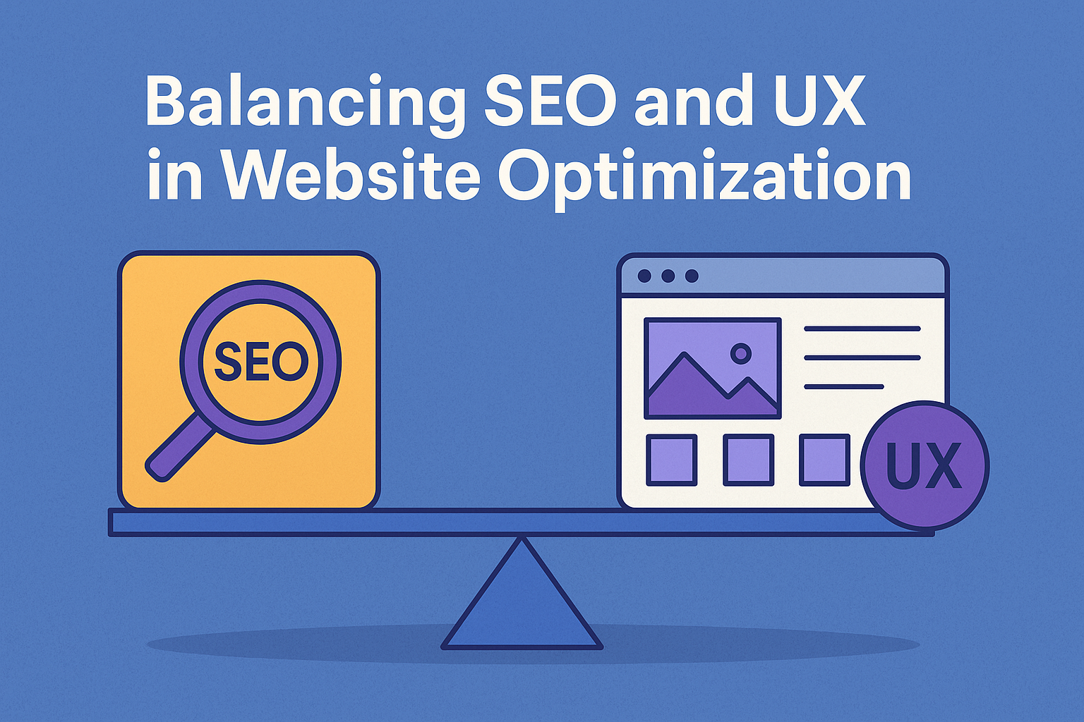
Understanding SEO and UX: Shared Goals, Distinct Disciplines
Search engine optimization (SEO) and user experience (UX) are often treated as separate areas of focus in website development and ecommerce strategy. One aims to attract visitors through improved visibility on search engines, while the other is focused on what happens once those visitors arrive. However, this division overlooks the shared goal at the heart of both disciplines: helping users find what they need, efficiently and with minimal friction.
SEO is rooted in structure, content, and discoverability. Its primary function is to help search engines understand and rank your content appropriately. That includes ensuring proper use of HTML markup, optimizing metadata, structuring content hierarchically, targeting relevant search terms, and building internal and external link networks. All of these elements aim to increase visibility in organic search results, drive traffic, and position the site as a credible resource.
UX, by contrast, centers on the user’s journey through the site. This includes interface design, navigational flow, readability, accessibility, and psychological cues that guide behavior. A well-designed user experience keeps visitors engaged, supports decision-making, and facilitates goal completion, whether that goal is a purchase, a sign-up, or simply reading an article. In ecommerce, UX design touches everything from homepage layout and product filtering to checkout forms and customer service interactions.
The misconception that SEO and UX exist in opposition often stems from outdated practices. Early SEO was dominated by tactics such as keyword stuffing, invisible text, and link farming. These tricks often came at the expense of user experience. Today, however, search engines like Google use hundreds of ranking factors, many of which are behaviorally driven. This shift means that UX metrics such as time on site, bounce rate, and interaction signals now directly influence SEO outcomes.
Consider this: if a user clicks on a search result and quickly returns to the results page, this behavior signals to the search engine that the content did not match the user’s intent. That is a UX issue. At the same time, if a page takes too long to load or the layout is cluttered and confusing, the user will likely leave, affecting both conversion potential and SEO performance. In that way, SEO and UX are no longer separate inputs, but intertwined components of a holistic optimization strategy.
Another point of convergence lies in mobile experience. Google’s mobile-first indexing makes mobile usability a key ranking factor. Poor mobile UX will hurt search rankings, even if the desktop experience is flawless. Responsive design, legible font sizes, intuitive menus, and fast loading are all crucial for both usability and search visibility.
The most successful optimization strategies do not favor SEO at the cost of usability, nor do they disregard search principles in the name of sleek design. Instead, they begin with a clear understanding of how the user’s needs and search engine guidelines intersect. This intersection is where strategic growth happens, and where both disciplines reinforce each other for stronger results across traffic, engagement, and revenue.
By seeing SEO and UX as collaborative rather than competitive, ecommerce brands and website teams can move beyond isolated improvements and into integrated, performance-focused development. In the sections that follow, we will explore how to translate this perspective into concrete action across key aspects of your website.
Site Speed and Core Web Vitals: Where SEO Meets Usability
Few areas demonstrate the overlap between SEO and UX as clearly as site speed. A slow website frustrates users, increases bounce rates, and diminishes trust. At the same time, it negatively affects your search engine visibility. Google has long acknowledged speed as a ranking factor, and the introduction of Core Web Vitals has raised the stakes by tying measurable user experience outcomes directly to search performance.
Core Web Vitals are a set of metrics introduced by Google to evaluate real-world user experience. They focus on three specific aspects of performance: loading, interactivity, and visual stability. These are measured by Largest Contentful Paint (LCP), First Input Delay (FID), and Cumulative Layout Shift (CLS), respectively.
Largest Contentful Paint (LCP) measures how quickly the main content of a page loads. Ideally, this should happen within 2.5 seconds. If your hero image, product gallery, or headline takes too long to render, visitors may leave before even engaging with your offer. From an SEO standpoint, LCP signals how quickly a site is usable, which impacts rankings. From a UX angle, it reflects the user’s first impression of the site’s efficiency.
First Input Delay (FID) quantifies how fast the site responds to user interaction. Whether someone clicks a button, scrolls, or begins filling out a form, they expect the site to react instantly. A delay greater than 100 milliseconds can make the interface feel unresponsive. While FID will soon be replaced by Interaction to Next Paint (INP), the principle remains the same: responsive design encourages engagement and reduces abandonment.
Cumulative Layout Shift (CLS) refers to unexpected shifts in layout while the page is loading. For example, if a "Buy Now" button jumps as the page renders and causes a misclick, that directly affects user satisfaction and conversion. From Google's perspective, such instability can lead to poor outcomes, so it has become part of the SEO equation.
Improving Core Web Vitals is a shared responsibility between developers, designers, and marketers. Techniques like image compression, preloading key resources, minimizing unused JavaScript, and employing content delivery networks (CDNs) can dramatically improve LCP and FID. Preventing layout shifts requires setting size attributes for images and iframes, avoiding dynamic content injection, and following consistent design rules.
Beyond Core Web Vitals, other speed-related elements continue to affect both user and search outcomes. For example, server response times, third-party scripts, and excessive redirects all slow down performance. Mobile performance deserves special attention, since mobile-first indexing means slow mobile sites may harm rankings even if the desktop version is optimized.
Importantly, perception plays a role. Even if a site is technically fast, poorly structured loading sequences can make it feel sluggish. Loading skeleton screens or prioritizing above-the-fold content helps users feel that the site is responsive, even before the entire page is fully rendered.
Testing tools like Google PageSpeed Insights, Lighthouse, and WebPageTest can identify performance bottlenecks, offer prioritized recommendations, and simulate user experiences on different devices. These tools bridge the gap between technical SEO audits and UX diagnostics.
In summary, site speed is not just a backend concern for developers or a checkbox for SEO professionals. It is a direct reflection of how users experience your site and how search engines evaluate its quality. The faster your site loads, the better your rankings, the higher your engagement, and the more conversions you can expect. Speed is not a compromise between SEO and UX. It is a shared cornerstone that benefits both equally when addressed with strategic intent.
Mobile-First Design as a Joint Priority
As of recent years, mobile traffic accounts for more than half of all global website visits. This shift has transformed mobile usability from a secondary consideration into a primary requirement. Google’s adoption of mobile-first indexing means that the mobile version of your website is now the default version evaluated for indexing and ranking. As a result, both SEO and UX professionals must prioritize mobile design not as an add-on, but as the foundation of their optimization strategies.
Mobile-first design involves structuring your website to deliver an optimal experience on smaller screens before scaling up to desktops. From a UX perspective, this ensures users on smartphones or tablets can easily navigate, read content, and complete actions such as adding products to a cart or filling out forms. From an SEO standpoint, mobile-first design supports accessibility, speed, crawlability, and overall ranking potential.
Navigation is one of the first elements impacted by mobile design. Complex desktop menus with multi-level dropdowns do not translate well to mobile devices. Instead, sites must simplify navigation through hamburger menus, collapsible filters, or segmented product categories. The key is maintaining logical structure and intuitive hierarchy without overwhelming the user. For SEO, this ensures crawl depth remains manageable, and important pages are not buried or inaccessible to bots.
Text size, contrast, and button tap areas are also critical. Text that is too small to read or links that are too close together cause frustration and increase bounce rates. Google’s Mobile Usability report in Search Console flags these issues because they degrade user experience and can affect rankings. A good rule of thumb is to use a minimum font size of 16 pixels for body text and to ensure all interactive elements are spaced at least 48 pixels apart.
Speed plays an even more vital role on mobile devices, where users often rely on cellular networks instead of high-speed Wi-Fi. Techniques like adaptive image loading, code minification, and using Accelerated Mobile Pages (AMP) can significantly improve performance. According to research by Deloitte, just a 0.1 second improvement in mobile site speed can lead to increased conversion rates and lower bounce rates across retail and travel sectors.
Designers and developers must also be conscious of how mobile layouts affect content structure. Elements like product carousels, modal windows, and embedded videos need to be responsive and should not obscure essential information. Pop-ups and interstitials, while sometimes useful for marketing, can harm both user experience and SEO if not implemented properly. Google penalizes mobile sites that use intrusive interstitials, especially when they block access to core content.
Testing tools like Google’s Mobile-Friendly Test, Chrome DevTools in mobile view, and BrowserStack for cross-device simulations allow teams to validate design quality across a range of screen sizes and devices. These tools are indispensable for ensuring both crawlability and usability in mobile contexts.
In short, mobile-first design is not just about scaling down a desktop experience. It is about building with mobile users as the primary audience. When executed properly, it leads to faster load times, cleaner navigation, and higher engagement. It also aligns perfectly with Google’s ranking criteria, making it a clear point of alignment between SEO and UX. By designing for mobile from the outset, you are not only future-proofing your site, you are also aligning performance and experience in a way that benefits both users and search engines.
Navigation Architecture That Serves Both Humans and Crawlers
The structure and clarity of your website’s navigation directly impact both user satisfaction and search engine discoverability. Navigation is not just a menu at the top of the screen or a sitemap in your footer. It is a framework that determines how easily users can find what they need and how efficiently search engine bots can index your content. When navigation is poorly planned, users get lost, search engines miss key pages, and conversions suffer. A well-crafted navigation architecture, on the other hand, supports both SEO and UX in a measurable way.
From a user experience standpoint, intuitive navigation reduces cognitive load. Visitors should be able to predict where a link will take them without guessing or backtracking. This means grouping related content logically, using clear and descriptive labels, and minimizing the number of clicks required to reach important pages. In ecommerce, this includes a well-organized product taxonomy, clear category hierarchies, and useful sorting or filtering options. For example, a user browsing for running shoes should not have to click through five unrelated categories to reach their destination. The faster and more naturally users can find what they want, the more likely they are to complete a purchase or engage with your content.
For SEO, clean navigation helps distribute link equity throughout your site and ensures that search engines can crawl and index every valuable page. Internal links within your menu and throughout your content act as signals of relevance and importance. When these links follow a clear hierarchy, they guide bots through your site in a logical way. Shallow site structures, where most pages are accessible within two or three clicks from the homepage, tend to perform better in organic search results. Deep, disorganized structures often result in orphan pages, missed opportunities for ranking, and reduced visibility overall.
Breadcrumb navigation is a feature that serves both functions effectively. It helps users orient themselves within your site and provides a secondary internal linking structure for search engines. For instance, a breadcrumb like "Home > Women > Tops > Blouses" not only improves user awareness of their location but also passes contextual relevance across multiple levels of content. This type of navigation can be marked up with structured data to enhance search snippets and improve click-through rates from Google.
URL structure also plays a role. Readable URLs that reflect the page hierarchy, such as “example.com/shop/mens/jackets,” are more user-friendly and better understood by search engines. Avoid dynamic parameters or overly long URLs that confuse users and offer no keyword relevance. Each part of your navigation should support SEO by incorporating relevant terms, while also maintaining clarity for users.
JavaScript-heavy navigation systems can present obstacles if not implemented correctly. While modern search engines are better at parsing JavaScript, excessive reliance on it can delay indexing or cause essential content to be missed. When in doubt, test with tools like Screaming Frog or Google Search Console’s URL Inspection tool to confirm that your content is accessible to crawlers.
Ultimately, effective navigation is not about adding more links or building complex menus. It is about understanding how your users think, what search engines prioritize, and creating a structure that bridges those needs. When done correctly, strong navigation reduces friction, improves dwell time, enhances crawlability, and lifts both UX and SEO performance across the board.

Crafting SEO-Friendly Content Without Compromising Clarity
One of the most persistent challenges in website optimization is developing content that satisfies both search engine algorithms and human readers. On the one hand, SEO requires attention to keywords, metadata, headings, and structure. On the other hand, UX demands readability, clarity, and a tone that resonates with real people. When these priorities are not balanced, content becomes either robotic and keyword-stuffed or beautifully written but invisible in search. The goal is to write content that performs well in rankings while also driving action and building trust.
The first step is to move beyond outdated keyword strategies. Years ago, it was common to cram exact-match keywords into every sentence and repeat target phrases unnaturally. This approach not only alienated readers, but also eventually became ineffective as search engines evolved. Today, Google’s natural language processing capabilities allow it to understand context, synonyms, and intent. This means content writers can use variations of keywords, natural phrasing, and topic clusters without sacrificing discoverability.
From a UX perspective, content should be structured for scannability. Most users do not read every word on a page. Instead, they skim, looking for headings, bullet points, bolded terms, and visuals to guide them. This is especially true for ecommerce pages, where users often compare products, features, and pricing before making a decision. Using a clear heading hierarchy, short paragraphs, and meaningful subheadings helps users absorb key information quickly. At the same time, these elements signal to search engines what the page is about.
Meta titles and descriptions still play a key role in SEO and also influence user experience before a visitor even lands on the page. A well-written title tag should reflect the primary keyword while making sense to a human reader. Meta descriptions should summarize the content accurately and include a call to action or reason to click. While meta descriptions are not a direct ranking factor, they can improve click-through rates, which indirectly supports SEO.
Incorporating semantic structure through the use of H1, H2, and H3 tags improves both accessibility and SEO. It provides a framework for screen readers, clarifies the information hierarchy, and helps Google understand how your content is organized. Every page should include a single H1 tag, which serves as the main topic header, followed by H2 and H3 tags that break down subtopics.
Avoiding jargon and keeping language accessible is another way to serve both goals. Writing for a general audience does not mean dumbing down your message. It means expressing ideas clearly, avoiding ambiguity, and eliminating unnecessary complexity. Even in technical industries, the most successful content is written in a way that is easy to follow.
Visual content should also be optimized for both readability and search performance. Use descriptive image filenames and alt text that reflect the content’s purpose. Not only does this support SEO by improving image search visibility, but it also enhances UX for users who rely on screen readers or encounter slow-loading images.
Internal linking within content offers yet another opportunity to bridge SEO and UX. Linking to relevant pages provides additional value to the reader and keeps them engaged longer. It also helps distribute authority throughout your site and allows search engines to crawl and index more pages.
In essence, good content writing is not a matter of choosing between algorithms and users. It is about understanding what people are searching for, how they process information, and how search engines interpret page structure and language. By respecting both audiences, content
Product Pages That Convert and Rank
Product pages are one of the most critical components of an ecommerce website. They are where interest becomes intent and where traffic ideally turns into revenue. These pages must work hard on two fronts: they must attract organic search traffic through effective SEO, and they must persuade users to take action through a seamless, informative, and trustworthy user experience. Striking the right balance between these two objectives is not only possible, it is essential for long-term ecommerce success.
From an SEO standpoint, product pages should be optimized for targeted keywords that reflect how users search. This includes using precise product names, incorporating relevant modifiers such as "buy," "best price," or "2025 edition," and placing these terms in key on-page elements. Title tags, meta descriptions, H1 headers, and product descriptions all play a role in helping search engines understand the page and rank it accordingly. Each product page should have unique content. Using manufacturer-provided descriptions or duplicating content across variants can lead to ranking issues or content cannibalization.
Yet keyword placement alone is not enough. UX demands that content be both useful and digestible. A product page should immediately answer the user's primary questions: What is it? How much does it cost? What are the key features or specifications? Is it available in their size or color preference? How quickly can it be delivered? To support this, use clear headlines, bullet-pointed feature lists, expandable sections for details, and high-resolution images that offer zoom capabilities.
Images play a dual role. Visually, they are central to user experience and purchase confidence. From an SEO perspective, each image should include descriptive file names and properly written alt text. This not only aids in accessibility but also helps the product appear in image search results, which can drive additional traffic. Including product videos or 360-degree views can also enhance both engagement and time on page, metrics that support stronger search performance.
Structured data, or schema markup, is another tool that aligns SEO and UX goals. Adding structured data to product pages enables enhanced search listings with elements like star ratings, pricing, availability, and review counts. These rich results increase visibility and credibility in search engine results pages. At the same time, they mirror what users expect to see on the product page itself. Displaying reviews, shipping info, and availability clearly reassures users and reduces uncertainty.
Product variants, such as different colors or sizes, should be handled carefully. If each variant is given a unique URL without clear differentiation, search engines may view these pages as duplicate content. A better approach is to use dynamic content loading or canonical tags that consolidate equity while still giving users the flexibility to view their preferred version.
Avoiding clutter is key. UX suffers when product pages are overloaded with pop-ups, upsell widgets, or auto-play videos that interrupt the browsing experience. From an SEO perspective, intrusive interstitials can also be penalized, especially on mobile. Keep the layout clean, prioritize essential information above the fold, and allow secondary content like FAQs or sizing guides to be accessible but not overwhelming.
Finally, the call to action should be clear, visible, and actionable. A prominent "Add to Cart" or "Buy Now" button should not require scrolling or be obscured by competing elements. Supporting content, such as trust badges, payment options, and return policies, should be close by to remove friction at the moment of decision.
In short, the most effective product pages are those that meet users where they are in their journey. They answer questions quickly, build confidence, and remove barriers to purchase. When designed with both SEO and UX in mind, these pages become powerful assets that not only attract traffic but also convert that traffic into measurable results.
Technical SEO Elements That Improve UX by Design
Technical SEO is often seen as the domain of developers and search specialists, focused on backend infrastructure and crawl logic. While this is partly true, many technical SEO decisions also affect how users experience a website. Clean site architecture, logical redirects, crawl efficiency, and structured metadata do not just support indexing and ranking. They also influence loading speed, accessibility, and ease of navigation, all of which have a direct impact on user experience. In this way, technical SEO is not separate from UX. It is a hidden foundation that supports it.
A good starting point is the site’s architecture. This refers to how pages are structured and linked within the site. A flat architecture, where most pages are reachable within three clicks from the homepage, allows both users and search engines to navigate easily. Deep, nested page hierarchies make it harder for users to explore and more difficult for search bots to crawl the site efficiently. A well-structured site map, both in XML and HTML formats, ensures full discoverability while also providing users with an alternate way to navigate.
Canonical tags are another technical element with dual impact. These tags tell search engines which version of a page should be considered the original when duplicate content exists. For users, this helps ensure consistency in the content they see and avoids confusion caused by similar pages with slight variations. For example, an ecommerce store might offer a product in several colors, each accessible by a unique URL. Canonicalization helps preserve ranking authority while preventing dilution of SEO value across duplicate or near-duplicate pages.
Redirects, particularly 301 redirects, help maintain page equity and ensure a smooth user experience. When a product is discontinued or a page is moved, users should be redirected to a relevant alternative. Broken links or 404 errors frustrate users and signal to search engines that the site is not well maintained. A proper redirect strategy ensures continuity for both indexing and user engagement. It is also important to periodically audit your site using tools like Screaming Frog or Ahrefs to catch broken links, outdated redirects, or chains that slow down performance.
Structured data, also known as schema markup, enhances how your content appears in search results through features like review stars, event details, or recipe previews. This added information boosts click-through rates while aligning with what users often look for immediately. On-page, this information also contributes to UX by making the content more informative and scannable. For ecommerce, implementing schema on product pages can include price, availability, and rating, all of which can be mirrored visually on the page for consistency.
Mobile usability is also directly connected to technical choices. Proper viewport configuration, responsive design frameworks, and accessible menu logic are all technical elements that affect how well your site functions on smaller screens. Google’s Mobile Usability report in Search Console can help surface issues like clickable elements being too close together, text that is unreadable without zooming, or content that falls outside the viewport.
Security is another area where technical SEO supports UX. Implementing HTTPS protects data transmission and is also a ranking factor. Users are increasingly aware of browser warnings related to non-secure sites, and even one security alert can erode trust and drive people away. A valid SSL certificate, properly configured, sends the right signal to both users and search engines.
Finally, accessibility improvements often stem from technical decisions. Semantic HTML tags, proper use of heading levels, descriptive link text, and alt attributes for images not only help screen readers but also reinforce SEO clarity. These practices ensure that your content can be understood and navigated by all users, regardless of ability, while also supporting better indexing by search engines.
In short, technical SEO is more than a behind-the-scenes checklist. It shapes the digital environment in which users interact with your content. When implemented with UX in mind, it becomes a powerful tool for creating websites that are fast, findable, functional, and user-friendly.
User Intent Alignment: The Missing Link Between CRO, SEO, and UX
User intent is one of the most important yet often misunderstood components of effective website optimization. It serves as the common thread connecting SEO, UX, and conversion rate optimization (CRO). Every search query represents a goal. That goal may be to learn, compare, or buy. When your website aligns closely with the intent behind a user’s search, you not only improve your chances of ranking well, but also create a better experience and increase the likelihood of conversion.
There are generally three types of user intent: informational, navigational, and transactional. Informational intent refers to users looking for answers or insights, such as “what is the best coffee for cold brew” or “how to set up a compost bin.” Navigational intent involves users trying to reach a specific site or brand, for example, searching “Nike running shoes” or “Etsy home decor.” Transactional intent refers to users who are ready to take action, such as “buy noise cancelling headphones” or “sign up for meal kit delivery.”
Understanding which type of intent is behind your target keywords allows you to design your content and page layout accordingly. A common mistake is trying to force a transactional experience on an informational query, or vice versa. For example, if someone is searching for “how to choose the right mattress,” and your landing page jumps immediately into product pitches without offering helpful content, the user will likely bounce. They are in research mode, not purchase mode. That disconnect not only hurts UX but also damages SEO performance over time, as search engines track bounce rates and short sessions as signs of misalignment.
Meeting user intent involves more than just writing the right content. It includes presenting the content in a way that matches the user’s expectations and guides them naturally toward the next step. For instance, a user landing on an informational blog post about skincare routines might not be ready to buy immediately, but placing a subtle, relevant product suggestion at the bottom of the article or offering a downloadable guide with a soft lead capture form can serve both UX and CRO objectives without being intrusive.
Search engines reward pages that satisfy user intent by analyzing metrics like dwell time, bounce rate, pogo-sticking (when a user clicks a result, then quickly returns to the search page), and engagement signals. These are not purely technical signals. They are behavioral indicators of how well your content fulfills the promise made in the search result.
To properly align with user intent, start by analyzing the top-ranking pages for your target keywords. What kind of content is ranking? Is it long-form guides, product listings, comparison tables, or visual tutorials? Then match your content type and format to what is working while still providing original value. Do not blindly copy structure, but pay attention to patterns.
Additionally, tools like Google Search Console and site heatmaps can reveal where users are engaging and where they drop off. If users frequently exit before reaching your call to action, it might indicate a mismatch between their intent and the page’s offer. Similarly, if visitors linger on certain sections or scroll repeatedly through a specific feature list, it suggests high-interest areas that can be highlighted or expanded.
In summary, user intent should not be viewed as an abstract SEO concept. It is a practical framework that informs how you design, structure, and optimize every element of your site. By ensuring that each landing page matches the mental state of the user arriving there, you create a more satisfying experience, improve visibility, and increase your chances of conversion. Proper intent alignment is not just good practice, it is a competitive advantage that connects the dots between discovery, experience, and action.

Measuring the Right Metrics for Long-Term Optimization
To effectively balance SEO and UX, you must rely on the right metrics. Data is your guide for knowing whether your changes are actually working. However, many brands focus too heavily on vanity metrics or isolated numbers, such as traffic or bounce rate, without understanding what those figures represent or how they interact. Long-term success comes from analyzing a combination of metrics that capture visibility, behavior, and business outcomes. These numbers help determine whether your site is both findable and usable, and whether it leads users toward meaningful actions.
Start with SEO metrics. Search engine visibility is a prerequisite for organic traffic, so tools like Google Search Console are indispensable. Look at impressions and average position for key queries, as these indicate how well your content is ranking. Click-through rate (CTR) reveals whether your title tags and meta descriptions are compelling enough to earn clicks. If impressions are high but clicks are low, your content may be visible but not persuasive. Organic traffic in Google Analytics gives you the volume of visitors entering through search, but that number alone does not show intent or quality.
That is where UX and engagement metrics come into play. Time on page, scroll depth, and interaction rates help assess how well users are consuming your content. A high bounce rate, often misunderstood, is not always negative. For example, a user reading a single article in full and then leaving might indicate a satisfied visitor rather than a disengaged one. Context is key. Look at bounce rate alongside session duration, page views per session, and return visits to get a fuller picture.
Heatmaps and session recordings, available through tools like Hotjar or Microsoft Clarity, offer visual insights into user behavior. You can see where users are clicking, how far they scroll, and what they ignore. These insights are especially valuable when testing different page layouts, calls to action, or navigation options. If a call to action is not being seen or clicked, no amount of SEO will drive conversions. UX must make the path to action clear and effortless.
CRO metrics bring the user journey full circle. Conversion rate is the most obvious number to track, but it should be broken down by traffic source, device type, and user segment. Other key performance indicators (KPIs) include average order value (AOV), cart abandonment rate, and micro-conversions such as email sign-ups or PDF downloads. These metrics reflect how well your site supports goal completion. A sudden drop in conversion rate could indicate a UX issue, such as a broken checkout form or confusing pricing table, even if your traffic remains steady.
For sites running frequent experiments or updates, A/B testing platforms like Google Optimize or VWO allow for precise measurement of user behavior before and after changes. Running controlled experiments helps isolate which elements truly impact performance and avoids the guesswork of relying on intuition alone.
It is important to review these metrics regularly and not in isolation. A rise in rankings that coincides with a drop in engagement may point to poor content alignment. A spike in traffic without a corresponding lift in conversions could signal mismatched intent. And a beautifully designed page that fails to rank likely needs technical or keyword improvements.
In conclusion, effective measurement is not about tracking everything. It is about tracking what matters, understanding how different metrics influence one another, and making decisions based on complete, contextual data. SEO, UX, and CRO all have their own indicators, but together they tell a single, actionable story. When you analyze your data through this combined lens, you create a feedback loop that informs smarter design, sharper content, and more consistent growth.
Cross-Functional Collaboration: Bridging SEO, UX, and CRO Teams
A website cannot succeed when SEO, UX, and CRO efforts operate in isolation. Each discipline brings critical expertise to the table, but their full impact is only realized when teams collaborate. Siloed work often leads to friction, inefficiency, and inconsistent user experiences. On the other hand, cross-functional collaboration creates a shared understanding of goals, reduces redundant work, and produces a more cohesive and effective website.
At a fundamental level, SEO professionals are focused on visibility, traffic acquisition, and search performance. UX designers concentrate on usability, accessibility, and visual hierarchy. CRO specialists focus on increasing conversions by testing messaging, layouts, and flows. While their priorities may appear different, they all contribute to the same outcome: a website that attracts the right visitors and guides them toward meaningful actions.
Collaboration begins with a unified strategy. All stakeholders must understand the website’s business goals, audience segments, and performance benchmarks. Whether the goal is to increase product sales, boost newsletter signups, or generate qualified leads, that shared vision should guide every decision. Kickoff meetings and cross-department planning sessions are helpful to align objectives and ensure that everyone is working toward the same targets.
Language is another area where collaboration often breaks down. SEO teams may talk in terms of schema markup and canonical tags, while UX designers refer to wireframes, hierarchy, and modal logic. Establishing a shared vocabulary allows teams to communicate more clearly. Creating documentation or glossaries of key terms, tools, and workflows helps bridge these gaps, especially in growing organizations with rotating staff or agency partners.
One of the most practical ways to foster collaboration is to integrate workflows. Instead of SEO audits happening months after a design is launched, or UX recommendations being implemented without input from SEO or CRO, teams can use shared tools and sprint cycles to work in tandem. Platforms like Figma, Asana, and Jira allow for transparent task tracking and collaborative problem-solving. When SEO guidelines are baked into the design stage, and UX testing results inform future content plans, the work becomes more proactive and less reactive.
Another key ingredient is shared data. Too often, teams track their own metrics in separate dashboards, making it difficult to see the full picture. Building unified reporting dashboards using tools like Looker Studio, Tableau, or GA4 enables everyone to view performance through the same lens. When all teams are reviewing the same engagement metrics, bounce rates, heatmap data, and conversion funnels, they can collaborate on diagnosing issues and identifying opportunities.
Cross-functional collaboration should also extend into experimentation. A/B tests should not be designed in isolation by the CRO team alone. Instead, SEO experts can contribute insight into traffic patterns, and UX designers can ensure that variations are consistent with design principles. This increases the chances that tests yield valid and scalable results. Sharing outcomes across departments also builds a learning culture, where data becomes the driver of decisions rather than opinions or assumptions.
Lastly, leadership must support collaboration. Managers should incentivize knowledge sharing, celebrate cross-department wins, and allocate time and resources to alignment activities. Building a high-performing website is not a one-person job. It is a collective effort that succeeds when different teams, with different skill sets, operate as one.
In short, aligning SEO, UX, and CRO through structured collaboration creates a stronger, more resilient optimization process. When these teams share knowledge, tools, and goals, the results are measurable. Sites become easier to find, more enjoyable to use, and better at driving action. Collaboration is not just good for culture. It is good for performance, retention, and long-term growth.
Conclusion: Optimizing Without Trade-Offs
Balancing SEO and UX in website optimization is no longer optional. In today’s digital landscape, where users expect fast, intuitive experiences and search engines reward those that deliver them, websites must be built with both disciplines working in harmony. The idea that you need to choose between ranking well and providing a great user experience is outdated. In reality, the most successful websites do both, and they do so with strategic intent and continuous improvement.
Throughout this article, we have examined how the intersection of SEO and UX plays out in practical, measurable ways. From technical speed improvements to content clarity, from mobile-first design to intuitive navigation, every element contributes to both visibility and usability. Whether you are optimizing a product page, refining a site’s architecture, or developing content, the same rule applies: search engines and users want the same thing. They both want relevance, speed, clarity, and trust.
This alignment presents a unique opportunity. Instead of dividing your efforts between SEO checklists and UX best practices, you can integrate them into a single optimization strategy. Doing so saves time, avoids conflicting priorities, and builds a stronger foundation for long-term growth. The metrics prove this out. Pages that load quickly, satisfy search intent, and present clear paths to conversion rank higher, engage better, and convert more reliably.
Still, this balance is not something you achieve once and then forget. It requires constant calibration. Search engine algorithms change, user expectations evolve, and design standards improve. What worked last year may be less effective today. This is why testing, measurement, and collaboration are essential. Optimization is not a one-time task. It is an ongoing process of refinement that must be guided by data and driven by real user feedback.
It is also important to recognize the human side of optimization. Behind every click, bounce, or conversion is a real person with specific needs and goals. UX reminds us to see those individuals clearly. SEO ensures they can find what they are looking for. And CRO helps us guide them toward taking action in a way that feels natural and satisfying. When these elements come together, the result is more than just increased traffic or higher conversion rates. It is a brand experience that builds trust, loyalty, and long-term value.
The most effective organizations do not treat SEO, UX, and CRO as separate functions. They encourage cross-functional collaboration, shared metrics, and collective accountability. They build teams that think holistically and make decisions based on outcomes, not departmental agendas. Whether you are a solo marketer or part of a larger ecommerce operation, adopting this integrated mindset can dramatically improve both your performance and your process.
As you move forward with your optimization efforts, ask yourself not only how to rank higher or convert better, but also how to meet user expectations more completely. Review your data regularly, audit your content honestly, and test your assumptions with humility. The answers you uncover will lead to smarter strategies and more sustainable results.
In the end, the true goal is not just a technically perfect site or a beautiful interface. It is a digital experience that attracts, engages, and serves the user while simultaneously fulfilling business objectives. That is the real meaning of balance in website optimization. When SEO and UX work together, your website does not just perform. It excels.
Research Citations
- Baymard Institute. (2023). Homepage & category usability.
- Deloitte Digital. (2020). Milliseconds make millions: A study of mobile speed impact.
- Google. (2023). Core Web Vitals and page experience.
- Google Search Central. (2023). Introduction to structured data.
- Google Search Central. (2023). Mobile-friendly sites.
- Google Search Central. (2023). Understanding page experience in Google Search.
- Hotjar. (n.d.). What is a heatmap?. Retrieved from https://www.hotjar.com/heatmaps/
- Moz. (2023). SEO basics: What is SEO?.
- Nielsen Norman Group. (2020). 10 usability heuristics for user interface design.
- Search Engine Journal. (2022). How to align SEO with UX to boost search rankings.
- Screaming Frog. (2023). SEO spider tool.
- Think with Google. (2021). Why user experience is key to success in SEO.
- W3C. (2018). Introduction to web accessibility.
FAQs
SEO focuses on increasing a website’s visibility in search engines, while UX is concerned with the ease and satisfaction of user interactions on the site. Although they serve different purposes, they are deeply connected. A well-optimized site that ranks highly but frustrates users will struggle to convert visitors. Likewise, a beautifully designed site that is not discoverable will miss out on traffic. The best-performing websites align both priorities so that users can find the site easily and navigate it effortlessly.
Yes, improving UX can support higher rankings. Google uses behavioral signals such as bounce rate, time on page, and interaction metrics to assess how well a page meets user needs. If visitors leave quickly or struggle to engage with your content, those patterns may indicate poor UX, which can negatively affect your visibility in search. Enhancing usability, clarity, and responsiveness can encourage longer sessions and repeat visits, both of which contribute to stronger SEO performance.
Not if it is done correctly. Modern keyword optimization involves using relevant terms naturally within the content. It is no longer necessary to repeat exact phrases excessively. Instead, focus on using clear, conversational language that addresses what users are searching for. Incorporate synonyms, related questions, and variations of your target keywords. This approach not only helps search engines understand your content but also ensures a smooth and engaging experience for readers.
Mobile usability is essential for both SEO and UX. Google primarily indexes the mobile version of your website, so if it performs poorly on mobile devices, your rankings may suffer. At the same time, most users now browse and shop using smartphones. A site that is hard to read or navigate on a smaller screen will frustrate visitors and lead to lost opportunities. Prioritizing mobile-first design helps ensure that your site meets both search engine requirements and user expectations.
Site speed is one of the clearest examples of where SEO and UX overlap. From an SEO perspective, Google considers page load time a ranking factor. From a UX standpoint, users are unlikely to wait more than a few seconds for a page to load. A slow site increases bounce rates and reduces conversions. Optimizing images, minimizing scripts, and leveraging caching are just a few ways to improve performance for both audiences.
Track a combination of technical, engagement, and outcome-based metrics. For SEO, monitor impressions, click-through rates, rankings, and indexed pages using Google Search Console. For UX, review metrics such as time on page, scroll depth, session duration, and heatmap behavior. When possible, combine this data in a single dashboard to identify patterns. For example, a page with high traffic but low engagement may need content improvements or layout changes.
Yes, collaboration is important. SEO specialists, UX designers, content strategists, and developers each bring unique expertise. Without cross-functional alignment, changes made for one purpose may unintentionally harm another. For instance, removing text to streamline a page might hurt keyword relevance, while adding too many elements for SEO could make the page feel cluttered. Working together ensures that improvements serve all objectives.
Can structured data improve both UX and SEO?
Absolutely. Structured data enhances how your content appears in search engine results, enabling rich snippets that show star ratings, pricing, availability, and more. These features can improve click-through rates, which supports SEO. At the same time, displaying this information clearly on your site improves UX by helping users quickly find what they need. It creates consistency between what users see in search and what they experience on the page.
A full audit should be performed at least twice a year, though certain areas require more frequent review. Technical SEO, such as broken links and crawl errors, should be monitored monthly. Content performance can be reviewed quarterly. UX testing, including user behavior analysis and A/B testing, should be an ongoing process. Continual monitoring helps you respond to changing search algorithms, user behavior trends, and business goals.
The biggest mistake is treating SEO and UX as separate or competing priorities. Optimizing only for rankings often leads to keyword stuffing, low-quality content, and slow, bloated pages. Focusing solely on aesthetics may result in beautiful sites that are invisible in search. Success lies in integration. Each decision should be evaluated based on how it affects both discoverability and usability. This mindset helps create websites that are not just functional or attractive, but genuinely effective at engaging and converting users.