
Overview
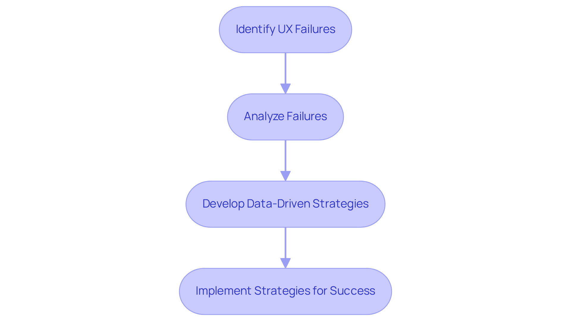
This article highlights nine notorious UX failures that direct-to-consumer (DTC) brands must avoid to enhance customer satisfaction and conversion rates. By examining specific examples, such as WhatsApp's confusing message deletion feature and Netflix's frustrating auto-play function, it illustrates how clarity and intuitive design can prevent these pitfalls. Ultimately, fostering customer loyalty is paramount, and understanding these failures is crucial for brands aiming to improve their user experiences.
Introduction
The digital landscape is filled with instances of user experience (UX) failures that have significantly impacted brands, eroding customer loyalty and diminishing revenue. For direct-to-consumer (DTC) companies, recognizing these infamous missteps transcends mere learning; it is an essential strategy for enhancing user satisfaction and driving conversions. As brands endeavor to create seamless interactions, the pivotal question arises: how can they effectively transform these UX pitfalls into success stories that not only retain customers but also enhance profitability?
Parah Group: Transforming UX Failures into Conversion Success
Parah Group stands at the forefront of Conversion Rate Optimization (CRO) for direct-to-consumer companies, dedicated to transforming notorious UX fails into compelling success stories. By leveraging data-driven methodologies and insights from consumer psychology, the agency empowers companies to enhance client interactions. This focus ultimately leads to increased conversion rates and higher average order values.
In this segment, we will scrutinize several infamous UX fails from prominent companies, illustrating how similar missteps can be effectively avoided. By doing so, we can ensure a seamless experience that significantly enhances profitability.
WhatsApp: The Confusing Delete Message Feature
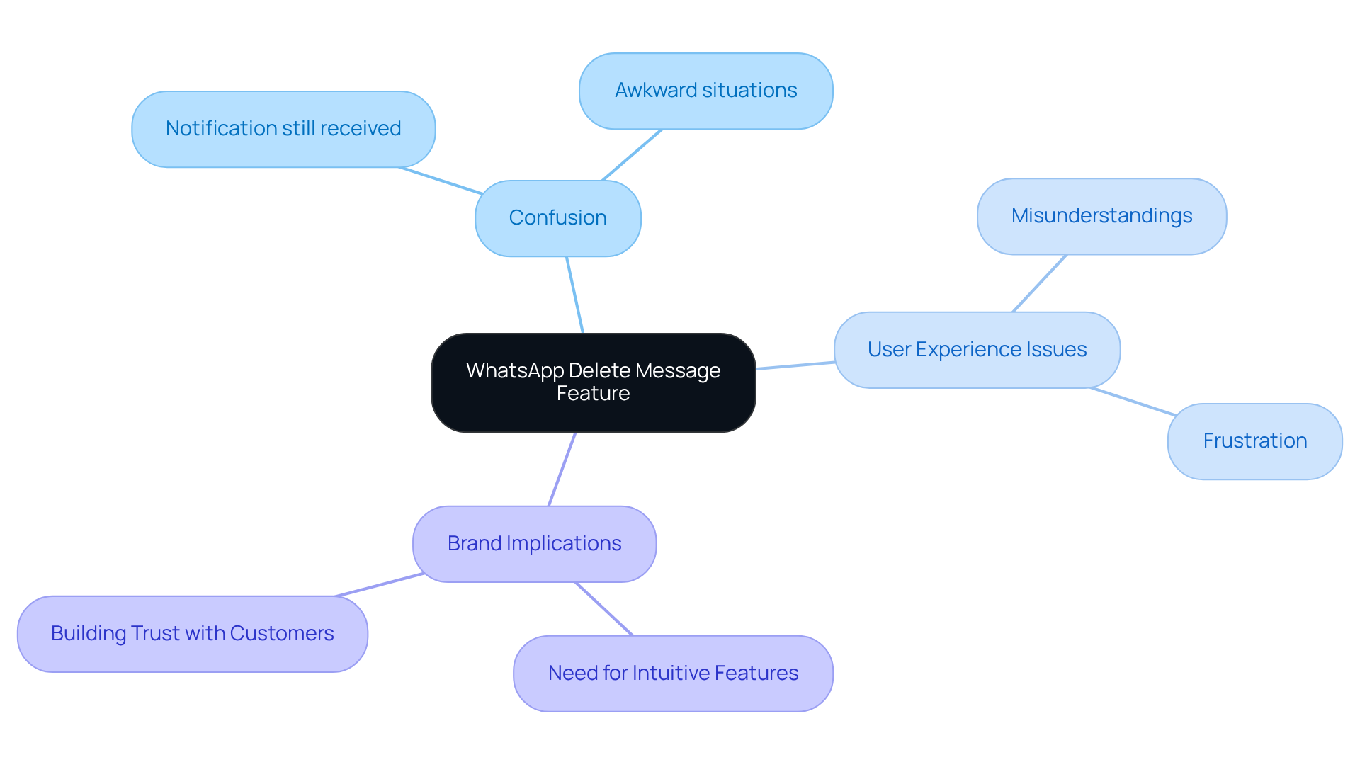
The confusing implementation of WhatsApp's 'Delete for Everyone' feature has led to significant criticism, marking it as a clear ux fail. Users frequently encounter awkward situations when they delete messages, as the recipient still receives a notification indicating that a message was deleted. This lack of clarity can lead to misunderstandings and frustration, resulting in a ux fail that ultimately diminishes customer satisfaction.
It is imperative for DTC brands to ensure that their features are both intuitive and transparent to prevent a ux fail. By prioritizing user experience, brands can foster trust and enhance customer loyalty.
Netflix: The Frustrating Hover Auto-Play Experience
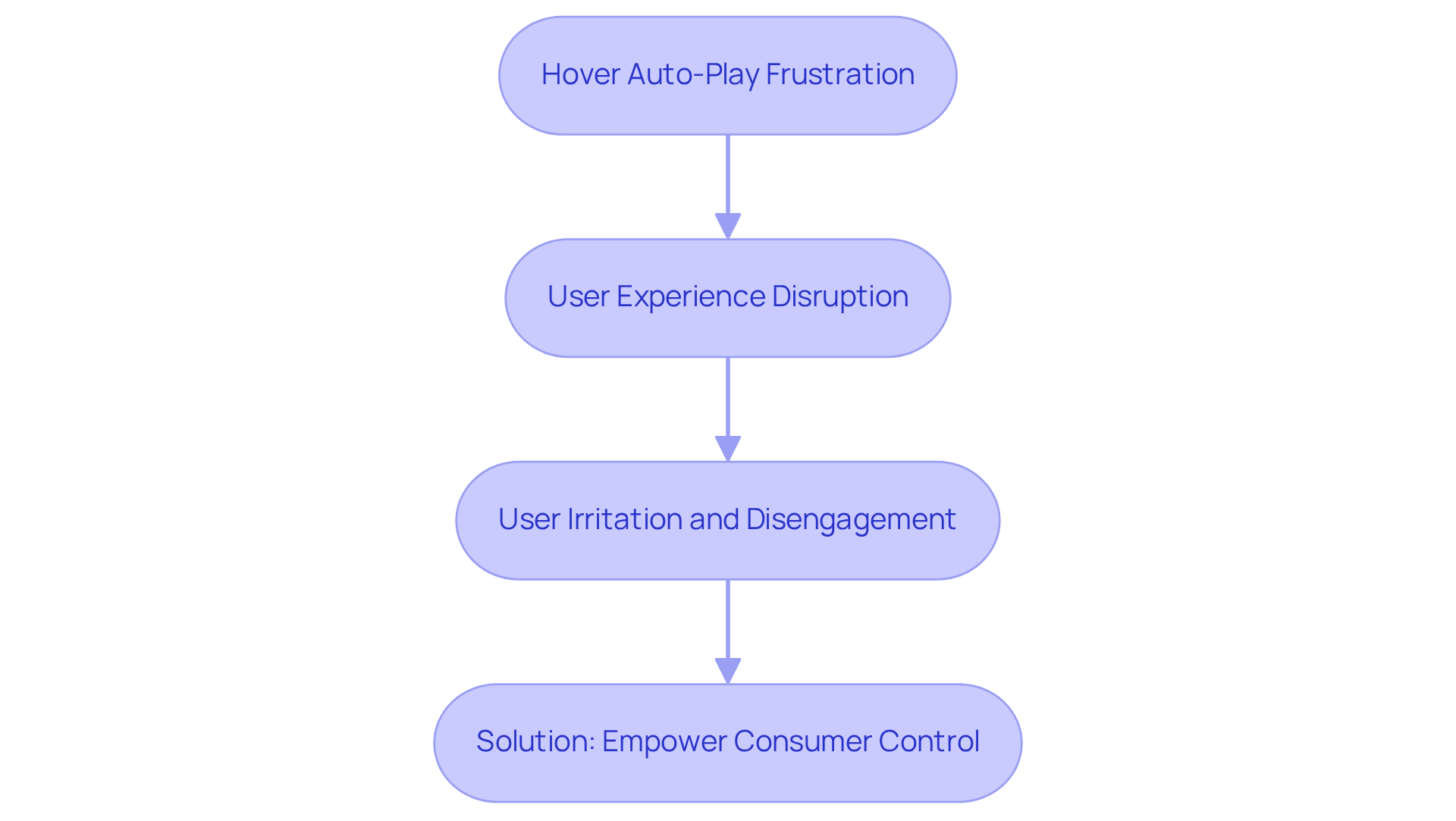
The hover auto-play feature on Netflix has become a source of frustration for many users, automatically playing trailers as they hover over titles. This unexpected behavior can result in a ux fail, disrupting browsing experiences and leading to irritation and disengagement.
To enhance overall satisfaction, DTC companies must prioritize consumer control, empowering clients to determine when and how they engage with content. By doing so, they can foster a more positive interaction that respects user preferences and enhances loyalty.
Ryanair: The Complicated Booking Process
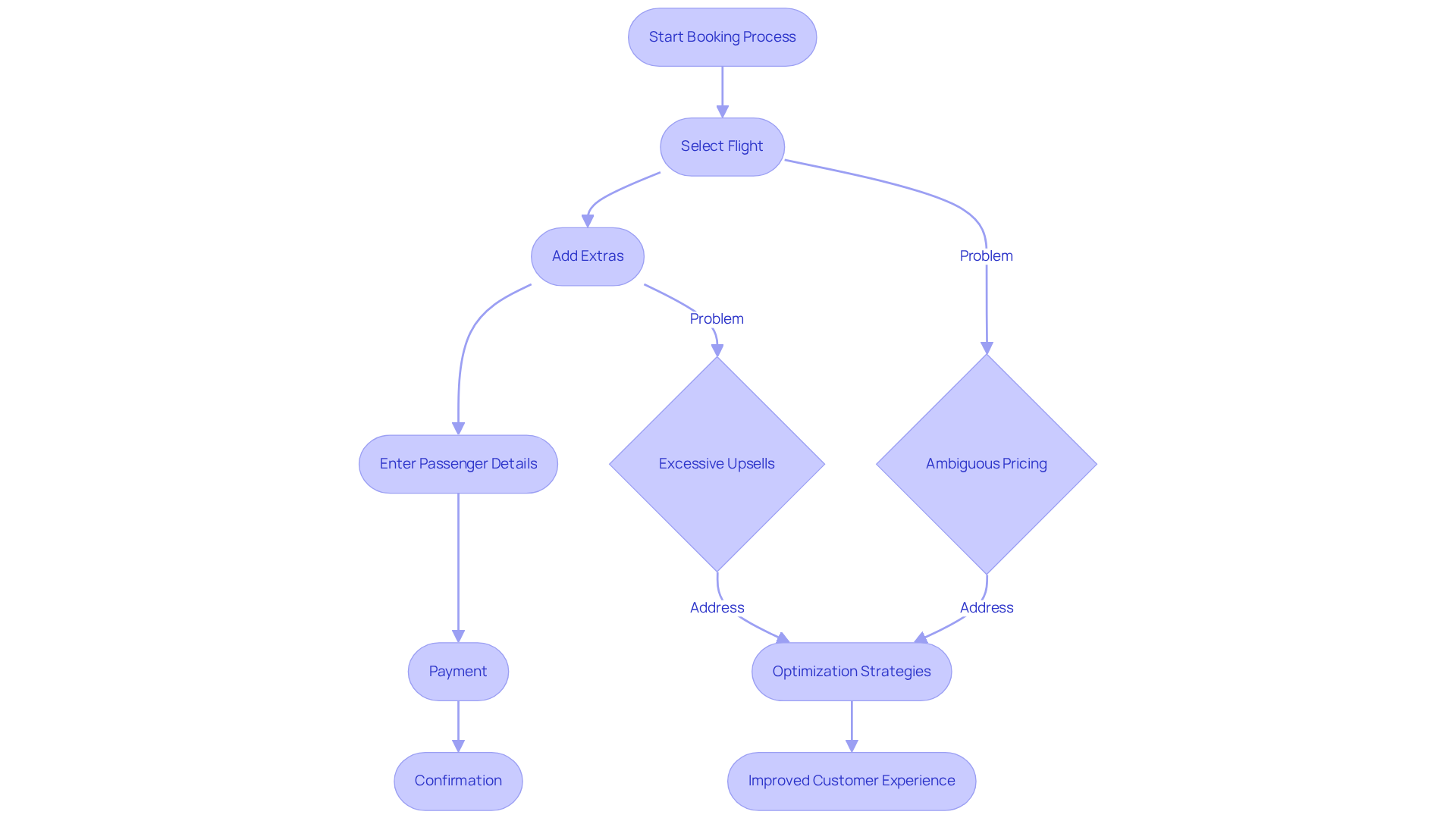
Ryanair's booking process is often deemed a ux fail due to its excessive complexity, characterized by numerous upsells and ambiguous pricing structures. This intricacy often leads to a ux fail among customers, which results in abandoned bookings.
Direct-to-Consumer (DTC) companies must prioritize a straightforward and transparent booking process, enabling customers to navigate the purchasing journey with ease and without confusion.
By implementing comprehensive Conversion Rate Optimization strategies, these companies can significantly enhance customer satisfaction and drive substantial growth. A commitment to clarity and simplicity in booking processes not only boosts customer satisfaction but also maximizes profitability, making it crucial for DTC companies to focus on these vital elements.
Apple: The Confusing Storage Management Interface
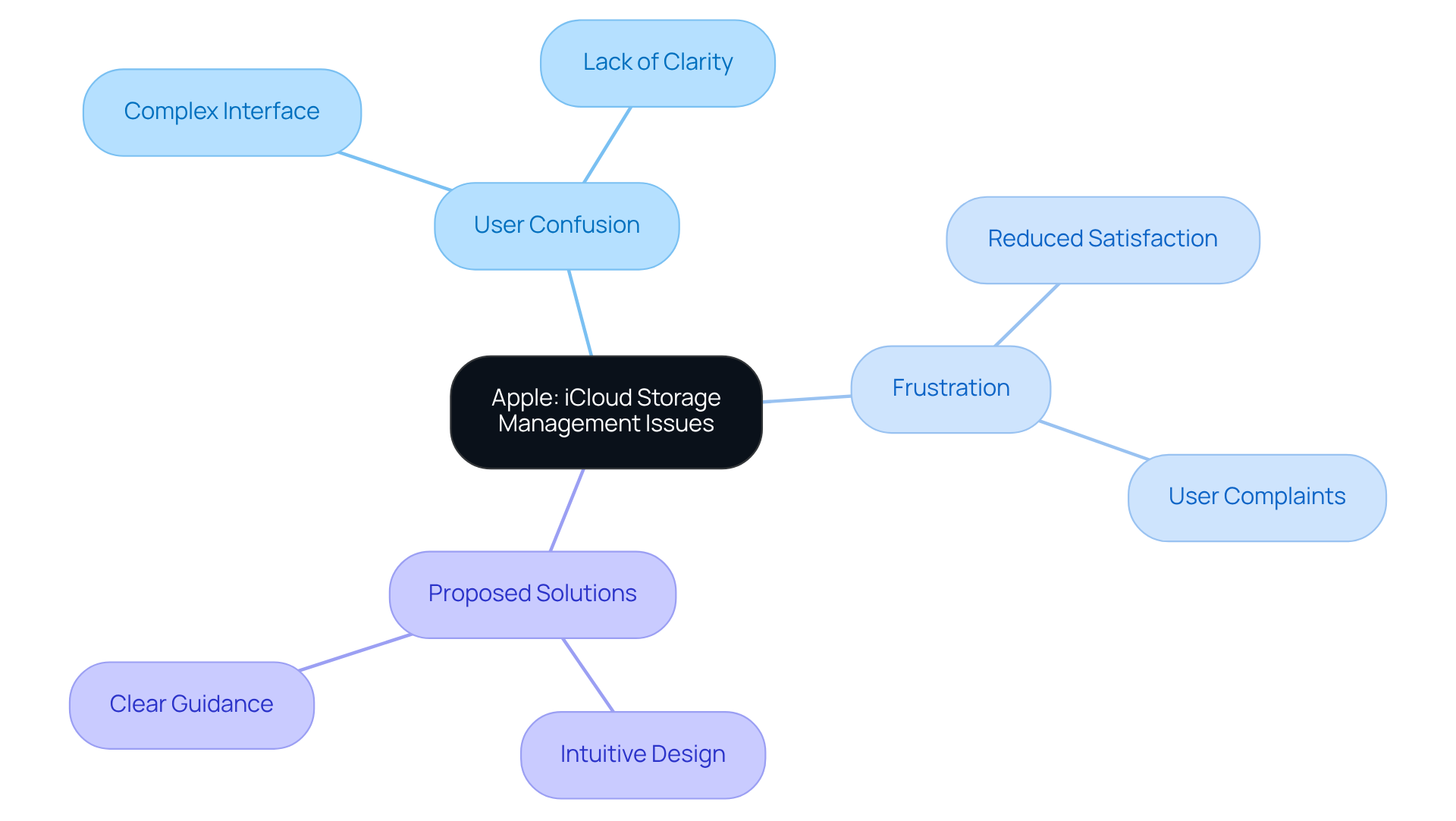
The complexity and lack of clarity in Apple's iCloud storage management interface highlight a significant UX fail. Users frequently encounter a UX fail in understanding their available storage and managing it effectively. This confusion not only breeds frustration but also results in a UX fail, diminishing overall satisfaction with the product. To address these issues, DTC companies must prioritize the development of intuitive interfaces that provide clear information and guidance, ultimately enhancing user interaction and satisfaction.
Common Mistake: Excessively Long Dropdown Menus
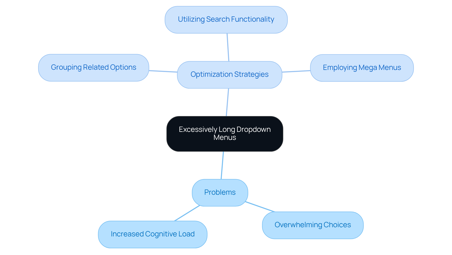
Excessively long dropdown menus can overwhelm individuals, making it challenging for them to locate the options they require. This design oversight contributes to a ux fail by heightening cognitive load, leading to frustration and potential abandonment. Direct-to-Consumer (DTC) companies must limit the number of choices in dropdown menus and explore alternative navigation methods to enhance usability and improve overall interaction.
To optimize dropdown menus, brands can implement strategies such as:
- Grouping related options
- Utilizing search functionality
- Employing mega menus for superior organization
Parah Group distinguishes itself from other Conversion Rate Optimization (CRO) agencies by prioritizing profitability and sustainable growth, ensuring that effective UX design is an integral component of CRO. A streamlined navigation experience not only mitigates the risk of ux fail for users but also facilitates data-driven decisions that enhance overall business performance.
UX Pitfall: Ineffective Password Recovery Systems
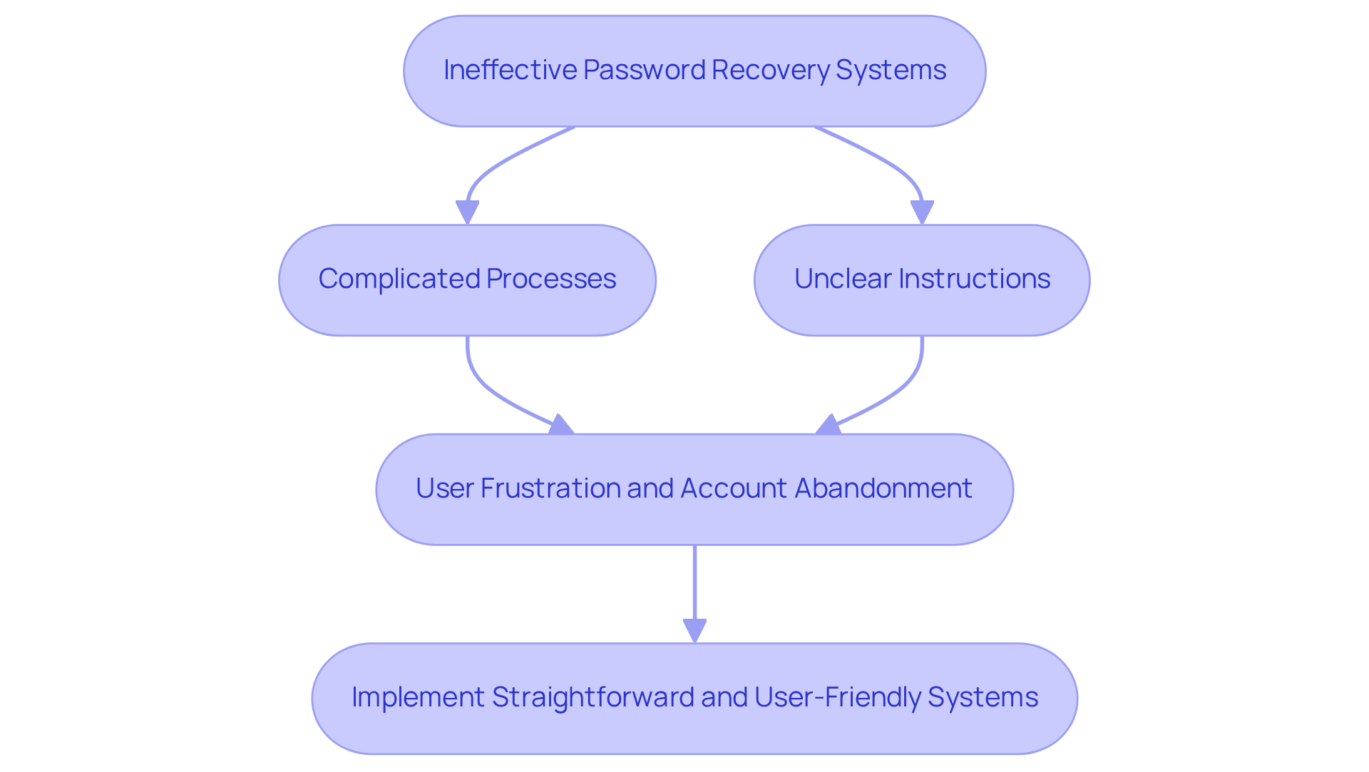
Ineffective password recovery systems pose significant barriers for individuals striving to access their accounts. Complicated processes and unclear instructions can create a UX fail, resulting in frustration and, ultimately, account abandonment. It is imperative that DTC labels implement straightforward and user-friendly password recovery systems. By doing so, they ensure that customers can easily regain access to their accounts, eliminating unnecessary hurdles and enhancing overall user satisfaction, which helps to prevent any UX fail.
O2: The Inefficient Live Chat Experience
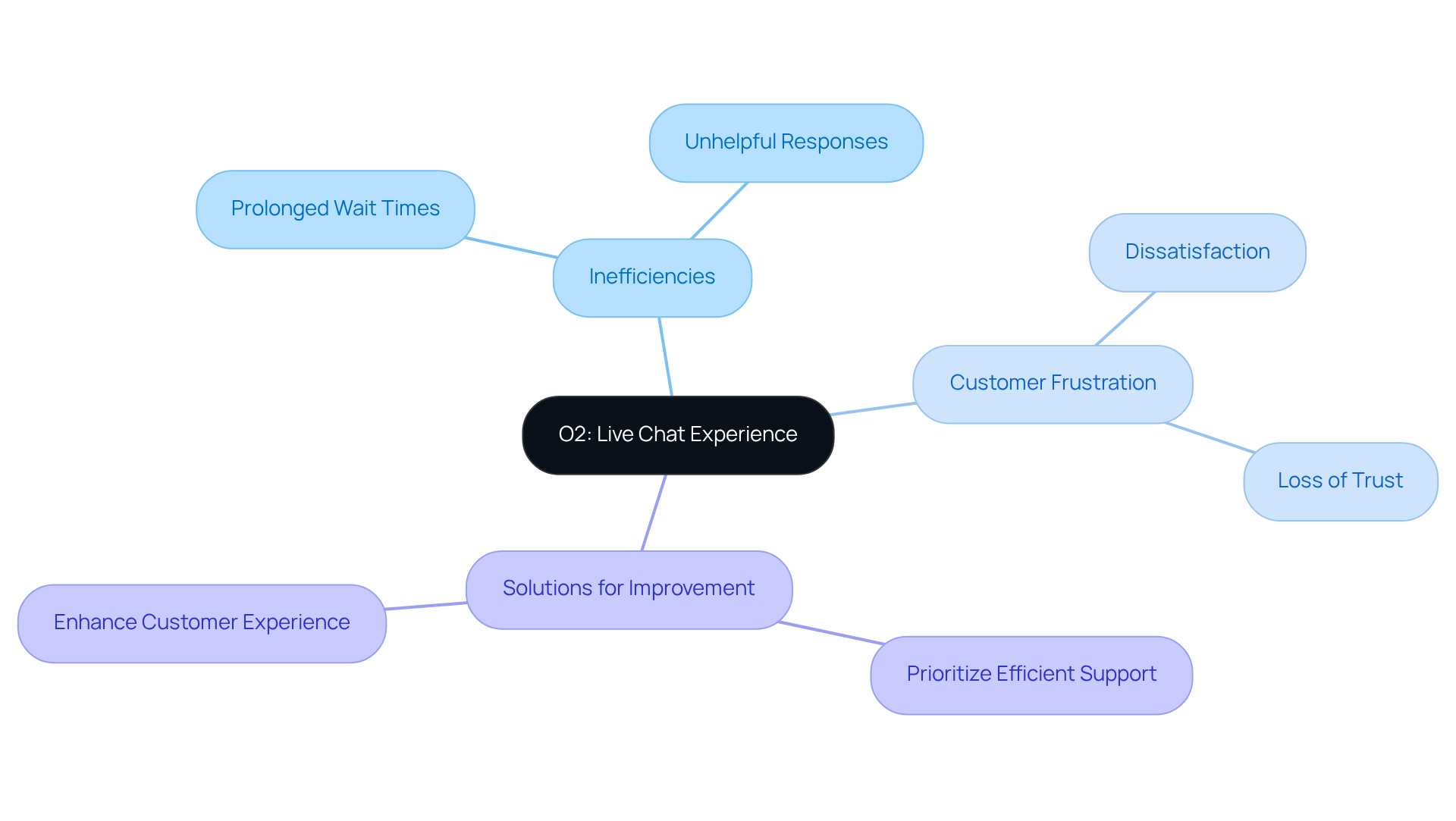
O2 has encountered significant criticism regarding its live chat support, which is seen as a UX fail due to prolonged wait times and unhelpful responses. Such inefficiencies can result in a UX fail, leading to considerable customer frustration and dissatisfaction.
It is imperative for DTC companies to prioritize the establishment of efficient and effective customer support systems. By doing so, they can ensure that customers receive timely assistance and feel valued throughout their interactions. This commitment not only enhances customer experience but also fosters loyalty and trust in the brand.
Hulu: The Confusing App Tab Navigation
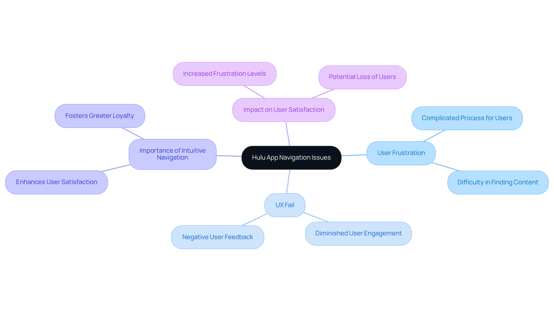
Hulu's application has come under scrutiny due to its perplexing tab navigation, leading to a UX fail that complicates the process for users seeking content. This lack of clarity not only frustrates users but also results in a UX fail, diminishing their engagement with the platform.
It is imperative for DTC companies to prioritize the development of intuitive navigation systems that allow users to effortlessly access the content they desire. By doing so, they can significantly enhance overall user satisfaction and foster greater loyalty.
Fiverr: The Misleading Five-Star Display System
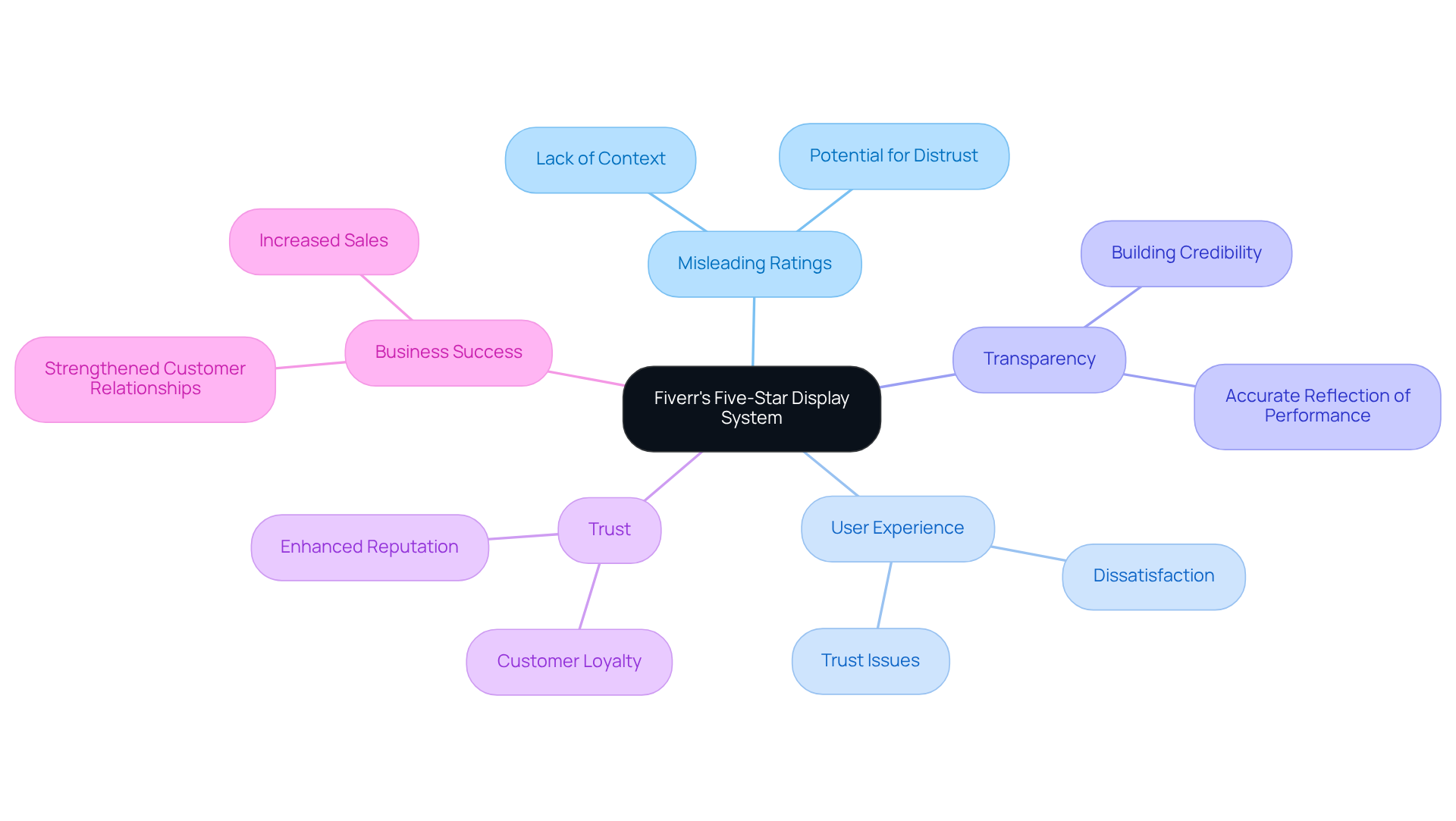
Fiverr's five-star display system is often criticized for its potential to mislead, highlighting a UX fail, as clients may not grasp the full context of a seller's performance. This lack of transparency can foster distrust and dissatisfaction among users.
To cultivate trust and credibility, DTC brands must prioritize transparent rating systems that accurately reflect user experiences. By doing so, they not only enhance their reputation but also strengthen customer loyalty, ultimately driving business success.
Conclusion
Addressing notorious UX failures is essential for direct-to-consumer brands aiming to enhance customer satisfaction and drive conversion success. By learning from the missteps of well-known companies, brands can implement strategies that prioritize user experience, fostering loyalty and trust among their clientele.
Key examples of UX failures—from confusing features like WhatsApp's message deletion to complicated processes in Ryanair's booking system—illustrate the profound impact of user-centered design. By focusing on intuitive interfaces, transparent navigation, and efficient support systems, DTC brands can avoid these pitfalls and create seamless interactions that resonate with users.
The significance of prioritizing user experience cannot be overstated. DTC brands must commit to understanding their customers' needs and preferences, transforming potential UX failures into opportunities for growth. By doing so, they not only enhance their reputation but also position themselves for long-term success in an increasingly competitive landscape.
Frequently Asked Questions
What is the main focus of Parah Group?
Parah Group focuses on Conversion Rate Optimization (CRO) for direct-to-consumer companies, aiming to transform UX failures into successful outcomes through data-driven methodologies and insights from consumer psychology.
How does Parah Group enhance client interactions?
The agency enhances client interactions by leveraging data-driven insights and consumer psychology, which ultimately leads to increased conversion rates and higher average order values for companies.
What notable UX fail is associated with WhatsApp?
WhatsApp's 'Delete for Everyone' feature has been criticized for its confusing implementation, where recipients still receive a notification when a message is deleted, leading to misunderstandings and frustration.
Why is it important for DTC brands to prioritize user experience?
Prioritizing user experience is crucial for DTC brands to prevent UX failures, foster trust, and enhance customer loyalty by ensuring that features are intuitive and transparent.
What is the UX fail associated with Netflix's hover auto-play feature?
The hover auto-play feature on Netflix frustrates users by automatically playing trailers when they hover over titles, disrupting the browsing experience and leading to irritation.
How can DTC companies improve user satisfaction based on the Netflix example?
DTC companies can improve user satisfaction by prioritizing consumer control, allowing users to determine when and how they engage with content, which fosters positive interactions and enhances loyalty.
FAQs


