
Overview
The article titled "10 Notable UX Failures That Hurt Brand Trust" examines the critical ways in which specific user experience (UX) failures can undermine consumer trust in various brands. It presents compelling examples, including:
- WhatsApp's confusing message deletion feature
- Netflix's disruptive auto-play function
These cases illustrate that poor UX design not only leads to user frustration and dissatisfaction but also significantly erodes brand loyalty and trust among consumers. By recognizing these failures, brands can take actionable steps to improve their user experience, thereby restoring and enhancing consumer confidence.
Introduction
Significant user experience (UX) failures can severely undermine brand trust and customer loyalty, resulting in lost revenue and frustrated users. In an increasingly competitive landscape, it is essential for companies to grasp the repercussions of these failures. This article explores ten compelling examples of UX missteps—from confusing interfaces to misleading rating systems—that not only disappointed users but also cast doubt on the integrity of the brands involved. What lessons can be gleaned from these failures, and how can businesses leverage these insights as opportunities for improvement?
Parah Group: Transforming UX Failures into Profitable Solutions
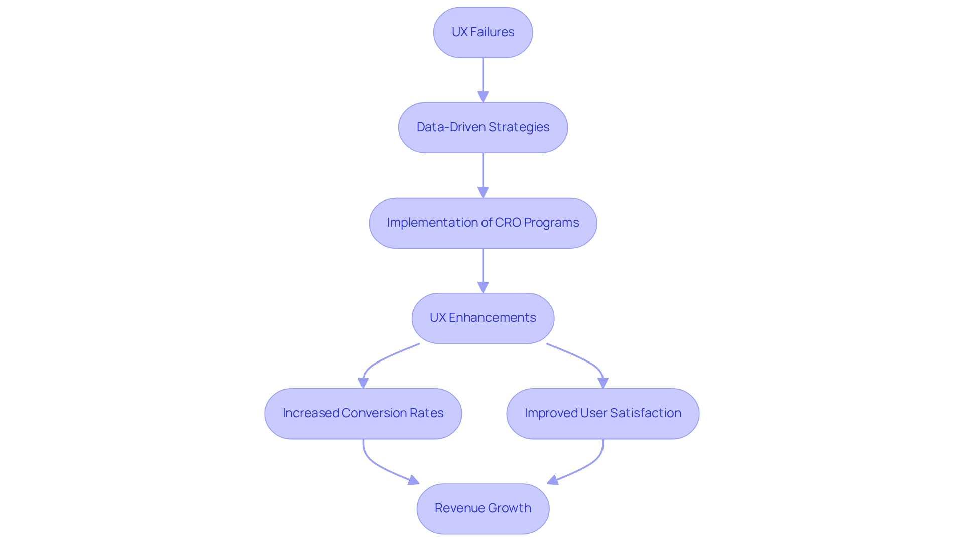
Parah Group is leading the way in transforming UX failures into profitable solutions for direct-to-consumer companies. By leveraging data-driven strategies and insights from consumer psychology, they execute high-velocity [Conversion Rate Optimization (CRO)](https://parahgroup.com) programs that not only tackle existing UX challenges but also elevate overall user satisfaction. This meticulous approach guarantees that every component of a client's website is , ultimately driving revenue growth without additional advertising expenses.
For example, a $30M apparel company experienced a remarkable 35% increase in conversion rates after Parah Group revamped their homepage to emphasize social proof and fine-tune product pricing. In a similar vein, Grab Green, a $15M cleaning product company, achieved an impressive 80% increase in average order value (AOV) by experimenting with free shipping thresholds and bundling products to promote larger purchases.
These transformative outcomes highlight the critical importance of prioritizing UX enhancements to mitigate UX failures, with some businesses reporting conversion rate surges of up to 400%. Moreover, integrating UX insights into CRO strategies eliminates uncertainty, empowering companies to make informed decisions that resonate with their audience.
As Waseem Bashir aptly notes, 'A strong UX is a foundation for a successful CRO.' By focusing on client-centered design and continuous testing, Parah Group not only enhances the customer journey but also fosters brand loyalty and trust—essential elements for sustained success in the competitive e-commerce landscape.
Furthermore, it is noteworthy that 85% of website issues can be averted through evaluations involving just five participants, underscoring the pivotal role of usability testing in bolstering both UX and CRO initiatives.
WhatsApp: The Controversial Delete Message Feature
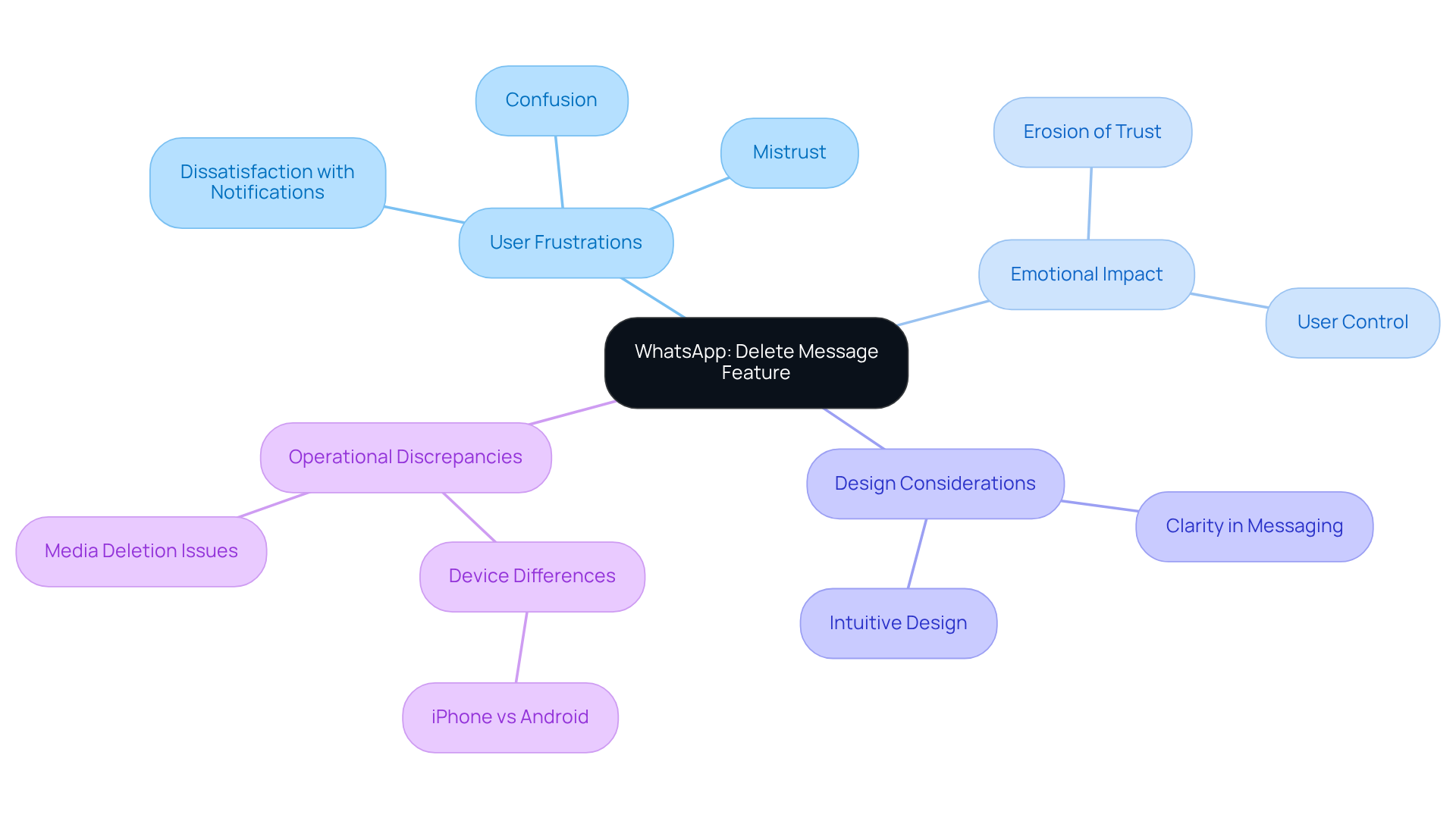
WhatsApp's has ignited significant debate due to its perplexing implementation. Users frequently express frustration when they delete a message, only to receive a notification stating, 'This message was deleted.' This design choice cultivates curiosity and mistrust among recipients, who are left speculating about the content that was removed. Such confusion can substantially erode trust and lead to dissatisfaction, underscoring the critical importance of thoughtful UX design that prioritizes emotional responses to prevent UX failures.
UX designers assert that clarity in messaging features is essential for sustaining a positive user experience and fostering loyalty to the brand. When individuals feel uncertain or misled, it can adversely affect their perception of the company, highlighting the necessity for intuitive design that aligns with user expectations. Furthermore, research indicates that most participants prefer using the 'Delete for Everyone' option over 'Delete for Me', demonstrating a strong desire for control over message visibility.
Moreover, the operational discrepancies between iPhone and Android devices regarding this feature can exacerbate frustrations, as deleted media may still be accessible on iPhones, raising privacy concerns. The dissatisfaction expressed by users regarding the feedback messages displayed upon deletion further illustrates the emotional ramifications of this feature, emphasizing the urgent need to mitigate UX failures and adopt a more audience-centric approach in design.
Netflix: The Disruptive Hover Auto-Play Feature
Netflix's hover auto-play feature has faced significant criticism because it has led to ux failures, disrupting the browsing experience. Users often express feelings of being overwhelmed by , which contribute to ux failures that hinder content discovery in a chaotic environment. This incessant barrage of sound and movement not only frustrates viewers but can also result in ux failures, as they struggle to concentrate on their options amidst the distractions.
Research indicates that such disruptive features can lead to ux failures and heighten frustration levels, with over 120,000 individuals signing a petition on Change.org regarding Netflix's autoplay feature. Many individuals articulate a desire for greater control over their viewing habits, particularly in light of ethical concerns surrounding children's exposure to content. A more audience-centric approach would empower users to choose when to engage with previews, thereby reducing ux failures and cultivating a more enjoyable and less intrusive browsing experience.
By implementing options that allow users to disable auto-play or customize their settings, streaming services like Netflix could significantly reduce ux failures, thereby enhancing viewer satisfaction and trust. As noted by UX researcher Chetty, 'We need more studies like this that provide quantifiable measures of online manipulation to help regulators, platform designers, and researchers to enhance consumer protections and ensure that designs are not having negative consequences on society.'
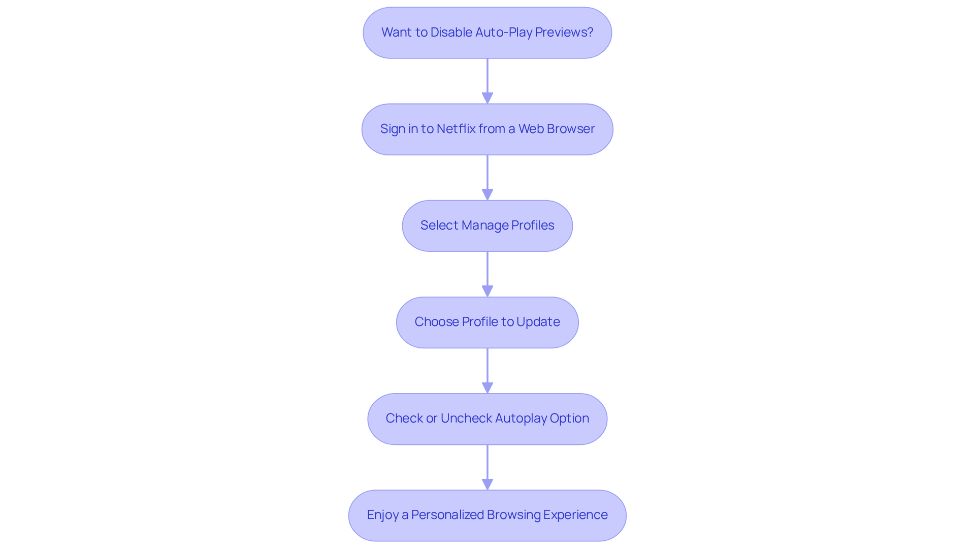
Furthermore, Netflix acknowledges that while some users find autoplay previews advantageous, others do not, underscoring the need for a balanced approach. To disable autoplay previews, users must sign in to Netflix from a web browser, select 'Manage Profiles,' and choose the profile they wish to update, allowing them to check or uncheck the autoplay option.
Ryanair: The Confusing Booking Platform Experience
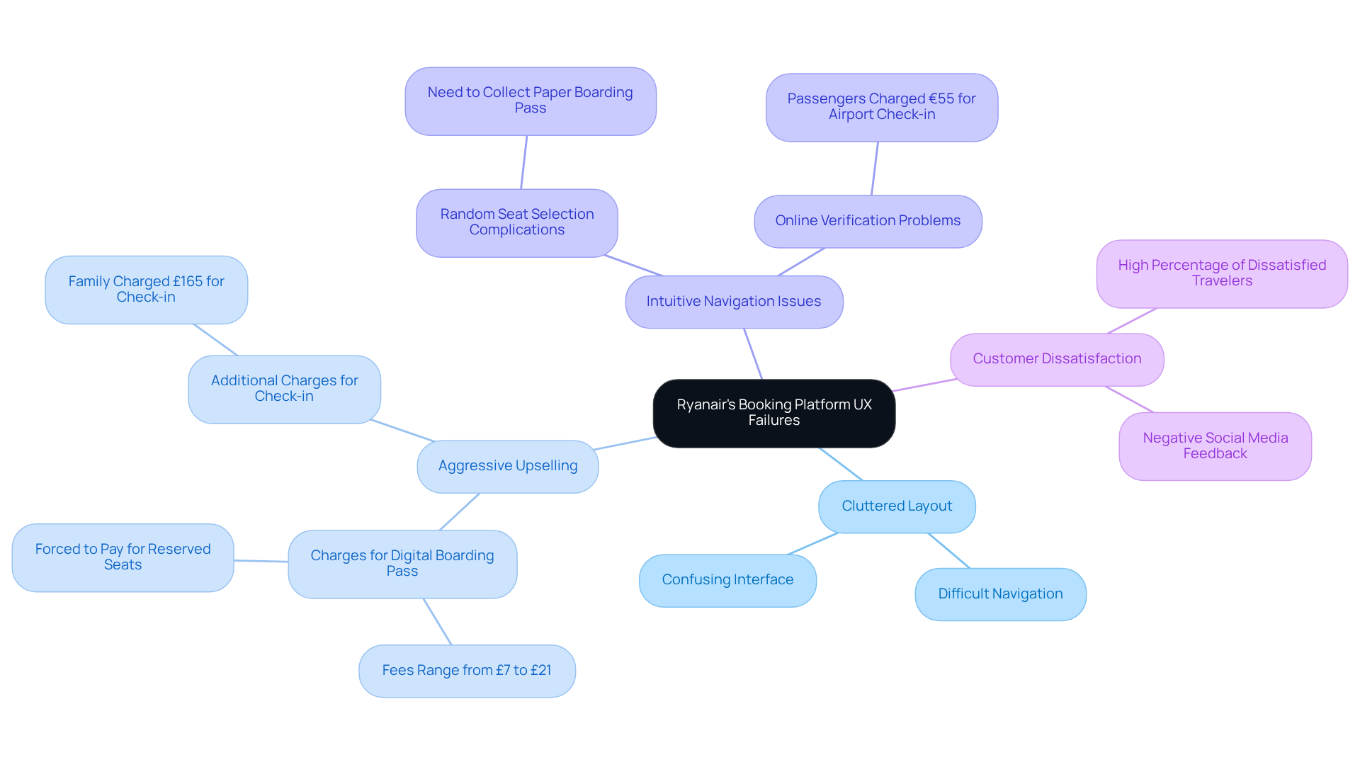
Ryanair's booking platform is an example of UX failures, characterized by a complicated interface that often confuses customers. The platform's cluttered layout, aggressive upselling tactics, and lack of intuitive navigation result in UX failures that create a challenging booking process. Reports reveal that a significant percentage of travelers express dissatisfaction with travel booking platforms; notably, some passengers are charged up to £21 for a seat to access a digital boarding pass. This scenario underscores the critical need for a streamlined, within the industry.
As travel industry UX experts assert, 'UX failures like confusing interfaces can significantly damage brand trust.' It is imperative for companies like Ryanair to prioritize experience design to foster customer loyalty and enhance profitability.
Apple: The Complex Storage Management System
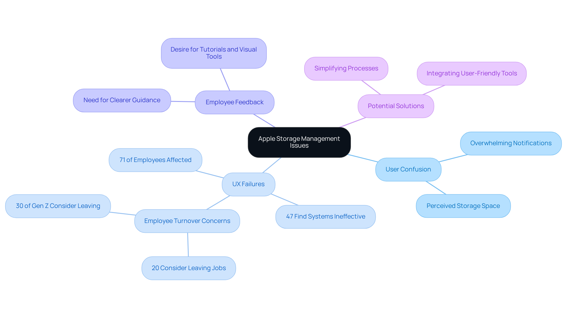
Apple's storage management system has faced considerable scrutiny due to its convoluted interface, which has led to multiple ux failures stemming from insufficient intuitive guidance. Users frequently express confusion regarding effective storage management, often feeling overwhelmed by notifications about storage limits, which contributes to ux failures, particularly when they believe they have ample space available.
In fact, 71 percent of employees indicate that poor digital organization obstructs their ability to work effectively, underscoring a widespread issue that extends beyond Apple customers. This complexity not only frustrates individuals but also leads to ux failures, diminishing their overall satisfaction with the product.
UX designers emphasize that and providing clearer, more actionable guidance could significantly reduce ux failures and enhance the user experience. For instance, integrating simple tutorials or visual tools could aid users in navigating storage management more effectively.
Additionally, 47 percent of employees report that their company’s digital organization methods are ineffective and challenging to navigate, which highlights the urgent need to rectify ux failures in systems like Apple's. By addressing these usability concerns, Apple stands to greatly enhance customer satisfaction and restore trust in its brand.
Furthermore, the ongoing legal challenges Apple faces regarding its storage management, including a recent court ruling that found no evidence of deceptive claims about storage management, spotlight the ramifications of customer dissatisfaction. By prioritizing enhancements in customer satisfaction, Apple has an opportunity not only to boost contentment but also to mitigate potential legal repercussions.
Common UX Pitfall: Super Long Dropdown Menus
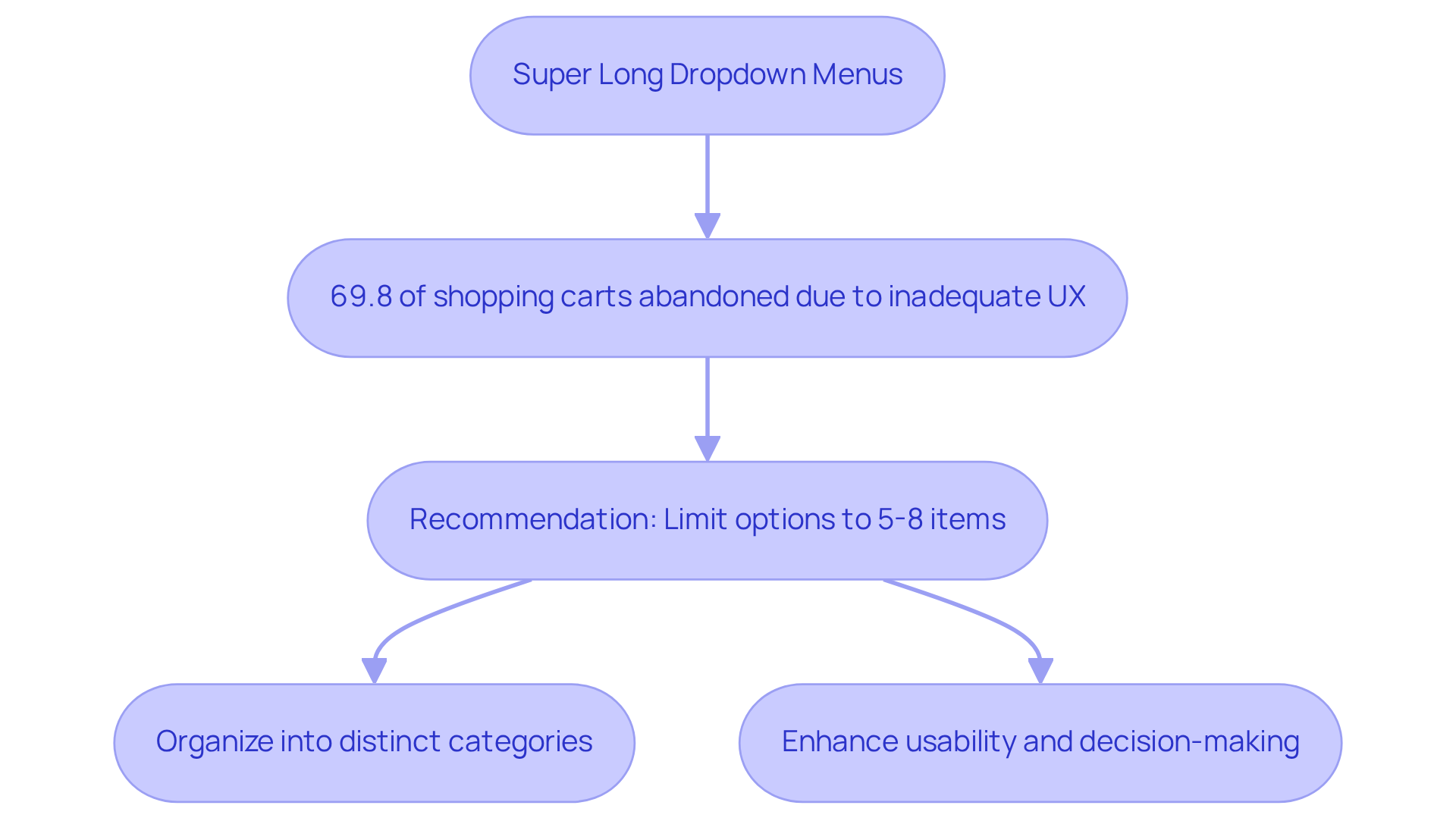
Super long dropdown menus signify a significant instance of UX failures that can overwhelm users and hinder their navigation experience. Research reveals that an abundance of options can lead to frustration, with studies indicating that 69.8% of shopping carts are abandoned due to inadequate UX.
To address these challenges, best practices advocate for limiting dropdown options to five to eight items. Usability expert Ishita Shah asserts, "We recommend staying between 5 to 8 items in a drop-down menu." Organizing these options into distinct categories not only streamlines the decision-making process but also enhances usability, enabling users to swiftly locate what they need.
Usability specialists emphasize that , underscoring the necessity for companies to prioritize effective navigation strategies. By implementing these optimal strategies, brands can significantly enhance customer satisfaction and foster greater trust among their audience.
The Password Kerfuffle: A Classic UX Design Failure
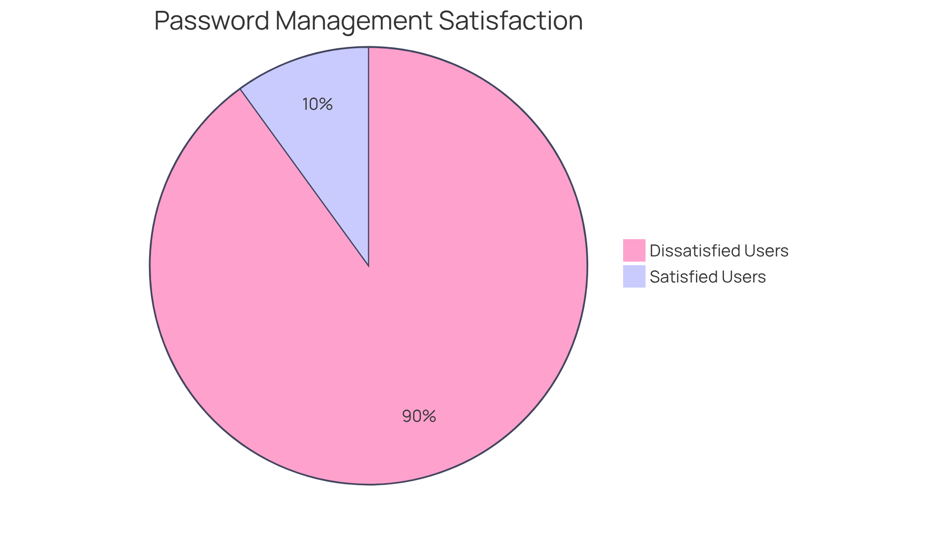
The ongoing password kerfuffle exemplifies a profound failure in UX design, showcasing the UX failures that arise from overly complex password requirements, which lead to among users. Many websites impose stringent rules that complicate both the creation and memorization of passwords, resulting in a staggering increase in UX failures. In fact, nearly 90% of consumers express dissatisfaction with managing their passwords, which reflects UX failures, as many abandon purchases due to forgotten credentials.
Streamlining password criteria and implementing accessible recovery systems can significantly enhance user experience. For instance, a well-designed password recovery system can dramatically reduce login failure rates, which are often exacerbated by convoluted password policies.
Cybersecurity specialists emphasize that a streamlined approach to password management not only improves usability but also instills confidence, as users feel more secure and less burdened by their login processes. By prioritizing user-friendly authentication methods, companies can cultivate a more positive relationship with their customers, ultimately driving loyalty and satisfaction.
O2: The Inefficient Live Chat System
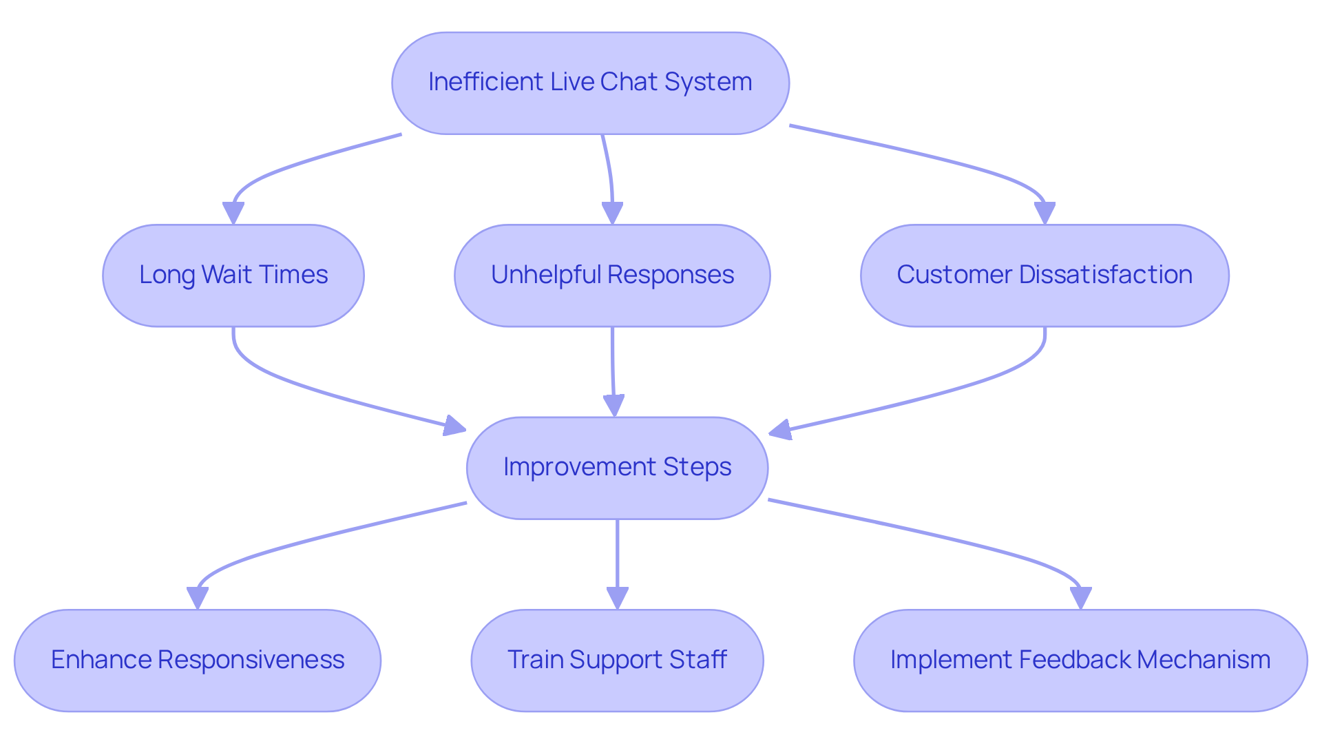
O2's live chat system has faced substantial criticism, primarily due to its inefficiency, which often results in ux failures like frustratingly long wait times and unhelpful responses. This , characterized by ux failures, not only breeds dissatisfaction but also erodes confidence in the company.
Experts emphasize that enhancing the responsiveness and effectiveness of live chat support is crucial for improving customer satisfaction and fostering loyalty. Inefficient customer support systems can instigate trust issues, as clients often experience ux failures when they anticipate prompt and effective resolutions to their inquiries.
Addressing these ux failures is imperative for brands striving to maintain a loyal customer base and a positive reputation in a competitive market.
Hulu: The Flawed App Tab Design
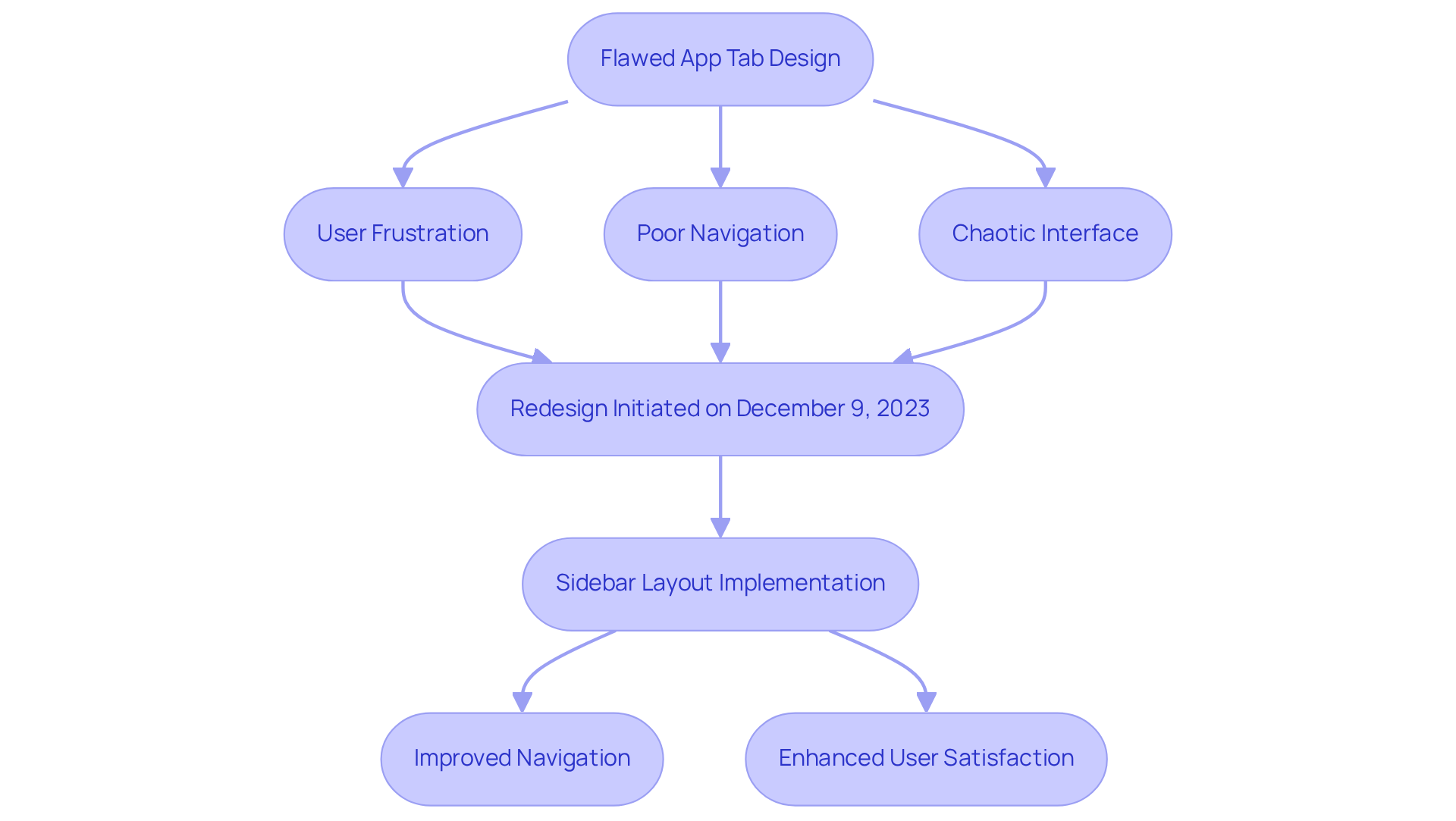
Hulu's app tab design has faced significant criticism due to its lack of clarity and organization, which has contributed to UX failures and frustration among users. Many individuals struggle to navigate through content because of UX failures such as poorly labeled tabs and a chaotic interface, which can detract from their overall satisfaction. Research indicates that 88% of users are after encountering UX failures, underscoring the importance of intuitive design. By streamlining the app's layout and enhancing tab labeling, Hulu can markedly improve navigation and user satisfaction.
Hulu's recent redesign, initiated on December 9, 2023, aims to simplify navigation by implementing a sidebar layout that aligns more closely with user expectations set by competitors. Jim Denney, Hulu's VP and head of Product Management, emphasized the need to improve density and navigation, stating, "We want to close some of those gaps so it becomes clearer which path to follow so individuals don’t get lost." By prioritizing clear labeling and a more coherent structure, Hulu can enhance audience engagement and trust, ultimately driving better retention and satisfaction among its viewers.
Fiverr: The Misleading Five-Star Display
Fiverr's five-star rating system faces significant criticism for its potential to mislead users regarding service quality. Many individuals report feelings of deception when the services they receive do not correspond with the ratings presented.
Research reveals that:
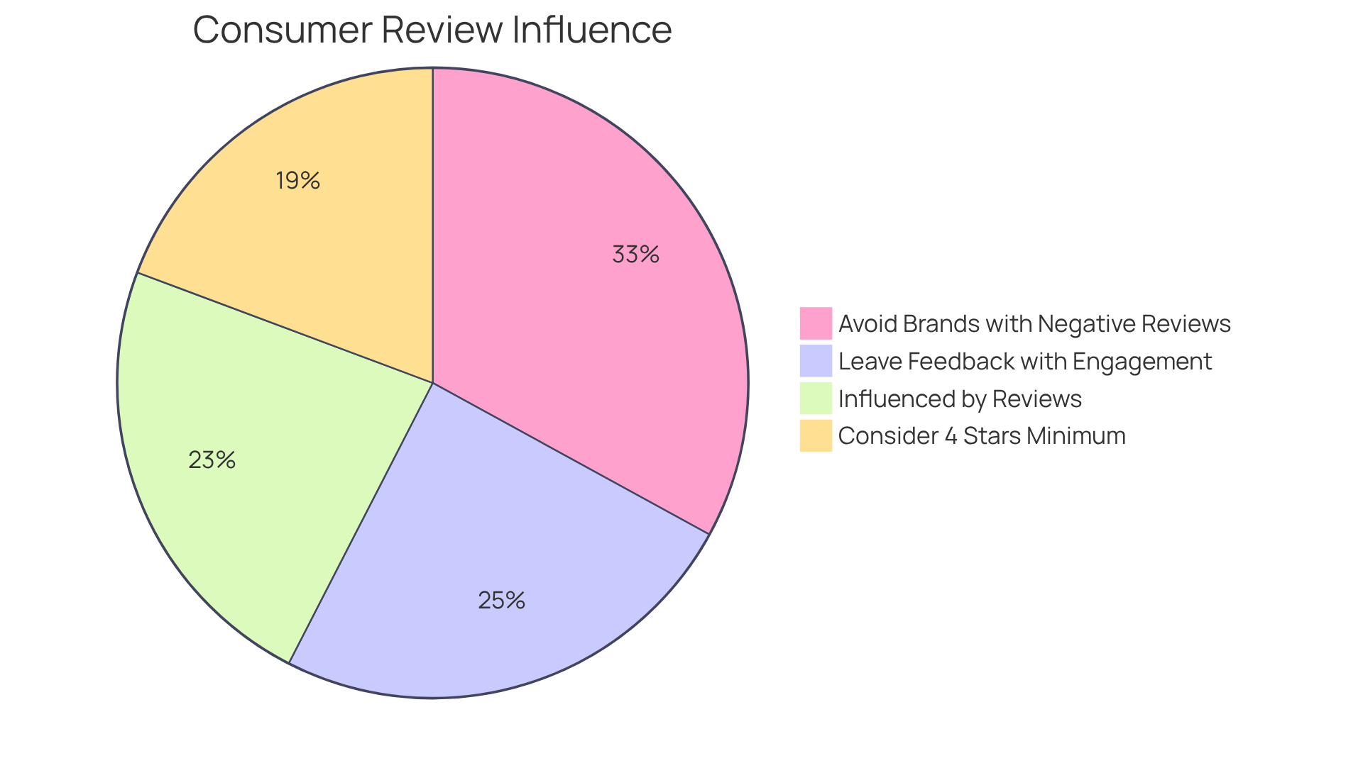
- 66% of consumers are influenced by reviews during their purchasing decisions, highlighting the critical need for accurate and transparent feedback mechanisms.
- 70% of customers are more likely to leave feedback when the business account engages with reviews, underscoring the importance of interaction in building trust.
- Misleading ratings can severely undermine this trust, as 94% of consumers have avoided brands with negative reviews.
- Users increasingly depend on authentic feedback to inform their choices, with 55% of consumers considering only businesses with a .
By implementing a more comprehensive review strategy that includes insights from UX researchers on transparency in review systems, Fiverr can rectify UX failures, enhance user experiences, and restore confidence in its platform.
Conclusion
The exploration of notable UX failures reveals a critical connection between user experience design and brand trust. Companies that overlook the significance of intuitive and user-friendly interfaces risk alienating their customers, ultimately jeopardizing their reputation and profitability. By addressing these UX failures, businesses can enhance user satisfaction and cultivate lasting loyalty and trust in their brand.
Throughout this article, various case studies illustrate the impact of poor UX design on customer perceptions. From WhatsApp's confusing message deletion feature to Netflix's disruptive auto-play option, each example highlights how missteps in user experience can lead to frustration and distrust. Furthermore, companies like Ryanair and Apple demonstrate the necessity for streamlined interfaces and clear communication to prevent user confusion and dissatisfaction. The importance of thoughtful UX design is underscored by staggering statistics surrounding user abandonment and dissatisfaction due to poorly designed systems.
In a landscape where user expectations are constantly evolving, the onus is on brands to prioritize user-centric design. By investing in effective UX strategies and learning from past failures, companies can transform potential pitfalls into opportunities for growth and customer engagement. Emphasizing the need for continuous improvement in user experience safeguards brand trust and paves the way for sustained success in an increasingly competitive market.
Frequently Asked Questions
What is Parah Group's approach to improving user experience (UX) for companies?
Parah Group transforms UX failures into profitable solutions for direct-to-consumer companies by leveraging data-driven strategies and insights from consumer psychology. They execute high-velocity Conversion Rate Optimization (CRO) programs that tackle existing UX challenges and elevate overall user satisfaction.
Can you provide examples of companies that benefited from Parah Group's services?
Yes, a $30M apparel company saw a 35% increase in conversion rates after Parah Group revamped their homepage, while Grab Green, a $15M cleaning product company, achieved an 80% increase in average order value by experimenting with free shipping thresholds and product bundling.
How significant can the impact of UX enhancements be on conversion rates?
Some businesses have reported conversion rate surges of up to 400% as a result of prioritizing UX enhancements, highlighting the critical importance of addressing UX failures.
What role does usability testing play in improving UX and CRO?
Usability testing can help avert 85% of website issues with evaluations involving just five participants, emphasizing its pivotal role in bolstering both UX and CRO initiatives.
What are the main criticisms of WhatsApp's 'Delete for Everyone' feature?
Users are frustrated by the notification stating 'This message was deleted,' which cultivates curiosity and mistrust among recipients. This design choice can erode trust and lead to dissatisfaction, highlighting the need for thoughtful UX design.
How do users feel about the control of message visibility in WhatsApp?
Research indicates that most participants prefer using the 'Delete for Everyone' option over 'Delete for Me', demonstrating a strong desire for control over message visibility.
What issues arise from the operational discrepancies between iPhone and Android devices regarding WhatsApp's delete feature?
The discrepancies can exacerbate frustrations, as deleted media may still be accessible on iPhones, raising privacy concerns among users.
What are the criticisms of Netflix's hover auto-play feature?
The hover auto-play feature has been criticized for disrupting the browsing experience, overwhelming users with automatically playing trailers, which can hinder content discovery and lead to frustration.
What do users desire in terms of control over Netflix's auto-play feature?
Many users express a desire for greater control over their viewing habits, particularly wanting the option to disable auto-play or customize their settings to reduce distractions.
How can Netflix users disable the auto-play previews?
Users must sign in to Netflix from a web browser, select 'Manage Profiles,' choose the profile they wish to update, and then check or uncheck the autoplay option.
FAQs


